

Button Group Settings
The button group attributes are configured using the Button Group settings screen.
The following options are available:
Content
Customize the content options and determine how other elements appear in the Button Group element.

| # | Option | Function |
|---|---|---|
| 1 | Static Values – Edit Mapping | Change the static value mapping of the button group after you add it to the Web project. Use static values to set pre-defined labels, values, and/or descriptions. These values are set on a project level and are not pulled from Salesforce. |
| 2 | Dynamic Values – Sync from Salesforce | Configure a dynamic sync from a picklist field in Salesforce. |
| 3 | Orientation | Use the drop-down list to select one of the following orientations: – horizontal – vertical |
| 4, 5 | Show Label checkbox and Label | Use the Show Label checkbox if you want to include a label that adds extra information in the Label field. |
| 6 | User tip | Add brief instructions or context to the radio element using the User tip field. |
Interactivity
Customize the interactivity options and determine how your user can interact with the Button Group element.
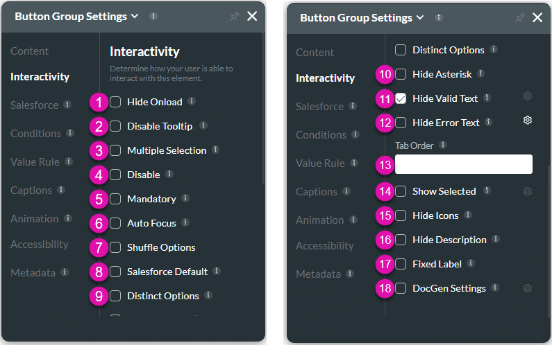
| # | Option | Function |
|---|---|---|
| 1 | Hide onload | Use the Hide Onload option to hide specific elements on load to control what the user sees. It allows you to hide an element when the page is loaded. |
| 2 | Disable Tooltip | The user will not see the tooltip of the text that they enter in the field. Tooltips give information to the user; however, when they are not necessary for self-explanatory fields, they may make fields look cluttered. |
| 3 | Multiple Selection | The button group element has a multiple selection option. A user will be able to select more than one option. |
| 4 | Disable | When this option is enabled, the user cannot interact with the element. |
| 5 | Mandatory | Use the Mandatory setting to mark various input fields as mandatory. The user will not be able to continue when a mandatory field is not complete. |
| 6 | Auto Focus | When you have multiple questions, you can guide the user to start answering specific questions by activating the text cursor to draw attention to a specific field. Use the Auto Focus feature to bring users to a specific input field when they open documents with Titan Web. You can use this option with accessibility mode. |
| 7 | Shuffle Options | Shuffle the options in the button group element each time the page is opened or refreshed. If this option is disabled, the button group will display the options in the same order every time. |
| 8 | Salesforce Default | Display the Salesforce Default values as the element default values. This option allows you to sync the Salesforce default value to the element. |
| 9 | Distinct Options | Use the Distinct Options functionality to ensure that no duplicate options are available to the user. |
| 10 | Hide Asterisk | Use the Hide Asterisk option to hide the mandatory element indicator. |
| 11 | Hide Valid Text | Use the Hide Valid Text option to either show or hide the valid indicator on the element. You can configure an icon to indicate valid input. |
| 12 | Hide Error Text | Use the Hide Error Text option to either show or hide the error text on the element. You can configure an icon to indicate invalid input. |
| 13 | Tab Order | Use the Tab Order to set which fields will be active when the user presses the Tab key. This assists the visually impaired who need to navigate using the Tab key. |
| 14 | Show Selected | You can add an icon to show which button the user has selected. |
| 15 | Hide Icons | Use screen space effectively by preventing the icon from displaying, for instance, when using a smaller device layout. |
| 16 | Hide Description | Hide the description. This is especially useful for smaller device layouts. |
| 17 | Fixed Label | Use the Fixed Label setting to ensure your long-form content always displays to users. |
| 18 | DocGen Settings | Use DocGen Settings to design the layout of the interactive fields in your document. Control the setting for each field, such as dimensions, font, color, and the positioning of the interactive elements and margins. |
Salesforce
Configure Integrations – Integrate data from Salesforce.
Conditions
Configure Conditions – Determine what will happen when your user interacts with this element.
Value Rules
Value Rules – Use the Set Value Rules function to set the acceptable values for an input field. This can improve efficiency and accuracy when capturing information.
Captions
Captions – Use the Captions to provide instructions and context to users. There are different caption options available per element that will help guide the user.
Animation
Animation – This option allows you to add visual interest to your screen. Create the illusion of movement when the element shows on the screen. You can set the duration and delay to control the movement and preview by default.
Accessibility
Accessibility – Ensure people with disabilities can perceive, understand, navigate, and interact effectively with your websites.
Metadata
Metadata – See how this element is identified in the backend, such as its purpose, content, or function. Your users won’t see this.