

Hide Error Text
Business Background
Use the Hide Error Text option to either show or hide the error text on the element. You can configure an icon to indicate invalid input.
How to Guide
The Hide Error Text option is available for different elements.
- Click the + icon to open the list of elements.
- Select the Input option from the list.
- In this article, we show the email element.
- Click-and-drag the Email element to the canvas.
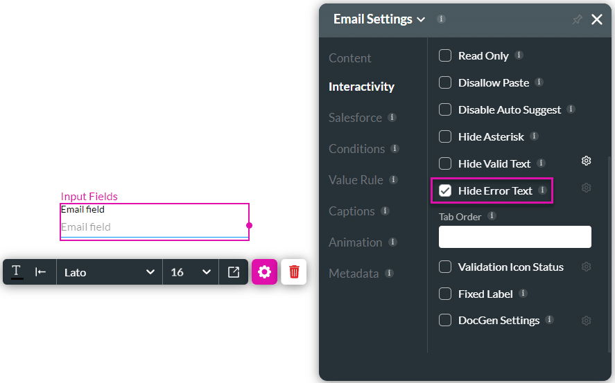
- Click the Email settings Gear icon. The Email setting screen opens.
- Select the Interactivity option from the list.
- Do one of the following:
Hide error text
- Click the Hide Error Text checkbox to hide the error text.
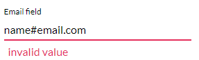
When the user types an error text, the invalid text feedback shows. When the Hide Error Text checkbox is enabled, the invalid text feedback will not show.
Show error text
- Make sure that the Hide Error Text checkbox is unchecked.
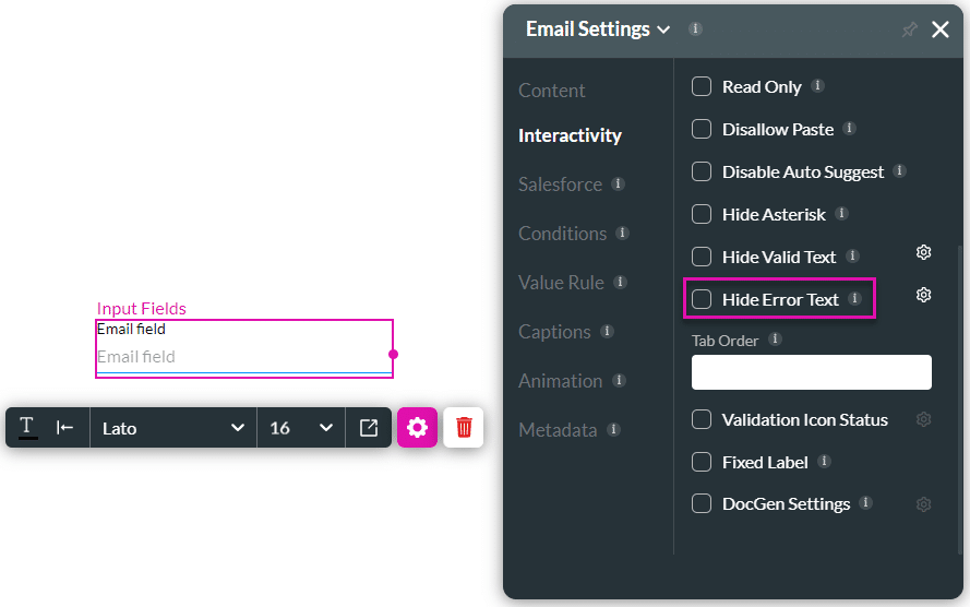
When a user enters invalid input, a message will be shown:
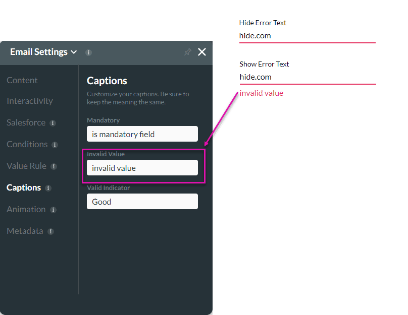
Show valid icon
- Make sure that the Hide Error Text checkbox is unchecked.
- Click the Gear icon. The Select icon screen opens.

- Configure any icons for valid input.

- Click the Apply button.
When a user enters invalid input, an icon will be shown:

Hidden Title
Was this information helpful?
Let us know so we can improve!
Need more help?
Book Demo