

Add an Icon to a Button
Business Background
Add an icon to a button to customize your content with Titan, in just a few clicks.
Titan Solution
- Using Titan, you can add an icon to a button, and style this icon as desired.
- Titan enables you to customize the look and feel of your button to suit your business needs.
How to Video
- 0:01 A quick introduction on how to add an icon to a button.
- 0:04 Learn the difference between an icon and a button.
- 0:17 Watch how you navigate to button settings, to enable the icon.
- 0:40 Check out how many options of icons you have.
- 1:06 Select the icon you wish to use.
- 1:12 Watch and see how the icon appears on the page.
- 1:16 We show you how to change the name and style of the icon.
- 1:33 See how to style the color, and increase the height and width of the icon.
- 2:09 Positioning of the icon before and after the text.
- 2:22 And that is all there is to it.
How to Guide
- Click the + icon to open the list of elements.
- Select the Button option from the list.
- Drag-and-drop a button element to the canvas.
- Click the Button Gear icon. The Button settings screen opens.
- Select the Interactivity option.
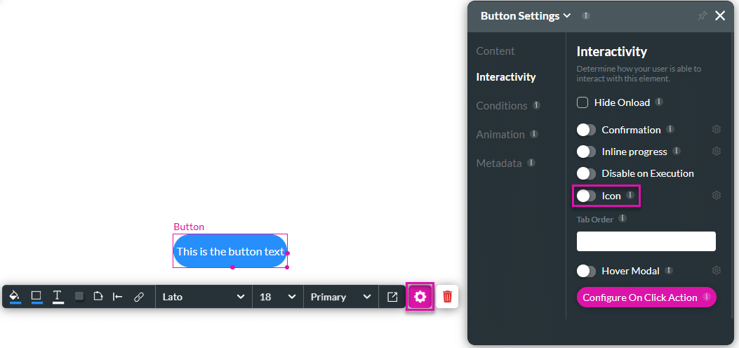
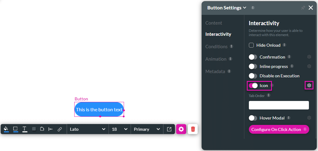
- Use the Icon toggle switch to enable the option.
- Click the Gear icon.
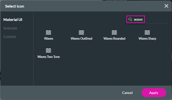
- Under the Material UI option, use the Search field, if necessary, and click an icon to select it.
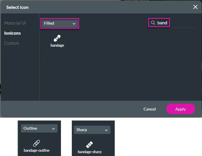
- As an alternative, select the Ionicons option.
- Use the drop-down list to select an option:
- Filled
- Outline
- Sharp
- As an alternative, select the Custom option.
- Add the CSS code to the field.
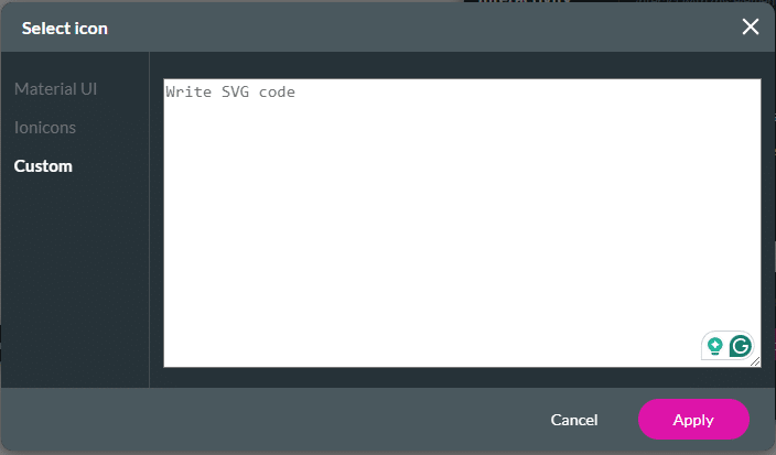
- Click the Apply button. The icon is added to the button.

You can clear the custom icon by disabling the Icon toggle switch.
Hidden Title
Was this information helpful?
Let us know so we can improve!
Need more help?
Book Demo