Text Settings
The Text attributes are configured using the Text Settings screen. This includes the following elements:
- Title
- Heading
- Subhead
- Paragraph
- Caption
The following options are available:
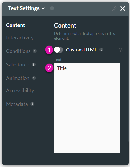
Content
Customize the content options and determine how other elements appear in the Text elements.

| # | Option | Function |
|---|---|---|
| 1 | Custom HTML | You can use this option to style HTML text using bold, italics, color, numbered lists, tables, and more features. You can disregard or choose to keep the formats from Salesforce. |
| 2 | Text | Use this option to add meaningful text or a name for a hyperlink. The Text option is available for the Text elements. |
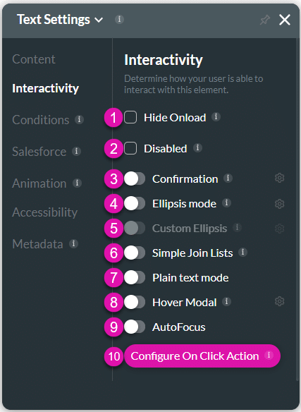
Interactivity
Customize the interactivity options and determine how your user can interact with the Text elements.

| # | Option | Function |
|---|---|---|
| 1 | Hide Onload | When using the Get method to retrieve multiple records from Salesforce into the same text element, records are separated by commas. Use the ‘Simple Join List’ to remove the commas. |
| 2 | Disabled | This option allows the user to only view the text element. They will not be able to type any text in this field. The Disable option is similar to the read-only option. |
| 3 | Confirmation | The confirmation option is available for different elements, including buttons, shapes, images, text, etc. This option allows the user to confirm their previous selection. |
| 4 | Ellipsis mode | You can use the Ellipsis Mode to give users a clue of what to expect from the content; for instance, you can show part of the text when you have a long paragraph, and if the user wants to continue to read, they can use the read more function. |
| 5 | Custom Ellipsis | Use the Custom Ellipsis when you have a long paragraph in a small input field. Users can define any scenario that will be triggered when the text in the Ellipsis mode is selected. |
| 6 | Simple Join Lists | The Simple Join Lists option is available for Text elements. When using the Get method to retrieve multiple records from Salesforce into the same text element, they are separated by commas. Use the ‘Simple Join List’ to remove the commas. |
| 7 | Plain text mode | Use the Plain text mode to ensure that HTML text in Salesforce (which is between < > brackets) displays correctly. |
| 8 | Hover Modal | This option can display a custom modal to the user when they hover over the text. You can set an Action Flow that will display when the user hovers over the text element. The Hover Modal is available for the buttons, shapes, images, text, etc. |
| 9 | Auto Focus | The Auto Focus option is available for different types of elements such as Text, URL, Number, and Email. When you have multiple questions, you can guide the user to start answering specific questions by activating the text cursor to draw attention to a specific field. Use the Auto Focus feature to bring users to a specific input field. |
| 10 | Configure On Click Action | This option allows you to run actions that are triggered when the user clicks on the text element. |
Conditions
Configure Conditions – Determine what will happen when your user interacts with this element.
Salesforce
Configure Integrations – Integrate data from Salesforce.
Animation
Animation – This option allows you to add visual interest to your screen. Create the illusion of movement when the element shows on the screen. You can set the duration and delay to control the movement and preview by default.
Accessibility
Accessibility – Make sure that your project is compatible with assistive technologies, such as screen readers.
Metadata
Metadata – See how this element is identified in the backend, such as its purpose, content, or function. Your users won’t see this.

