

Hover Modal
Business Background
Use the Hover Modal function to display a custom modal to the user when they hover over an element. For example, display a modal with a message or with additional options from which the user can choose.
How to Guide
Note:
- Click the + icon to open the list of elements.
- Select the Button option from the list and drag-and-drop a button element to the canvas.
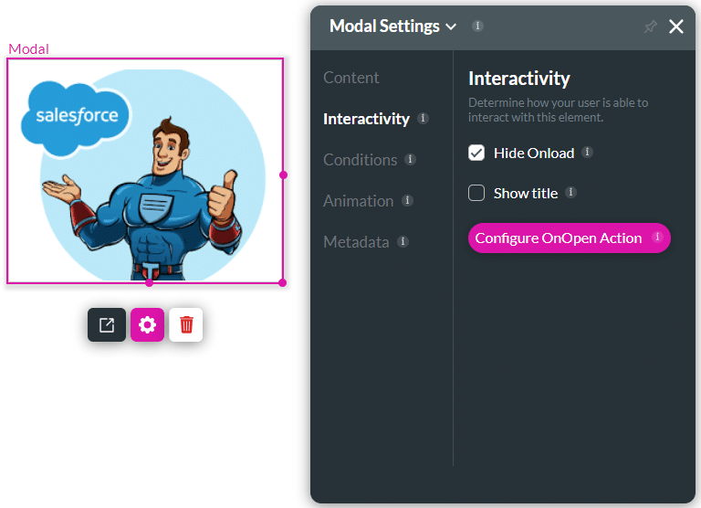
- Click the Gear icon of the button element. The Button Settings screen opens.
- Select the Interactivity option.
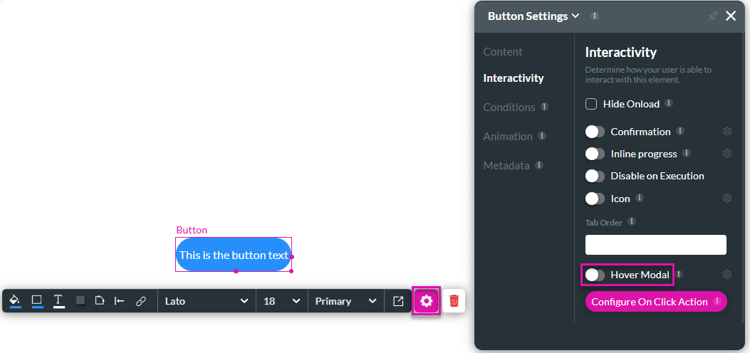
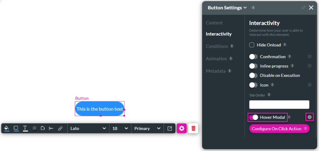
- Use the toggle switch to enable the Hover Modal option.
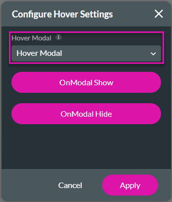
- Click the Hover Modal Gear icon. The Configure Hover Settings screen opens.
- Use the drop-down list to select the Hover Modal that you created.
- Click the Apply button.
- Save and Preview the project.
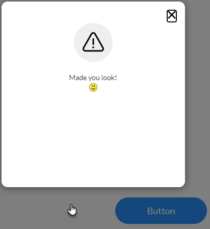
- Place the mouse over the button. The hover modal is shown.

- To configure an action when the modal is hidden, click the OnModal Hide button. The OnOpen Modal Action screen opens.

- Click the + icon next to Start. The Add Modal screen opens.

- Click on a node to add it. In this example, the Show message option was selected.
- Click the Next button.

- Type a message and click the Next button.

- Type a tag if necessary and click the Insert button. The Show message node is added.
- Click the Apply button.

- Click the Apply button on the Configure Hover Settings screen.
- Save and Preview the project.
- Place the mouse over the button. The hover modal is shown.
- Move the mouse away from the button. The message is shown.
Hidden Title
Was this information helpful?
Let us know so we can improve!
Need more help?
Book Demo