

Create a Responsive Modal
Business Background
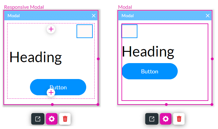
Use Responsive Modals to create web page elements that pop up in front of the main body of content and that adapt to different screen sizes and devices. Users must engage with the modals by interacting with them to return to the main content. Modals draw user attention and highlight important information.
Titan Solution
- Add and configure a responsive modal that displays on different screen sizes and devices. You can position the elements anywhere you want and in different positions for different device layouts.
- The responsive modal gives you more freedom to customize the modal.
Note:
You can position the elements anywhere in a responsive modal, whereas the elements are automatically fitted in a modal.
How to Video
- Coming soon!
How to Guide
Note:
Click here for the best practices for working with modals.
- Navigate to Titan Web Application.
- Click the expand (+) button next to the settings icon. A list of elements will show.
- Select the Containers option from the list.
- Drag-and-drop the Responsive Modal element to the canvas.
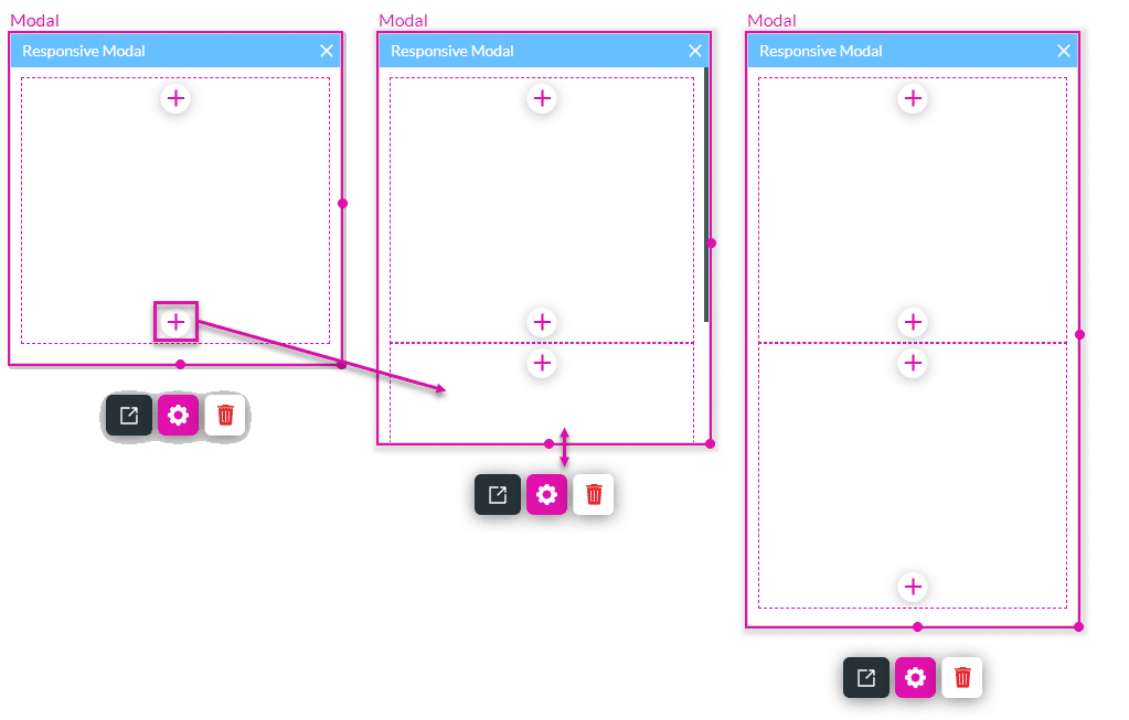
- Click the + icon to add another strip to the modal.
- Use the handle to drag the responsive modal bigger.
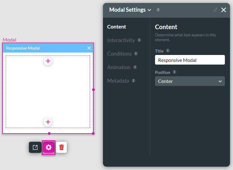
- Customize the following:
- Customize the responsive modal settings.
- Customize the modal style.
- Activate the modal as follows:
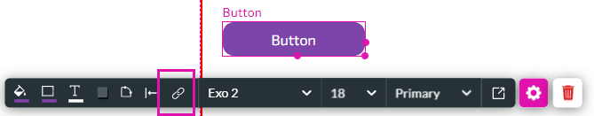
- Add an element, for instance, a button. In this example, the modal will be activated when the user clicks on this button, depending on the action you set.
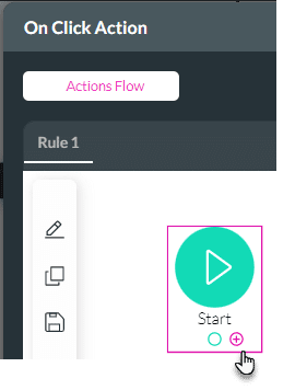
- Click the On Click Action icon.
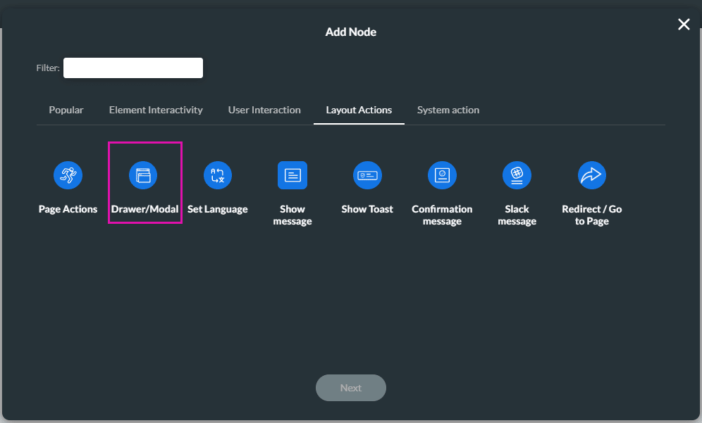
- Click the + icon. The Add Node screen opens.
- Under Layout Actions, click the Drawer/Modal option. The Add Node/Drawer/Modal screen opens.
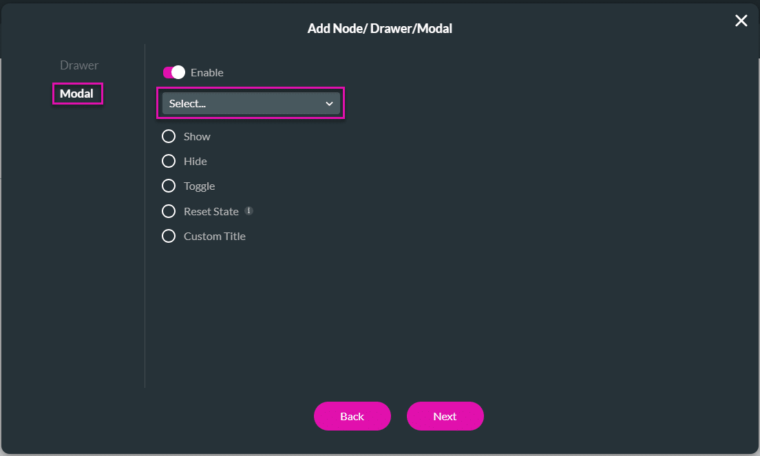
- Click the Modal option on the left of the screen.
- Use the toggle switch to enable the modal.
- Select the modal from the drop-down list.
- Use the radio buttons to select an action.
- Show: Use this option to show the modal.
- Hide: Use this option to hide the modal.
- Toggle: Use this option to toggle the modal. If it was shown, it would be hidden or vice versa.
- Reset State: Use this option to reset the modal. All input fields will be cleared, and the modal will return to the default settings.
- Custom Title: add a dynamic custom title to the modal.
- Add a tag, if necessary, and click the Insert button. The modal is added to the On Click Action screen.
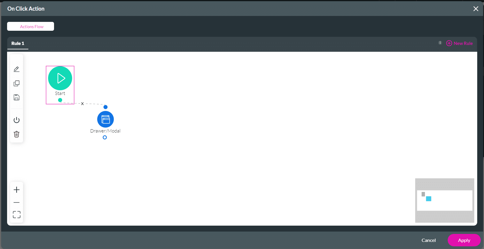
- Click the Apply button.
The action will be applied to the custom modal, and the content will be shown.
Hidden Title
Was this information helpful?
Let us know so we can improve!
Need more help?
Book Demo