Responsive Modal Settings
The responsive modal is configured using the Responsive Modal Settings screen.
The following options are available:
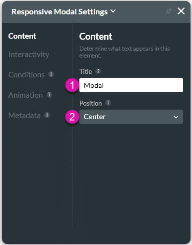
Content
Customize the content options and determine how other elements appear in the responsive modal container.

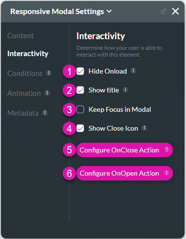
Interactivity
Customize the interactivity options and determine how your user can interact with the responsive modal container.

| # | Option | Function |
|---|---|---|
| 1 | Hide onload | Use the Hide Onload option to hide specific elements on load to control what the user sees. It allows you to hide an element when the page is loaded. |
| 2 | Show Title | The Show Title option is available for the Modal element. Change the appearance of the modal by removing the title. |
| 3 | Keep Focus in Modals | In certain scenarios, you may want to make sure that the focus remains only on a modal or responsive modal, for instance, when accessibility is used. |
| 4 | Show Close Icon | When the modal has a title you can add or remove the close icon. |
| 5 | Configure On Close Action | Use the Configure On Close Actions to run actions upon closing. The On Close Actions option is available for multiple elements, such as modals or button elements. |
| 6 | Configure On Open Action | Use the Configure On Open Actions to run actions upon opening. The On Open Actions option is available for multiple elements, such as modals. |
Conditions
Configure Conditions – Determine what will happen when your user interacts with this element.
Animation
Animation – This option allows you to add visual interest to your screen. Create the illusion of movement when the element shows on the screen. You can set the duration and delay to control the movement and preview by default.
Metadata
Metadata – See how this element is identified in the backend, such as its purpose, content, or function. Your users won’t see this.

