Learn About Containers
What do Containers do?
Containers refer to a layout technique where content can be placed within a box or a defined area on a web page. Containers help organize content, keeping related elements together and separating them from other parts of the page.
The elements’ positions are relative to their container. When the container is moved, the elements within are moved with it.
How to Video
Coming Soon!
Types of Containers
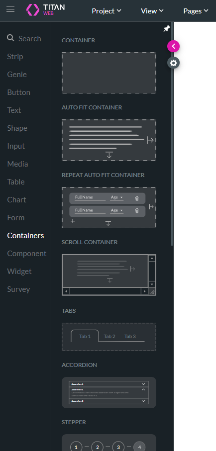
You can choose from various containers in Titan Web.
| Type of Container | Description |
|---|---|
| Container | This is the most basic container for organizing and managing content. It provides a framework for arranging, styling, and controlling the layout of various elements. The elements can be placed freely, in other words, they do not snap to the outline of the container. |
| Auto fit Container | The elements inside an auto fit container cannot be placed freely; they snap to the (left) side of the container (in left-to-right projects) and are stacked either vertically or horizontally inside. Each element dragged to the container is added in a new row. The autofit container automatically adjusts its size based on the content it holds; in other words, it readjusts to the dynamic size of all the elements. For instance, if you pull text from Salesforce to a dynamic field, the element will grow to accommodate the longer text. On the other hand, if an element is not shown, the container will also adjust. |
| Repeat Auto fit Container | The repeat auto fit container functions as an auto fit container, allowing you to repeat elements in the container. |
| Scroll Container | The contents of the scroll container can be scrolled horizontally, vertically, or both. Scroll containers are particularly useful for managing large amounts of content in a limited space. |
| Tabs Container | A tabs container is a UI component that organizes content into multiple sections, each accessible via a clickable tab. This allows users to switch between different views or content areas within the same space, improving navigation and reducing page clutter. Tabs are commonly used in settings pages, dashboards, or any interface that requires multiple related sections to be presented efficiently. |
| Accordion Container | Use an accordion container to display content in a vertically stacked list of items, where each item can be expanded or collapsed to reveal or hide content. This allows users to manage large amounts of information within a limited space by expanding only the sections they are interested in, improving usability and keeping the interface clean. Accordions are commonly used in FAQs, menus, and content-heavy pages. |
| Stepper Container | A stepper container guides users through a multi-step process by breaking it down into a series of stages or steps. Each step is typically represented visually, often with numbered circles or labels, and users progress through the steps in a linear or non-linear fashion. Stepper Containers are commonly used in forms, checkout processes, onboarding sequences, and any workflow that requires users to complete multiple tasks in a specific order. |
| Multi-step Container | A multi-step container is similar to a stepper. It divides content into multiple steps or sections without necessarily providing explicit visual indicators for each step. Users may not see a progress bar or step numbers. Stepper Containers often guide users through a strict sequence, while Multi-Step Containers might allow for more flexible navigation between steps. They are commonly used to break down long forms, such as personal information and contact details or payment information. |
| Carousel Container | Carousel containers display a series of content items, such as images or cards, in a rotating or sliding fashion within a single container. Users can navigate through the items either automatically or manually using navigation controls like arrows or dots. Carousels are commonly used for showcasing featured content, product images, or testimonials on websites. |
| Two Side Section (Animated) Container | The content area on a two-sided section container is divided into two distinct sections (back and front), each with its own content. The container often features animated transitions or effects, such as sliding or fading, to smoothly reveal or switch between the two sections. This design creates dynamic, engaging interfaces that allow users to interact with or explore content in a visually appealing manner. |
| Modal Container | A modal container is a UI component that displays content in a pop-up window or overlay. It is used to present important information, forms, or actions without navigating away from the current page. |
| Responsive Modal Container | A responsive modal container is a pop-up window or overlay that adapts its size and layout based on the screen size or device being used. It ensures that the modal content is easily readable and usable across various devices, such as desktops, tablets, and smartphones. |
| Drawer Container | A drawer container slides in from the side of the screen, typically providing additional navigation options, content, or controls without disrupting the main view. It is often used for side menus, additional settings, or contextual actions and can be activated via a button or swipe gesture. |
How to Guide
- Click the + icon to open the list of elements.
- Select the Container option and click-and-drag a container to the canvas.
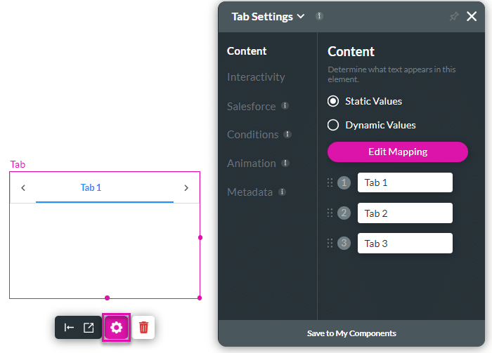
- In this example, a tab container is used.

- Click the settings Gear icon to configure the container. Each container has different configuration options.

Hidden Title
Was this information helpful?
Let us know so we can improve!
Need more help?
Book Demo

