Multi Step Settings
The multi-step attributes are configured using the Multi-Step Settings screen.
The following options are available:
Content
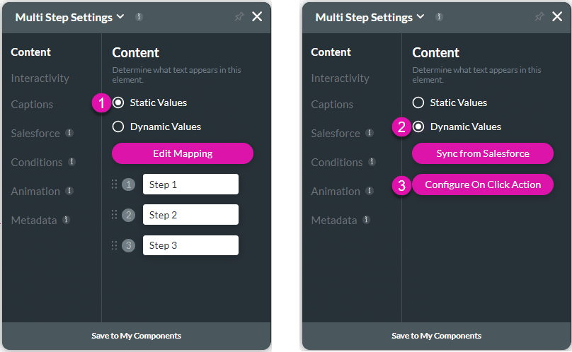
Customize the content options and determine the values that appear in the multi-step container.

| # | Option | Function |
|---|---|---|
| 1 | Static Values – Edit Mapping | Use the Edit Mapping button to configure static values for the step names. |
| 2 | Dynamic Values – Sync from Salesforce | Use the Sync from Salesforce button to configure values from Salesforce. |
| 3 | Configure On Click Action | You can configure actions that will run when the user clicks on a step in the container. |
Interactivity
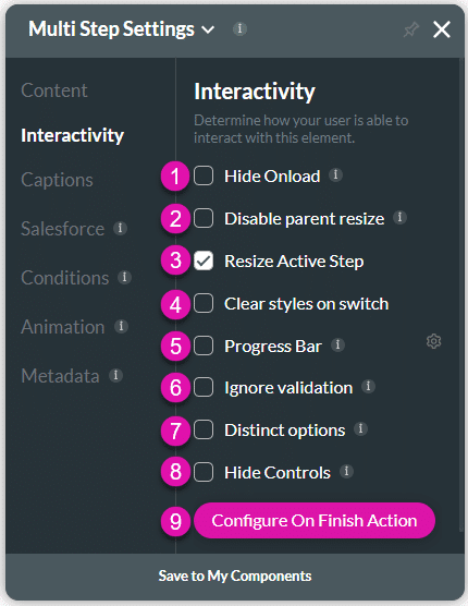
Customize the interactivity options and determine how your user can interact with the multi-step container.

| # | Option | Function |
|---|---|---|
| 1 | Hide Onload | Use the Hide Onload option to hide specific elements on load to control what the user sees. It allows you to hide an element when the page is loaded. |
| 2 | Disable Parent Size | The Disable Parent Resize option is available for most of the container elements. When added to the canvas, the container elements are automatically attached (snapped) to the strip or parent. Adjusting the container location on the strip resizes the strip accordingly. When the Disable Parent Resize option is on, the strip resizes independently from the parent. |
| 3 | Resize Active Step | The Resize Active Step option is available for the multi-stepper container. The container will resize according to the contents on the step. |
| 4 | Clear styles on switch | If the Resize Active Step option does not work for your multi-step container, use the Clear styles on switch to ensure that each step resizes based on the content of that step dynamically. The Clear Styles on Switch option is available for the multi-stepper container. The style or size of the multi-step container will be restored when switching to the next or previous step. There will not be an unnecessary vertical scrollbar. |
| 5 | Progress Bar | Use this option to show a progress bar on the stepper container. |
| 6 | Ignore Validation | The Ignore Validation option allows users to move to the next step without triggering the validation on fields, whether validations or value rules. |
| 7 | Distinct Options | The Distinct Options option is available for several elements, such as button groups, drop-downs, radios, multi-selects, and checkboxes. Use this functionality to ensure that no duplicate options are available to the user. |
| 8 | Hide Controls | The Hide Controls option lets you hide the built-in control buttons at the bottom of the stepper element. The user can navigate the stepper by clicking on the step name, or you can add custom buttons or other elements with on-click action to navigate the user to the next step. |
| 9 | Configure On Finish Action | Use the Configure On Finish Actions to run actions upon finishing, for instance, a Salesforce Action, generate documents, send emails, redirects, show messages, and more. This only works if you use the built-in stepper controls. |
Captions
Captions – Use the Captions to provide instructions and context to users. There are different caption options available per element that will help guide the user.
Salesforce
Configure Integrations – Integrate data from Salesforce.
Conditions
Configure Conditions – Determine what will happen when your user interacts with this element.
Animation
Animation – This option allows you to add visual interest to your screen. Create the illusion of movement when the element shows on the screen. You can set the duration and delay to control the movement and preview by default.
Metadata
Metadata – See how this element is identified in the backend, such as its purpose, content, or function. Your users won’t see this.

