Accordion Settings
The accordion is configured using the Accordion settings screen.
The following options are available:
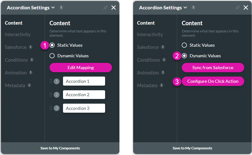
Content
Customize the content options and determine the values that appear in the Accordion container.

| # | Option | Function |
|---|---|---|
| 1 | Static Values – Edit Mapping | Use the Edit Mapping button to configure static values for the accordion tab names. |
| 2 | Dynamic Values – Sync from Salesforce | Use the Sync from Salesforce button to configure values from Salesforce. |
| 3 | Configure On Click Action | You can configure actions that will run when the user clicks on an accordion tab in the container. |
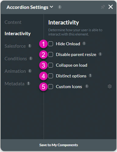
Interactivity
Customize the interactivity options and determine how your user can interact with the Accordion container.

| # | Option | Function |
|---|---|---|
| 1 | Hide Onload | Use the Hide Onload option to hide specific elements on load to control what the user sees. It allows you to hide an element when the page is loaded. |
| 2 | Disable Parent Size | The Disable Parent Resize option is available for most of the container elements. When added to the canvas, the container elements are automatically attached (snapped) to the strip or parent. Adjusting the container location on the strip resizes the strip accordingly. When the Disable Parent Resize option is on, the strip resizes independently from the parent. |
| 3 | Collapse On Load | Use this option to show all the accordion tabs collapsed upon loading. |
| 4 | Distinct Options | The Distinct Options option is available for several elements, such as button groups, drop-downs, radios, multi-selects, and checkboxes. Use this functionality to ensure that no duplicate options are available to the user. |
| 5 | Custom Icons | Choose from a variety of Custom Icons. This creates visual interest in your projects and can convey a purpose so users can easily understand and recognize the required information. |
Salesforce
Configure Integrations – Integrate data from Salesforce.
Conditions
Configure Conditions – Determine what will happen when your user interacts with this element.
Animation
Animation – This option allows you to add visual interest to your screen. Create the illusion of movement when the element shows on the screen. You can set the duration and delay to control the movement and preview by default.
Metadata
Metadata – See how this element is identified in the backend, such as its purpose, content, or function. Your users won’t see this.

