

ARIA Accessibility for Text Elements
Business Background
ARIA (Accessible Rich Internet Applications) accessibility refers to a set of specifications developed by the World Wide Web Consortium (W3C) to improve the accessibility of web content, especially dynamic content and user interface components.
Make sure that your project is compatible with assistive technologies, such as screen readers. ARIA is a set of attributes that can be added to HTML elements to provide additional information to assistive technologies, making web content more usable and understandable for users with various disabilities.
Titan Solution
With Titan Web, you can ensure that the project is ARIA-compatible. The screen reader ensures that the text content on a web page is properly interpreted and conveyed by assistive technologies. It looks at the following fields that you can configure:
- Role: Roles define the purpose or type of an element on a web page. For example, a text element’s role is to display text. Specifying roles helps assistive technologies understand the function of each element, making the user experience more accessible. Without proper roles, assistive technologies might not interpret elements correctly, leading to confusion for users with disabilities.
- ARIA Levels: ARIA provides attributes that can be added to HTML elements to define their roles, properties, and states. ARIA attributes help developers create more accessible web content by providing additional information to assistive technologies. ARIA levels, specifically, are used to define the hierarchical level of a text element in a structure, such as in a menu or a list. This information helps screen readers and other assistive technologies navigate and present content more effectively to users.
How to Guide
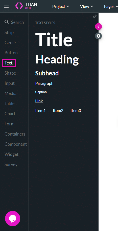
- On a Titan Web project, click the + icon to open the list of elements.
- Select the Text option and drag-and-drop an element to the canvas. The options are as follows:
- Title
- Heading
- Subheading
- Paragraph
- Caption
- Link
- Item List
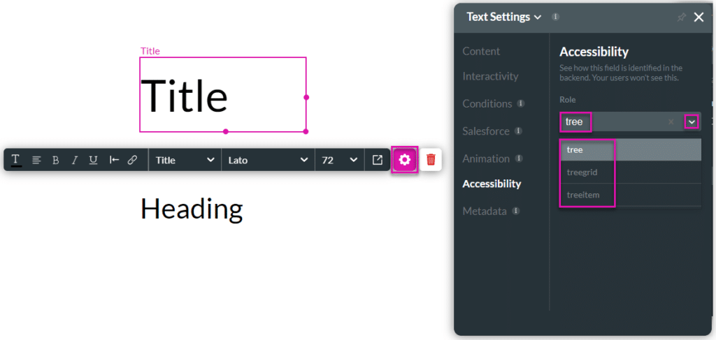
- Click the Text element’s Gear icon to open the Settings screen.
- Select the Accessibility option.
- Use the drop-down list to set the role of the element. The default option is Presentation.
- Click the drop-down arrow to open the list and select an option.
- Alternatively, type the word or part of a word in the field to search for an option and then click an option to select it.
The following options are available:
- Widget Roles: These roles define interactive components of the user interface.
- alert: A message with important, and usually time-sensitive, information.
- alertdialog: A type of dialog that contains an alert message, where the focus goes to the alert message.
- button: An input that allows for user-triggered actions.
- checkbox: A checkable input allowing one or more values to be selected.
- dialog: A dialog is a window overlaid on the main content.
- grid: A grid of cells, like a table.
- gridcell: A cell in a grid or a treegrid.
- link: An interactive reference to a resource.
- log: A type of live region where new information is added in a meaningful order.
- marquee: A type of live region where non-essential information changes frequently.
- menu: A widget that offers the user a list of choices.
- menubar: A menu presentation that is usually visible and typically presented horizontally.
- menuitem: An option in a set of choices contained by a menu or menubar.
- menuitemcheckbox: A checkable menuitem in a set of choices contained by a menu or menubar.
- menuitemradio: A checkable menuitem in a set of elements contained by a menu or menubar.
- option: A selectable item in a select list.
- progressbar: An element that displays the progress status for tasks.
- radio: A checkable input in a group of radio buttons.
- radiogroup: A group of radio buttons.
- scrollbar: A scroll bar.
- slider: A user input where the user selects a value from within a given range.
- spinbutton: A user input where the user can choose from a given range.
- status: A type of live region that contains advisory information for the user but is not important enough to be an alert.
- switch: A kind of checkbox that represents on/off values.
- tab: A navigational link in a tablist.
- table: A table of data.
- tablist: A list of tabs.
- tabpanel: A container for the resources associated with a tab.
- textbox: An input where the user can enter text.
- timer: A type of live region containing a numerical counter that indicates an amount of elapsed time from a start point or the time remaining until an end point.
- Widget Roles (continue):
- tooltip: A contextual pop-up that displays a description of an element.
- tree: A hierarchical list with groups that can be expanded and collapsed.
- treegrid: A grid whose rows can be expanded and collapsed.
- treeitem: An option in a hierarchical list.
- Document Structure Roles: These roles define the structure of a document or application.
- application: A region declared as a web application instead of a document.
- article: A section of content that forms an independent part of a document or site.
- banner: A region that contains a page’s prime heading or internal title.
- complementary: A supporting section of the document that is related to the main content.
- contentinfo: A region that contains information about the content, like a footer.
- document: A region containing related information that’s separate from the main content.
- feed: A scrollable list of articles or items.
- figure: A perceivable section of content, typically with a caption, referenced from the document’s main flow.
- form: A region containing a collection of items that together submit information to a service.
- main: The main content of a document.
- navigation: A collection of navigational links.
- region: A generic section of a web page.
- search: A region that allows the user to search the website or application’s content.
- Landmark Roles: These roles identify regions that are typically navigational.
- banner: A landmark that contains site-wide content.
- complementary: A landmark that is complementary to the main content.
- contentinfo: A landmark that provides information about the parent document.
- form: A landmark that contains a collection of items and objects that, as a whole, form a submission to a service.
- main: A landmark containing the main content of a document.
- navigation: A landmark that contains a collection of navigational links.
- region: A landmark that serves as a region within a document.
- search: A landmark that provides search functionality.
- Composite Roles: These roles define containers that manage other roles.
- combobox: A composite widget that combines a single-line textbox with a listbox.
- grid: A container for a collection of elements that form a grid.
- Composite Roles (continue):
- row: A row of cells in a grid.
- rowgroup: A group of rows within a grid.
- listbox: A widget that allows the user to select one or more items from a list.
- radiogroup: A group of radio buttons.
- tablist: A container for a set of tab elements.
- toolbar: A collection of commonly used function buttons or controls.
- Live Region Roles: These roles are used for page regions updating dynamically.
- alert: A message with important, time-sensitive information.
- log: A region where new information is added in a meaningful order.
- marquee: A type of live region with non-essential, frequently updated information.
- status: A live region with advisory information for the user.
- timer: A region containing a numerical counter that indicates the elapsed time from a start point or the time remaining until an endpoint.
- Window Roles: These roles are used for window-like components.
- alertdialog: A dialog with an alert message.
- dialog: A dialog is a window overlaid on the main content.
- Relationship Roles: These roles are used to define relationships between elements.
- group: A set of user interface objects that would not be included in a larger grouping element.
- note: A section whose content is parenthetic or ancillary to the main content.
- separator: A divider that separates and distinguishes sections of content or groups of menu items.
- presentation: An element whose implicit native role semantics will not be mapped to the accessibility API.
- Structural Roles: These roles define large-scale regions or structural elements.
- banner: A region at the top of the page that contains site-wide information.
- complementary: A supporting section of the document that is related to the main content.
- contentinfo: A region with information about the content, such as a footer.
- form: A landmark region that contains a collection of items and objects that, as a whole, form a submission to a service.
- main: The main content of a document.
- navigation: A landmark region with a collection of links for navigating the document or related documents.
- region: A generic landmark region.
- search: A landmark region that provides search functionality.
- Type the Aria Level in the field.
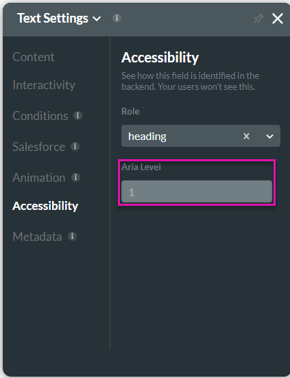
For instance:
ARIA Levels for Headings
The aria-level attribute can be applied to elements with the role=”heading” to define their hierarchical level in the document structure. Common levels include:
- aria-level=”1″: Represents the top-level heading, typically the main title or primary heading of a document or section.
- aria-level=”2″: Represents a second-level heading, usually a subheading under the main heading.
- aria-level=”3″: Represents a third-level heading, typically a sub-subheading.
- And so on. There is no upper limit to the aria-level value; it can be any positive integer that makes sense for the document’s structure.
ARIA Levels for Trees
The aria-level attribute is also used in tree structures, where it defines the depth of a treeitem within a tree. Examples include:
- aria-level=”1″: Represents the root level of the tree.
- aria-level=”2″: Represents the second level within the tree.
- aria-level=”3″: Represents the third level within the tree.