

Signature Settings
The signature attributes are configured using the Signature Settings screen.
The following options are available:
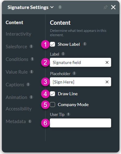
Content
Customize the content options and determine how other elements appear in the Signature element.
| # | Option | Function |
|---|---|---|
| 1 | Show Label | Labels give users more information about an element. You can choose to show or hide label fields. |
| 2 | Label | Add information to your various elements by adding Labels. Use the Labels option in Titan Web to easily track and map and identify elements. |
| 3 | Placeholder | Use Placeholder text to indicate to the user the information they should provide to gain quality data for your business needs |
| 4 | Draw Line | Use the Draw Line function to create a dotted line for users to sign on. |
| 5 | Company Mode | Use this option for documents that require a company or business signature. A company stamp validates official documents, such as contracts, certificates, deeds, etc. The company signature usually contains the company’s name and registration number and often includes the authorized person’s written signature above it. |
| 6 | User tip | Using user tips, you can add brief instructions or context to each input field. The user tip is displayed when users hover over the element. |
| 7 | Width (Only on Titan Survey) | Set the Width for various input fields |
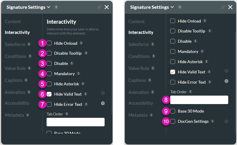
Interactivity
Customize the interactivity options and determine how your user can interact with the Signature element.
| # | Option | Function |
|---|---|---|
| 1 | Hide onload | Use the Hide Onload option to hide specific elements on load to control what the user sees. It allows you to hide an element when the page is loaded. |
| 2 | Disable Tooltip | Tooltips give information to the user; however, when they are not necessary for self-explanatory fields, they may make fields look cluttered. The Disable Tooltip will hide the tooltip. |
| 3 | Disable | When the Disable option is enabled, the user cannot interact with the element. |
| 4 | Mandatory | Use the Mandatory setting to mark various input fields as mandatory. The user will not be able to continue when a mandatory field is not complete. |
| 5 | Hide Asterisk | Use the Hide Asterisk option to hide the mandatory element indicator. |
| 6 | Hide Valid Text | Use the Hide Valid Text option to either show or hide the valid indicator on the element. You can configure an icon to indicate valid input. |
| 7 | Hide Error Text | Use the Hide Error Text option to either show or hide the error text on the element. You can configure an icon to indicate invalid input. |
| 8 | Tab Order | Use the Tab Order feature to set which fields will be active when the user presses the Tab key. This assists the visually impaired who need to navigate using the Tab key. |
| 9 | Base 30 Mode | Use the Base 30 Mode to store a signature in a Salesforce object using the Base 30 Format. This gives you the ability to re-use your signatures from Titan Sign and Document Generation projects. |
| 10 | DocGen Settings | Use DocGen Settings to design the layout of the interactive fields in your document. Control the setting for each field, such as dimensions, font, color, and the positioning of the interactive elements and margins. |
Salesforce
Configure Integrations – Integrate data from Salesforce.
Conditions
Configure Conditions – Determine what will happen when your user interacts with this element.
Value Rules
Value Rules – Use the Set Value Rules function to set the acceptable values for an input field. This can improve efficiency and accuracy when capturing information.
Captions
Captions – Use the Captions to provide instructions and context to users. There are different caption options available per element that will help guide the user.
Animation
Animation – This option allows you to add visual interest to your screen. Create the illusion of movement when the element shows on the screen. You can set the duration and delay to control the movement and preview by default.
Accessibility
Accessibility – Ensure people with disabilities can perceive, understand, navigate, and interact effectively with your websites.
Metadata
Metadata – See how this element is identified in the backend, such as its purpose, content, or function. Your users won’t see this.