Address Finder Settings
The address finder attributes are configured using the Address Finder Settings screen.
The following options are available:
Content
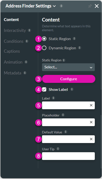
Customize the content options and determine how other elements appear in the address finder widget.

| # | Option | Function |
|---|---|---|
| 1 | Static Region | Configure a static region for the address finder widget. The returned results will only be from the selected region. |
| 2 | Dynamic Region | Configure a dynamic region for the address finder widget. The returned results will only be from the selected region. |
| 3 | Configure | Configure custom parameters for the address finder. |
| 4, 5 | Show label checkbox and Label | Use the Show Label checkbox if you want to include a label that adds extra information in the Label field. |
| 6 | Placeholder | Use the placeholder to indicate to the user the information they should provide so you can gain quality data. |
| 7 | Default Value | Use the Default Value to set a value that will automatically be shown. |
| 8 | User Tip | The user tip is displayed when users hover over the element, assisting the user in understanding how the data provided contributes to your business. |
Interactivity
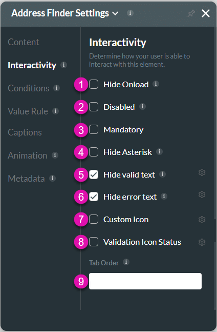
Customize the interactivity options and determine how your user can interact with the address finder widget.

| # | Option | Function |
|---|---|---|
| 1 | Hide onload | Use the Hide Onload option to hide specific elements on load to control what the user sees. It allows you to hide an element when the page is loaded. |
| 2 | Disable | When this option is enabled, the user cannot interact with the element. |
| 3 | Mandatory | Use the Mandatory setting to mark various input fields as mandatory. The user will not be able to continue when a mandatory field is not complete. |
| 4 | Hide Asterisk | Use the Hide Asterisk option to hide the mandatory element indicator. |
| 5 | Hide Valid Text | Use the Hide Valid Text option to either show or hide the valid indicator on the element. You can configure an icon to indicate valid input. |
| 6 | Hide Error Text | Use the Hide Error Text option to either show or hide the error text on the element. You can configure an icon to indicate invalid input. |
| 7 | Custom Icon | Choose from a variety of Custom Icons. This creates visual interest in your projects and can convey purpose so users can easily understand and recognize the information required. |
| 8 | Validation Icon Status | Configure icons to indicate valid or invalid input. |
| 9 | Tab Order | Use this feature to set which fields will be active when the user presses the Tab key. This assists the visually impaired who need to navigate using the Tab key. |
Conditions
Configure Conditions – Determine what will happen when your user interacts with this element.
Value Rule
Value Rules – Use the Set Value Rules function to set the acceptable values for an input field. This can improve efficiency and accuracy when capturing information.
Captions
Captions – Use the Captions to provide instructions and context to users. There are different caption options available per element that will help guide the user.
Animation
Animation – This option allows you to add visual interest to your screen. Create the illusion of movement when the element shows on the screen. You can set the duration and delay to control the movement and preview by default.
Metadata
Metadata – See how this element is identified in the backend, such as its purpose, content, or function. Your users won’t see this.

