

Validation Icon Status
Business Background
With Titan, you can enhance the user experience by verifying whether input fields contain valid or invalid content. You can configure icons to indicate whether input is valid or invalid. This option is available for input elements.
How to Guide
- Click the + icon to open the list of elements.
- Select the Input option from the list.
- In this example, an email element is used.
- Click-and-drag the Email element to the canvas.
- Click the Email settings Gear icon. The Email setting screen opens.
- Select the Interactivity option from the list.
- Click the Validation Icon Status checkbox.
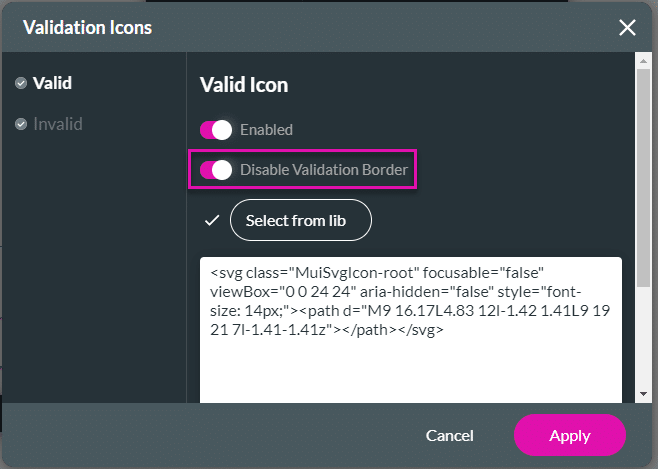
- Click the Validation Icon Status Gear icon. The Validation Icon screen opens.

- Do the following:
Enable Icons
- Select the Valid option and use the toggle switch to enable the Valid Icon.
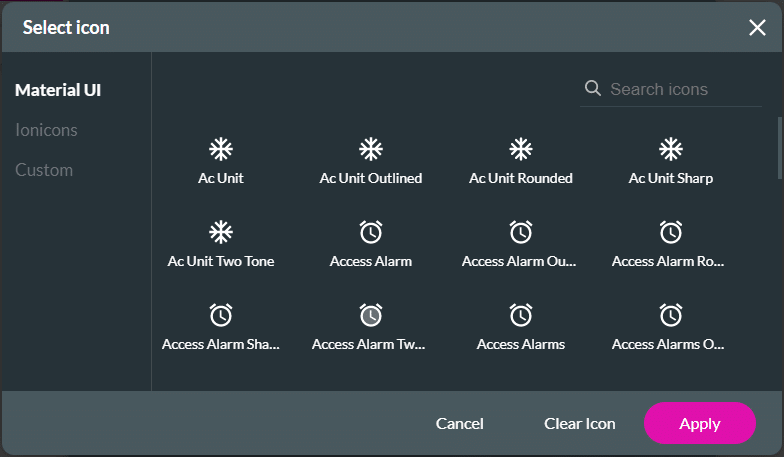
- Click the Select from Library button. The Select icon screen opens.

- Configure any icons for valid input.
- Select the Invalid option and use the toggle switch to enable the Invalid Icon.
- Click the Select from Library button. The Select icon screen opens.
- Configure any icons for invalid input.
Disable Validation Border
- Use the toggle switch to disable the validation border for the valid option.
- Use the toggle switch to disable the validation border for the invalid option.
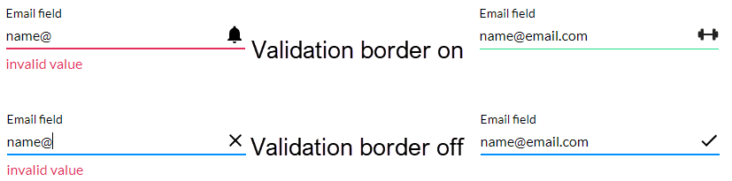
When the validation border is on, the element’s line changes color for valid and invalid input. The default line color is red for invalid input and green for valid input
Hidden Title
Was this information helpful?
Let us know so we can improve!
Need more help?
Book Demo