Do you like this
feature?
If you like this feature and want to transform your business with Titan's zero code applications for Salesforce, then schedule a demo today!
Slider Settings
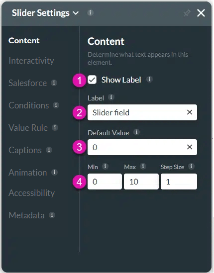
The slider attributes are configured using the Slider Settings screen.
The following options are available:
Content
Customize the content options and determine how other elements appear in the slider element.

| # | Option | Function |
|---|---|---|
| 1, 2 | Show label checkbox and Label | Use the Show Label checkbox if you want to include a label that adds extra information in the Label field. |
| 3 | Default value | Use the Default Value to set a value that will automatically be shown. |
| 4 | Min/Max/Step Size | Set the minimum, maximum, and step values for various elements in Titan Web. |
Interactivity
Customize the interactivity options and determine how your user can interact with the slider element.

| # | Option | Function |
|---|---|---|
| 1 | Hide onload | Use the Hide Onload option to hide specific elements on load to control what the user sees. It allows you to hide an element when the page is loaded. |
| 2 | Disable | When this option is enabled, the user cannot interact with the element. |
| 3 | Display Value Label | Use the Display Value Label setting to show or hide the minimum and maximum values on the Slider element after the user’s selection. |
| 4 | Show Ticks | Use Show Ticks to demonstrate the place of every value. Min, Max, and Step Size affect the number of ticks. |
| 5 | Active Line | Use the Active Line option to highlight the progress using a line on the slider. |
| 6 | Hide Valid Text | Use the Hide Valid Text option to either show or hide the valid indicator on the element. You can configure an icon to indicate valid input. |
| 7 | Hide Error Text | Use the Hide Error Text option to either show or hide the error text on the element. You can configure an icon to indicate invalid input. |
| 8 | Tab Order | Use this feature to set which fields will be active when the user presses the Tab key. This assists the visually impaired who need to navigate using the Tab key. |
| 9 | Fixed Label | Use the Fixed Label setting to ensure your longform content always displays to users |
| 10 | DocGen Settings | Use DocGen Settings to design the layout of the interactive fields in your document. Control the setting for each field, such as dimensions, font, color, and the positioning of the interactive elements and margins. |
Salesforce
Configure Integrations – Integrate data from Salesforce.
Conditions
Configure Conditions – Determine what will happen when your user interacts with this element.
Value Rules
Value Rules – Use the Set Value Rules function to set the acceptable values for an input field. This can improve efficiency and accuracy when capturing information.
Captions
Captions – Use the Captions to provide instructions and context to users. There are different caption options available per element that will help guide the user.
Animation
Animation – This option allows you to add visual interest to your screen. Create the illusion of movement when the element shows on the screen. You can set the duration and delay to control the movement and preview by default.
Accessibility
Accessibility – Ensure people with disabilities can perceive, understand, navigate, and interact effectively with your websites.
Metadata
Metadata – See how this element is identified in the backend, such as its purpose, content, or function. Your users won’t see this.

