Matrix Settings
The matrix attributes are configured using the Matrix Settings screen.
The following options are available:
Content
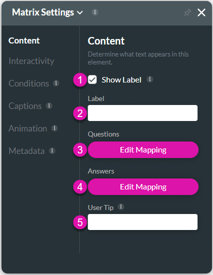
Customize the content options and determine how other elements appear in the matrix survey element.

Content settings screen
| # | Option | Function |
|---|---|---|
| 1, 2 | Show label checkbox and Label | Use the Show Label checkbox if you want to include a label that adds extra information in the Label field. |
| 3 | Questions- Edit Mapping | Configure Questions on the matrix survey element that syncs directly with Salesforce. |
| 4 | Answers – Edit Mapping | Users can select their answers from a list provided, and the information syncs directly with Salesforce data. |
| 5 | User Tip | The user tip is displayed when users hover over the element, assisting the user in understanding how the data provided contributes to your business. |
Interactivity
Customize the interactivity options and determine how your user can interact with the matrix survey element.

| # | Option | Function |
|---|---|---|
| 1 | Hide onload | Use the Hide Onload option to hide specific elements on load to control what the user sees. It allows you to hide an element when the page is loaded. |
| 2 | Shuffle Answers | Shuffle the options in the element each time the page is opened or refreshed. If this option is disabled, the element will display the options in the same order every time. |
| 3 | Card Mode | Use the card option to organize and design your information in an easy-to-understand format. This assists users with mobile devices when there is insufficient width to display all the elements. |
| 4 | Disable | When the Disable option is enabled, the user cannot interact with the element. |
| 5 | Mandatory | Use the Mandatory setting to mark various input fields as mandatory. The user will not be able to continue when a mandatory field is not complete. |
| 6 | Hide Asterisk | Use the Hide Asterisk option to hide the indicator on a mandatory element. The Hide Asterisk option is available for different elements. |
| 7 | Hide Valid Text | Use the Hide Valid Text option to either show or hide the valid indicator on the element. You can configure an icon to indicate valid input. |
| 8 | Hide Error Text | Use the Hide Error Text option to either show or hide the error text on the element. You can configure an icon to indicate invalid input. |
| 9 | Tab Order | The Tab Order option is available for different elements, such as the Date Range, Email, or Number field. Use this feature to set which fields will be active when the user presses the Tab key. This assists the visually impaired who need to navigate using the Tab key. |
Conditions
Configure Conditions – Determine what will happen when your user interacts with this element.
Captions
Captions – Use the Captions to provide instructions and context to users. There are different caption options available per element that will help guide the user.
Animation
Animation – This option allows you to add visual interest to your screen. Create the illusion of movement when the element shows on the screen. You can set the duration and delay to control the movement and preview by default.
Metadata
Metadata – See how this element is identified in the backend, such as its purpose, content, or function. Your users won’t see this.

