Shape Settings
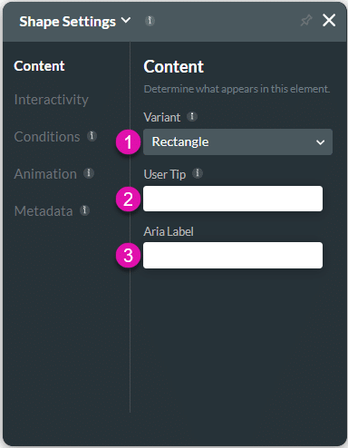
The shape attributes are configured using the Shape Settings screen.
The following options are available:
Content
Customize the content options and determine how shape elements appear.

| # | Option | Function |
|---|---|---|
| 1 | Variant | The Variant option is available for the Shape element. The variant determines what the shape will look like. This is a quick way to change a shape that is already on the canvas instead of dragging a new shape to the project. |
| 2 | User Tip | This option adds meaning to your various elements by typing in the Aria Label field. The screen reader will start reading the text. This option is suitable for screen readers. |
| 3 | Aria Label | You can use this option to add meaning to your various elements by typing in the Aria Label field. The screen reader will start reading the text. This option is suitable for screen-reader users. |
Interactivity
Customize the interactivity options and determine how your user can interact with the Shape element.

| # | Option | Function |
|---|---|---|
| 1 | Hide Onload | You can use the Hide Onload option to hide specific elements on load to control what the user sees. This option allows the user to hide an effect element. For instance, the user will not see the shape when this option is selected. The Hide Onload option is available for different types of elements. |
| 2 | Disable | This option allows the user to view only, and they will not be able to type any text in this field. The Disable option is similar to the read-only option. |
| 3 | Confirmation | This option can display a custom modal to the user when they hover over the shape. You can set an Action Flow that will display when the user hovers on the Icon. The Hover Modal is available for the buttons, shapes, images, text, etc. |
| 4 | Hover Modal | This option can display a custom modal to the user when they hover over shape. You can set an Action Flow that will display when the user hovers on the Icon. The Hover Modal is available for the buttons, shapes, images, text, etc. |
| 5 | Configure On Click Action | You can use this option to build a process that will be triggered when the shape is selected. The On Click Actions option is available for multiple elements, such as text, buttons, shapes, images, and more. |
Conditions
Configure Conditions – Determine what will happen when your user interacts with this element.
Animation
Animation – This option allows you to add visual interest to your screen. Create the illusion of movement when the element shows on the screen. You can set the duration and delay to control the movement and preview by default.
Metadata
Metadata – See how this element is identified in the backend, such as its purpose, content, or function. Your users won’t see this.
Hidden Title
Was this information helpful?
Let us know so we can improve!
Need more help?
Book Demo

