

Profile Styling
Customize the look and feel of your Profile screen to complement your brand and business needs. Visit the SmartV Profile page for more information on configuring the SmartV Profile screen. This element can be edited on both the Project Style Level and Element Style Level.
The Profile page has two major elements:
Main
The SmartV Profile’s main screen has several different aspects that you can style in numerous ways, for instance, changing the font (family, color, or size), adding borders, or changing colors and margins.
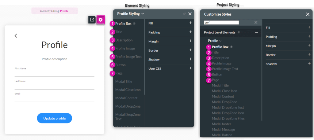
| # | Option | Function |
|---|---|---|
| 1 | Profile Box | This option allows you to style the rectangle container that holds all of the content on the login page. Set a background color or image, add padding or margin, change the border, etc. |
| 2 | Title | Title properties allow you to style the name of the element. For example, its font type, font size, and color. |
| 3 | Description | The description properties allow you to control the style of the descriptive text under the title. For example, its font type, font size, and color. |
| 4 | Profile Image | Change the styling of the Profile Image that you added. |
| 5 | Profile Image Text | Change the styling of the Profile Text that that the user will see when they hover on the profile image. |
| 6 | Button | This option allows you to style the Submit button. You can set different styles to for the different button states: Default, Hover and Clicked. |
| 7 | Page | When you select the input field on the login canvas, it enables you to set the style for the various inputs, for instance, primary color, labels, etc. It also enables you to set styles for the Date field modal when used in the login box. |
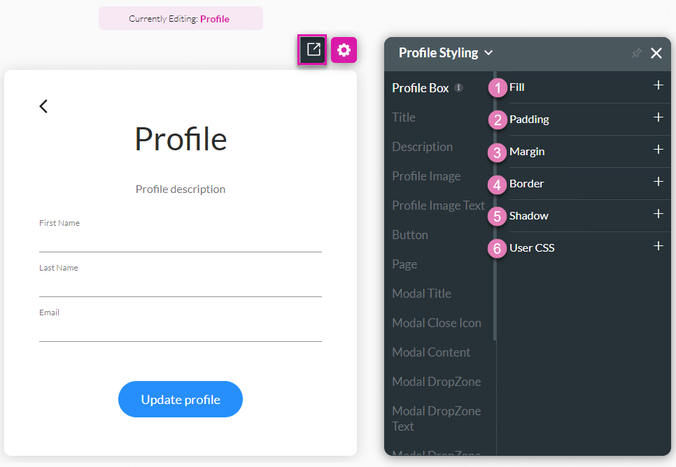
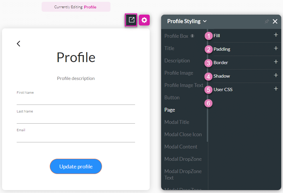
1. Profile Box
The Profile Boox option allows you to style the rectangle container that holds all the content on the profile page. Set a back color or image, add padding or margin, change the border, etc.
| # | Option | Function |
|---|---|---|
| 1 | Fill | The fill option allows you to add color to the element’s content or shape. Select a color fill from the color palette. |
| 2 | Padding | You can style the padding of an element by controlling the text’s distance from the borders of the element. |
| 3 | Margin | Margin allows you to set the size of the outer space of an element. It also allows you to add space between the label and the adjacent element parts. |
| 4 | Border | Use the border properties to create an outline of an element. You can change the entire border or each side separately. |
| 5 | Shadow | You can style the shadow of an element to complement your brand. |
| 6 | User CSS | Cascading Style Sheets (CSS) are a simple mechanism used to add style to elements. You can easily change the element background, font color, or font type using syntax. |
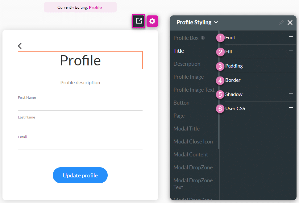
2. Title
Title properties allow you to style the main title of the profile box.
| # | Option | Function |
|---|---|---|
| 1 | Font | The fill option allows you to add color to the element’s content or shape. Select a color fill from the color palette. |
| 2 | Fill | The fill option allows you to add color to the content or the shape of the element. Select a color fill from the color palette. |
| 3 | Padding | You can style the padding of an element by controlling the text’s distance from the borders of the element. |
| 4 | Border | You can style the padding of an element by controlling the text’s distance from the borders of the element. |
| 5 | Shadow | You can style the shadow of an element to complement your brand. |
| 6 | User CSS | Cascading Style Sheets (CSS) are a simple mechanism used to add style to elements. You can easily change the element background, font color, or font type using syntax. |
3. Description
The description properties allow you to control the style of the descriptive text under the title. For example, its font type, font size, and color.

| # | Option | Function |
|---|---|---|
| 1 | Font | The font allows you to change the style of the typography, for instance, font family, weight, color, and size. |
| 2 | Fill | The fill option allows you to add color to the element’s content or shape. Select a color fill from the color palette. |
| 3 | Padding | You can style the padding of an element by controlling the text’s distance from the borders of the element. |
| 4 | Margin | Margin allows you to set the size of the outer space of an element. It also allows you to add space between the label and the adjacent element parts. |
| 5 | Border | Use the border properties to create an outline of an element. You can change the entire border or each side separately. |
| 6 | Shadow | You can style the shadow of an element to complement your brand. |
| 7 | User CSS | Cascading Style Sheets (CSS) are a simple mechanism used to add style to elements. You can easily change the element background, font color, or font type using syntax. |
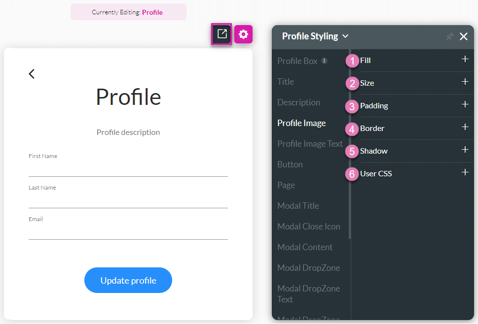
4. Profile Image
Use this option to change the styling of the Profile Image that you added.
| # | Option | Function |
|---|---|---|
| 1 | Font | The fill option allows you to add color to the element’s content or shape. Select a color fill from the color palette. |
| 2 | Fill | The fill option allows you to add color to the content or the shape of the element. Select a color fill from the color palette. |
| 3 | Padding | You can style the padding of an element by controlling the text’s distance from the borders of the element. |
| 4 | Border | You can style the padding of an element by controlling the text’s distance from the borders of the element. |
| 5 | Shadow | You can style the shadow of an element to complement your brand. |
| 6 | User CSS | Cascading Style Sheets (CSS) are a simple mechanism used to add style to elements. You can easily change the element background, font color, or font type using syntax. |
5. Profile Text
Change the styling of the Profile Text that the user will see when they hover over the profile image.

| # | Option | Function |
|---|---|---|
| 1 | Font | The font allows you to change the style of the typography, for instance, font family, weight, color, and size. |
| 2 | Fill | The fill option allows you to add color to the element’s content or shape. Select a color fill from the color palette. |
| 3 | Size | This option allows you to change the width and height of the button. |
| 4 | Padding | You can style the padding of an element by controlling the text’s distance from the borders of the element. |
| 5 | Margin | Margin allows you to set the size of the outer space of an element. It also allows you to add space between the label and the adjacent element parts. |
| 6 | Border | Use the border properties to create an outline of an element. You can change the entire border or each side separately. |
| 7 | Shadow | You can style the shadow of an element to complement your brand. |
| 8 | User CSS | Cascading Style Sheets (CSS) are a simple mechanism used to add style to elements. You can easily change the element background, font color, or font type using syntax. |
6. Button
This option allows you to style the Continue button. You can set different styles for the different button states: Default, Hover and Clicked. Learn more about the tree button states here.

| # | Option | Function |
|---|---|---|
| 1 | Font | The font allows you to change the style of the typography, for instance, font family, weight, color, and size. |
| 2 | Fill | The fill option allows you to add color to the element’s content or shape. Select a color fill from the color palette. |
| 3 | Size | This option allows you to change the width and height of the button. |
| 4 | Padding | You can style the padding of an element by controlling the text’s distance from the borders of the element. |
| 5 | Margin | Margin allows you to set the size of the outer space of an element. It also allows you to add space between the label and the adjacent element parts. |
| 6 | Border | Use the border properties to create an outline of an element. You can change the entire border or each side separately. |
| 7 | Shadow | You can style the shadow of an element to complement your brand. |
| 8 | User CSS | Cascading Style Sheets (CSS) are a simple mechanism used to add style to elements. You can easily change the element background, font color, or font type using syntax. |
7. Page
This refers to the entire browser real estate that resides under the login box. It allows you to set a background, padding, border, etc.
| # | Option | Function |
|---|---|---|
| 1 | Fill | The fill option allows you to add color to the element’s content or shape. Select a color fill from the color palette. |
| 2 | Padding | You can style the padding of an element by controlling the text’s distance from the borders of the element. |
| 3 | Border | Use the border properties to create an outline of an element. You can change the entire border or each side separately. |
| 4 | Shadow | You can style the shadow of an element to complement your brand. |
| 5 | User CSS | Cascading Style Sheets (CSS) are a simple mechanism used to add style to elements. You can easily change the element background, font color, or font type using syntax. |
Modal
The SmartV Profile’s modal has several different aspects that you can style in numerous ways, for instance, changing the font (family, color, or size), adding borders, or changing colors and margins.
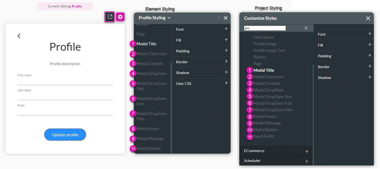
| # | Option | Function |
|---|---|---|
| 1 | Modal Title | The Modal Title option is used to change the styling of the modal’s Title, for instance, “Update profile image.” |
| 2 | Modal Close Icon | Change the styling of the modal’s close icon “X.” |
| 3 | Modal Content | Use this option to style of the modal’s Content. |
| 4 | Modal DropZone | Change the styling of the modal’s DropZone. This is the box where the user can click to drop or upload an image. |
| 5 | Modal DropZone Text | Change the styling of the modal’s DropZone Text, for instance, “Drag and drop a file here or click.” |
| 6 | Modal DropZone Icon | Change the styling of the modal’s DropZone Icon. |
| 7 | Modal DropZone Files | Use this option to change the styling of the modal’s DropZone Files message, for instance, “No files.” |
| 8 | Modal Footer | Change the styling of the modal’s Footer, for instance, “Use a picture up to 200×200 px.” |
| 9 | Modal Message | Style the modal’s Message, for instance, “Profile image updated.” |
| 10 | Modal Button | Use the Modal Button option to change the styling of the modal’s Buttons, for instance, “Update” and “Cancel.” |
| 11 | Input Fields | When you select the input field on the login canvas, it enables you to set the style for the various inputs for instance, primary color, labels, etc. It also enables you to set styles for the Date field modal when used in the login box. |
1. Modal Title
Change the styling of the modal’s Title, for instance, “Update profile image.”
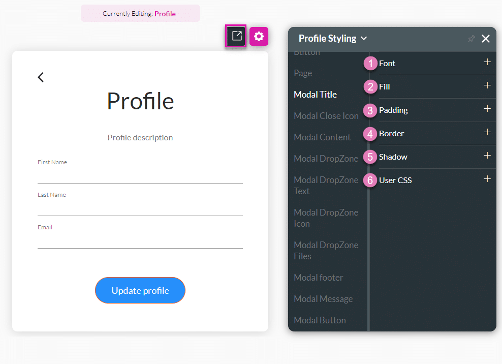
| # | Option | Function |
|---|---|---|
| 1 | Fill | The fill option allows you to add color to the element’s content or shape. Select a color fill from the color palette. |
| 2 | Padding | You can style the padding of an element by controlling the text’s distance from the borders of the element. |
| 3 | Margin | Margin allows you to set the size of the outer space of an element. It also allows you to add space between the label and the adjacent element parts. |
| 4 | Border | Use the border properties to create an outline of an element. You can change the entire border or each side separately. |
| 5 | Shadow | You can style the shadow of an element to complement your brand. |
| 6 | User CSS | Cascading Style Sheets (CSS) are a simple mechanism used to add style to elements. You can easily change the element background, font color, or font type using syntax. |
2. Modal Close Icon
Change the styling of the modal’s close icon “X.”

| # | Option | Function |
|---|---|---|
| 1 | Color | Change the color of the icon. |
| 2 | Stroke | Use this option to change the color of the stroke. |
| 3 | Fill | You can style the padding of an element by controlling the text’s distance from the borders of the element. |
| 4 | Size | This option allows you to change the width and height of the icon. |
| 5 | Margin | Margin allows you to set the size of the outer space of an element. It also allows you to add space between the label and the adjacent element parts. |
| 6 | Border | Use the border properties to create an outline of an element. You can change the entire border or each side separately. |
| 7 | User CSS | Cascading Style Sheets (CSS) are a simple mechanism used to add style to elements. You can easily change the element background, font color, or font type using syntax. |
3. Modal Content
Change the styling of the modal’s Content.

| # | Option | Function |
|---|---|---|
| 1 | Fill | The fill option allows you to add color to the element’s content or shape. Select a color fill from the color palette. |
| 2 | Padding | You can style the padding of an element by controlling the text’s distance from the borders of the element. |
| 3 | Border | Use the border properties to create an outline of an element. You can change the entire border or each side separately. |
| 4 | Shadow | You can style the shadow of an element to complement your brand. |
| 5 | User CSS | Cascading Style Sheets (CSS) are a simple mechanism used to add style to elements. You can easily change the element background, font color, or font type using syntax. |
4. Modal DropZone
Change the styling of the modal’s DropZone. This is the box where the user can click to drop or upload an image.
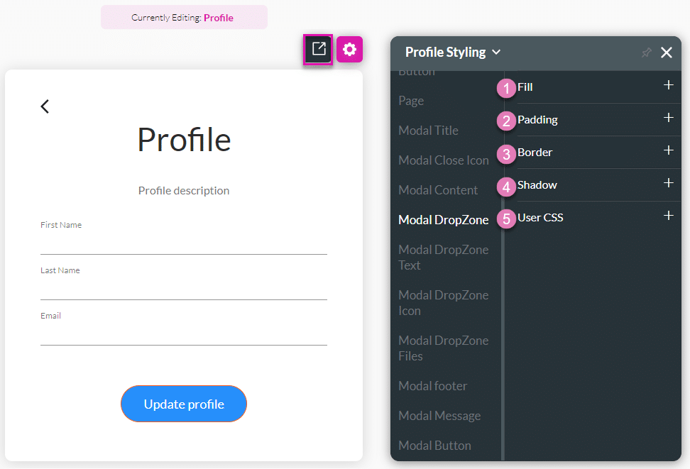
| # | Option | Function |
|---|---|---|
| 1 | Fill | The fill option allows you to add color to the element’s content or shape. Select a color fill from the color palette. |
| 2 | Padding | You can style the padding of an element by controlling the text’s distance from the borders of the element. |
| 3 | Border | Use the border properties to create an outline of an element. You can change the entire border or each side separately. |
| 4 | Shadow | You can style the shadow of an element to complement your brand. |
| 5 | User CSS | Cascading Style Sheets (CSS) are a simple mechanism used to add style to elements. You can easily change the element background, font color, or font type using syntax. |
5. Modal DropZone Text
Change the styling of the modal’s DropZone Text, for instance, “Drag and drop a file here or click.”

| # | Option | Function |
|---|---|---|
| 1 | Font | The font allows you to change the style of the typography, for instance, font family, weight, color, and size. |
| 2 | Fill | The fill option allows you to add color to the element’s content or shape. Select a color fill from the color palette. |
| 3 | Padding | You can style the padding of an element by controlling the text’s distance from the borders of the element. |
| 4 | Margin | Margin allows you to set the size of the outer space of an element. It also allows you to add space between the label and the adjacent element parts. |
| 5 | Border | Use the border properties to create an outline of an element. You can change the entire border or each side separately. |
| 6 | Shadow | You can style the shadow of an element to complement your brand. |
| 7 | User CSS | Cascading Style Sheets (CSS) are a simple mechanism used to add style to elements. You can easily change the element background, font color, or font type using syntax. |
6. Modal DropZone Icon
Change the styling of the modal’s DropZone Icon.
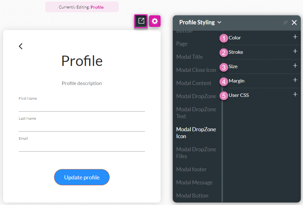
| # | Option | Function |
|---|---|---|
| 1 | Color | Change the color of the icon. |
| 2 | Stroke | Use this option to change the color of the stroke. |
| 3 | Size | This option allows you to change the width and height of the icon. |
| 4 | Margin | Margin allows you to set the size of the outer space of an element. It also allows you to add space between the label and the adjacent element parts. |
| 5 | User CSS | Cascading Style Sheets (CSS) are a simple mechanism used to add style to elements. You can easily change the element background, font color, or font type using syntax. |
7. Modal DropZone Files
Change the styling of the modal’s DropZone Files message, for instance, “No files.”

| # | Option | Function |
|---|---|---|
| 1 | Font | The font allows you to change the style of the typography, for instance, font family, weight, color, and size. |
| 2 | Fill | The fill option allows you to add color to the element’s content or shape. Select a color fill from the color palette. |
| 3 | Padding | You can style the padding of an element by controlling the text’s distance from the borders of the element. |
| 4 | Border | Use the border properties to create an outline of an element. You can change the entire border or each side separately. |
| 5 | Shadow | You can style the shadow of an element to complement your brand. |
| 6 | User CSS | Cascading Style Sheets (CSS) are a simple mechanism used to add style to elements. You can easily change the element background, font color, or font type using syntax. |
8. Modal Footer
Change the styling of the modal’s Footer, for instance, “Use a picture up to 200×200 px.”

| # | Option | Function |
|---|---|---|
| 1 | Fill | The fill option allows you to add color to the element’s content or shape. Select a color fill from the color palette. |
| 2 | Padding | You can style the padding of an element by controlling the text’s distance from the borders of the element. |
| 3 | Border | Use the border properties to create an outline of an element. You can change the entire border or each side separately. |
| 4 | Shadow | You can style the shadow of an element to complement your brand. |
| 5 | User CSS | Cascading Style Sheets (CSS) are a simple mechanism used to add style to elements. You can easily change the element background, font color, or font type using syntax. |
9. Modal Message
Change the styling of the modal’s Message, for instance, “Profile image updated.”
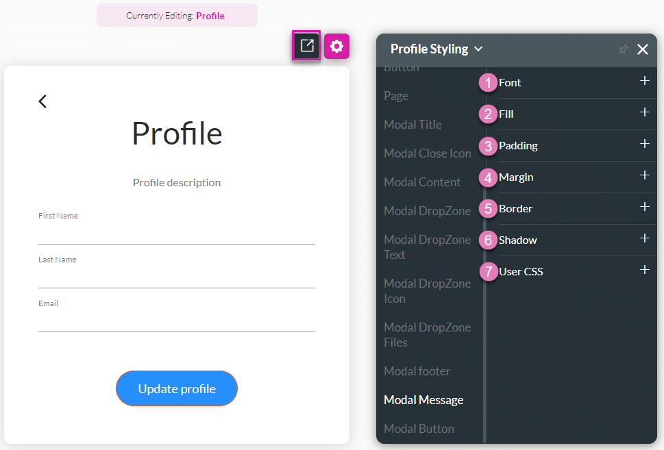
| # | Option | Function |
|---|---|---|
| 1 | Font | The font allows you to change the style of the typography, for instance, font family, weight, color, and size. |
| 2 | Fill | The fill option allows you to add color to the element’s content or shape. Select a color fill from the color palette. |
| 3 | Padding | You can style the padding of an element by controlling the text’s distance from the borders of the element. |
| 4 | Margin | Margin allows you to set the size of the outer space of an element. It also allows you to add space between the label and the adjacent element parts. |
| 5 | Border | Use the border properties to create an outline of an element. You can change the entire border or each side separately. |
| 6 | Shadow | You can style the shadow of an element to complement your brand. |
| 7 | User CSS | Cascading Style Sheets (CSS) are a simple mechanism used to add style to elements. You can easily change the element background, font color, or font type using syntax. |
10. Modal Button
Change the styling of the modal’s Buttons, for instance, “Update” and “Cancel.”
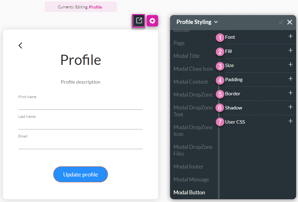
| # | Option | Function |
|---|---|---|
| 1 | Font | The font allows you to change the style of the typography, for instance, font family, weight, color, and size. |
| 2 | Fill | The fill option allows you to add color to the element’s content or shape. Select a color fill from the color palette. |
| 3 | Size | This option allows you to change the width and height of the button. |
| 4 | Padding | You can style the padding of an element by controlling the text’s distance from the borders of the element. |
| 5 | Border | Use the border properties to create an outline of an element. You can change the entire border or each side separately. |
| 6 | Shadow | You can style the shadow of an element to complement your brand. |
| 7 | User CSS | Cascading Style Sheets (CSS) are a simple mechanism used to add style to elements. You can easily change the element background, font color, or font type using syntax. |
11. Input Fields
When you select the input field on the login box, it enables you to set the style for the various inputs’ primary color, labels, etc. It also enables you to set styles for the Date field modal when used in the login box. Use the Input Variant to choose the general look of the input from the five existing variants.
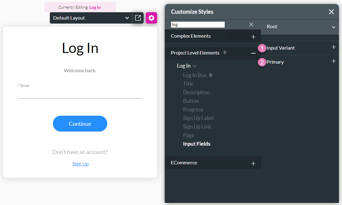
| # | Option | Function |
|---|---|---|
| 1 | Input Variant | Configure the TextField Varient and the Size Variant. |
| 2 | Primary | The primary properties allow you to change the element’s primary color. |
Use the Captions option to change the wording of the following:
- Title
- Description
- Modal Title
- ModalDropZoneText
- ModalDropZoneFiles
- Modal Message