

Style Input Variants
Business Background
Style the input variants using Titan Web.
Titan Solution
- The Input Variant option is available for project styling.
- The Input Variant option allows you to change the element’s look and inherit styles from elements except for their size. You can use the primary properties to change the element color and the size to adjust the width and height.
How to Guide
Note:
Prerequisite:
Add an input element to the canvas.
- Open the Project drop-down list.
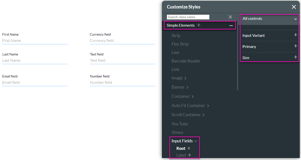
- Select the Style option and click the Configure sub-option. The Customize Styles screen opens.

- Expand the Simple Elements option. A drop-down list opens.
- Scroll down and select the Input Fields option.

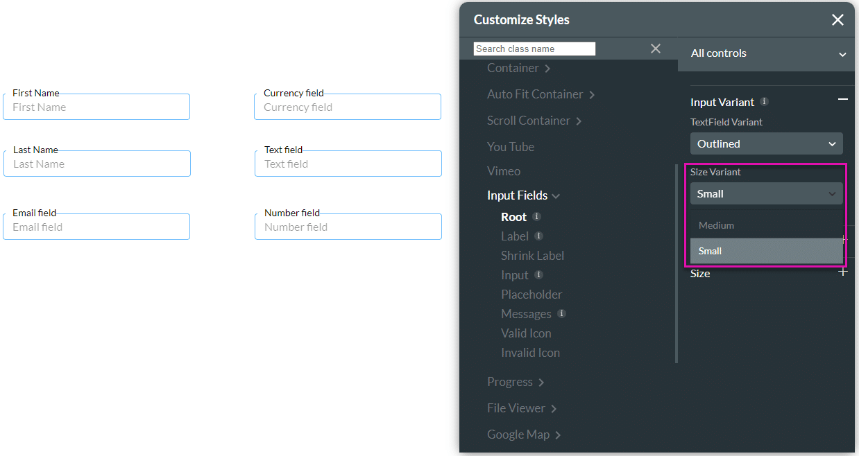
- Open the Text Field Variant drop-down list and choose the following style options:
- Standard: This is the default, minimalist option with an underline only. There’s no border or background—just a bottom line that becomes active when the user clicks or types.
- Filled: The text field has a solid background fill, often in light gray or theme color.
- Outline: The text field has a visible border around it, usually rounded or squared.
- Fixed: The text field’s label position is fixed (it doesn’t float or move when the user types).
- Classic: The text field has a more traditional form style, similar to legacy or older UI systems.

- Use the Size Variant drop-down list to adjust the height of the element.
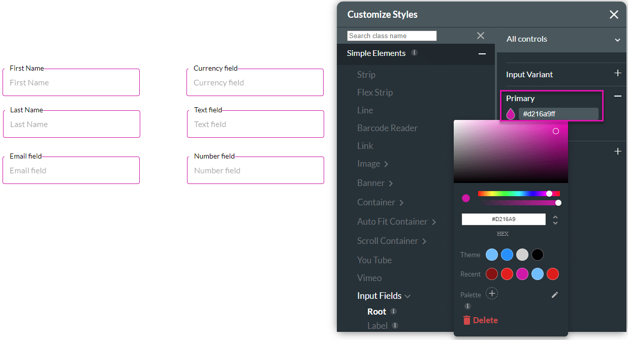
- Click the Primary option to change the color of the element.
- Use the Size option to adjust the element’s width or height.
- Click the Advanced option to adjust the following:
- Click the Auto-resize height checkbox to remove unnecessary spacing between the element’s height when working with multiple elements. You can use this option to auto-fit your content.
- Click the Auto-resize width checkbox to remove unnecessary spacing on the width of the element; for instance, when you drag the Title element to the canvas, there is an extra space after the text. You can use this option to auto-fit your content.
- You can manually adjust the minimum and maximum height and width sizes.

Hidden Title
Was this information helpful?
Let us know so we can improve!
Need more help?
Book Demo