

Project Styling
What is Project Styling?
The Project style is designed to store all of the base styles used in your Titan project. It contains the style of each and every group type (e.g., all input fields or all buttons) or single element type (e.g., a numeric input field, an image, or a power table) and is applied to the entire project and affects it as a whole.
The Project Styling panel is divided into 5 groups:
- Simple elements, such as a line or input elements.
- Complex elements, such as a table or a gallery carousel.
- Project-level elements, such as a page, header, or confirmation modal.
- ECommerce, such as the catalog or product dialog.
- Scheduler, such as the meeting types or profiles.
Once you set a style for an element through the Project style panel, it will automatically be applied to all elements of the same type in this project. For example, if you set a style for your email input field (making the label font color blue), then all email elements in this project, or those added to it after, will get the same style (and have a blue label).
Project-level styling saves time by avoiding repetitive configurations and enables you to create a unified look and feel for your project, with elements appearing the same across the project.
It is important to understand that the Project style is not the only style available in Titan. We also provide Element-level styling, which allows you to change the styling in specific elements. The Project-level style and Element-level style can override one another. When setting styles, they can be used together to create your final design.
Keep in mind that Project style and Element style override one another, so no matter what style configurations you already have for your element, the last style applied to it will always override the previous one.
When should I use it?
It is recommended that you start your project design by setting its base styles at the Project level. We suggest going over all of the elements you will be using in the project and setting the common characteristics from here. After this, if you have elements that require personalized styling, we suggest selecting them and using the Element style to override the base style. Read more on how to use the Element style.
How to Guide
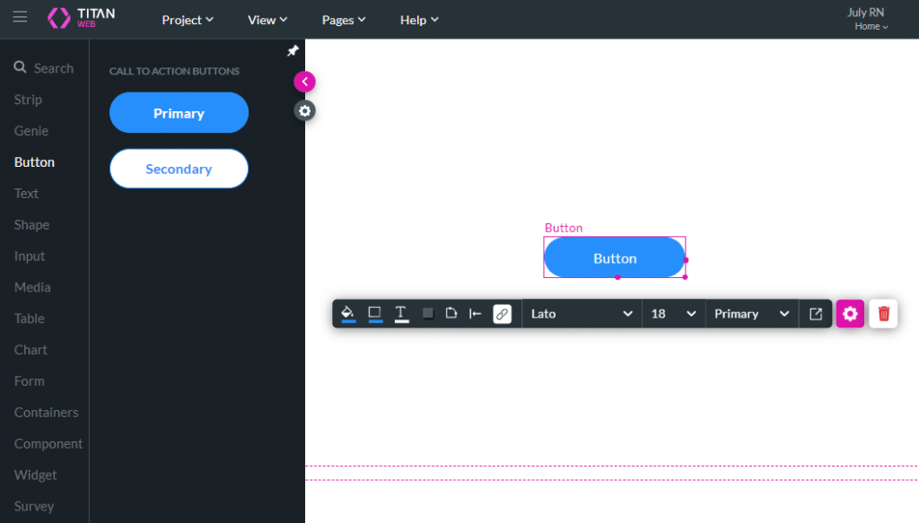
In the “How to Guide” below, the button element is simply used as an example. You can configure Project styling for any element group type or single element type.
- Click the + icon to open the element list.
- Click-and-drag any element to the canvas. In this example, the primary button element was dragged to the canvas.
2. Click Project > Style > Configure. This will open the Customize Styles panel.
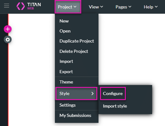
Configure style
Once the element is selected on the canvas, the panel focus will skip and display its relevant properties, in this case, the button styles. Another way to navigate the Customize Styles panel is to use the Search field at the top.
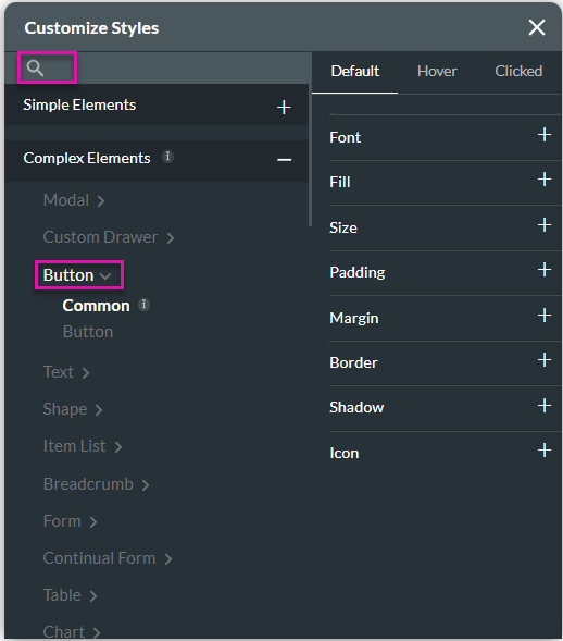
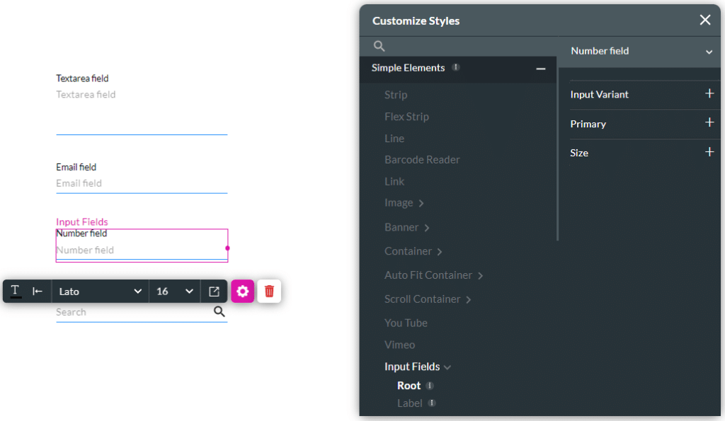
Please note that some elements belong to a group while others are individual elements. When you select an element that belongs to a group, you will be able to set the styles for the group as a whole, as well as for a specific element in it.
For example, when the input element is selected on canvas, the panel will automatically focus on its group (All controls) allowing you to set common styles that will apply to all of the inputs in this group.
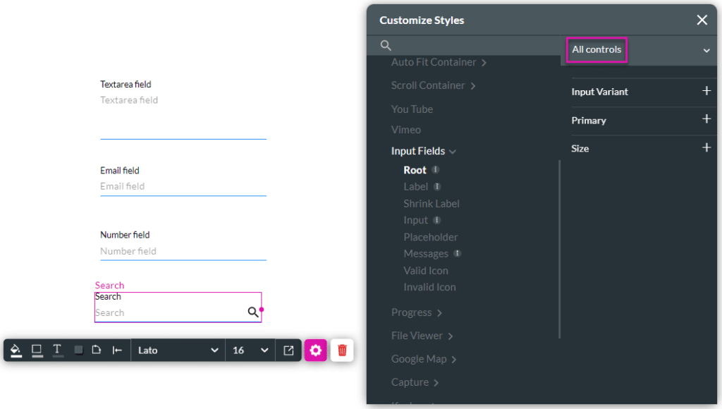
If you then wish to apply a certain style to a specific type of input, for example the text input, you will be able to do that by selecting this element from the dropdown on the right before you set the styles.
The Common option in the panel will be highlighted by default, and any changes to the styling will affect all types of buttons.
If you wish to style the Primary or Secondary button individually, choose the Button option and select the specific one from the dropdown on the right.
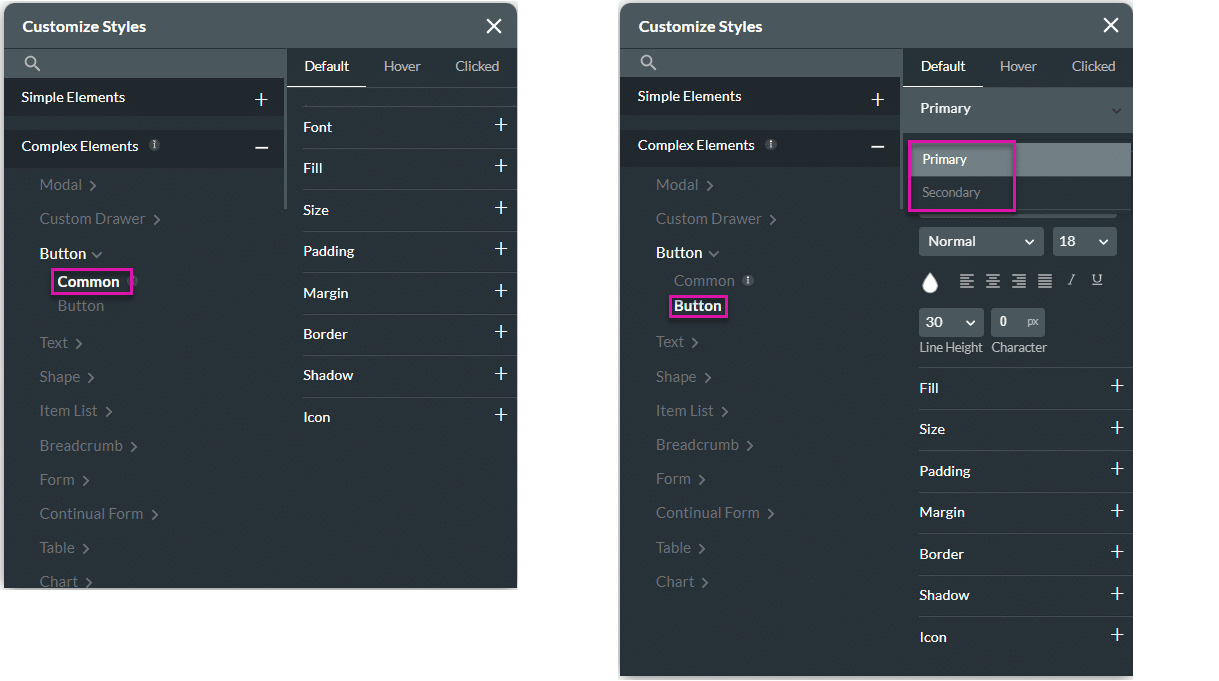
Once you’ve chosen “common” (to style both types of buttons) or “button” (to style a selected type of button), you can then go to the style categories and set your desired Size, Border, Fill, etc.
List of Examples for Common Uses
There are a number of common uses for Project styling. These use cases demonstrate that setting certain project-wide styles can give your project greater uniformity in terms of look and feel:
- Setting a font family for the entire project.
- Setting the input field group style.
- Setting the text type colors and sizes.
- Setting the general look of a power table (header style, row style, icons style).
- Setting the style of commonly used modals such as information or confirmation modals.
Theme and Project Style
The theme is a Project-level style created by Titan and saved for users. When you create a new project, one of the steps is to select a theme so you can choose the default style you start with. However, the theme can be customized.