

Auto Fit Container Styling
All containers in Titan enable you to insert multiple elements into one holder. When this container is moved, all the elements inside it move along a unit, keeping their position in the container.
The auto fit container might look like a regular container in which you can freely place elements, but it is, in fact, a stack element built of rows that expands and contracts automatically based on the content inside and allows you to insert only one element per row. Each time you drag in an element, a new row opens, and the element is placed inside below the previous row. The auto fit container stacks the elements vertically by default but may also be changed to fit elements in a horizontal stack.
The auto fit container’s main purpose is to display dynamic data. It expands to fit larger content and contracts when the content is smaller or hidden, without leaving any unwanted spaces. The Auto Fit can be made to look interactive using three states: Default, Hover and Clicked. Styling the states differently will create a desired effect.
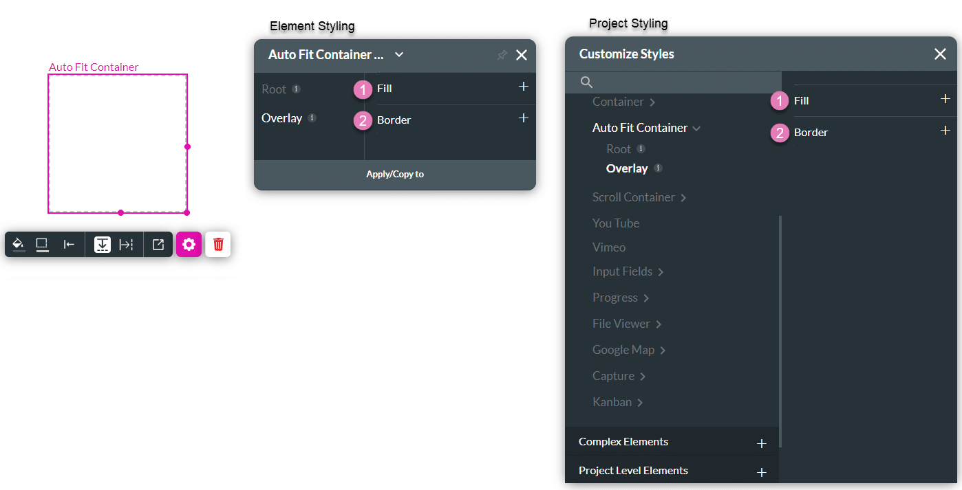
This element can be broken down into two parts, which can be styled individually, for example, the Root fill color and size or the Overlay border. It can be edited on both the Element Style Level and the Project Style Level.
The Three Auto Fit Container States

| # | Option | Function | Available in Project or Element 
|
|---|---|---|---|
| 1 | Default | The Default option refers to the basic state of a Link element. This state is when it is not hovered or clicked on, but simply visible. | 

|
| 2 | Hover | This option refers to the state of the Link once the user hovers over it with the mouse. |
|
| 3 | Clicked | This refers to the state of the Link when the user clicks it. |
|

| # | Option | Function | Available in Project or Element
|
|---|---|---|---|
| 1 | Root | This option enables you to set general properties that affect the auto fit container as a whole. |
|
| 2 | Overlay | The Overlay option allows you to create a filter or effect above the auto fit container by setting a partially transparent color, image or border on top of it. |
|
1. Root
The Root option enables you to set general properties that affect the auto fit container as a whole, such as fill, spacing, position, size, padding, and so much more.
You can also give end users an indication of when they are hovering or clicking on the auto fit container. For this reason, Titan provides three states for the Root styling options: Default, Hover, and Clicked. For example, you can set different fill or border values in each state to create the desired effect.

| # | Option | Function | Available in Project or Element
|
|---|---|---|---|
| 1 | Fill | The Fill option allows you to set the background color of the auto fit container. The color can be set by selecting from a color palette or by providing a HEX color code. An image may also be uploaded as a background. Set your selected fill of choice (color or image) to also have opacity. |
|
| 2 | Spacing | The Spacing property enables you to set the vertical spacing in pixels between the Auto Fit rows or the horizontal space when the auto fit container is used horizontally. |
|
| 3 | Position | You can use this option to change the auto fit container’s location in the content area, on the x- and y-axis (left/right/top/bottom). Position also allows you to make the auto fit container float over its parent container or over the entire page. “Float over Parent” allows you to set the location of the auto fit container within the box containing it, such as a strip. “Float over Page” allows you to set the location of the auto fit container inside of the entire page (and have it stay in the same location even when the user is scrolling in it). |
|
| 4 | Size | This option allows you to change the width and height of the auto fit container. |
|
| 5 | Padding | This option allows you to set a space inside of the auto fit container border so that the content does not reach the edges. The padding could be set for the Top, Bottom, Left and Right sides. |
|
| 6 | Alignment | You can set the auto fit container to a vertical or horizontal position in relation to its strip (left/center/right/top/middle/bottom). The Alignment option also allows you to set the position of a few elements in relation to each other. |
|
| 7 | Border | The Border option allows you to style the contour of the auto fit container: make the border visible or invisible, change its width, color, corner radius, and more. The border can be styled as a whole or separated into top, bottom, left, and right border lines. |
|
| 8 | Shadow | You can add single or multiple shadow layers to the inner and outer contours of the auto fit container with the Shadow option. |
|
| 9 | User CSS | Cascading Style Sheets (CSS) allow a user to apply styles to the auto fit container with CSS code. Note: For Project styling, CSS is accessed via the Tools menu, which you can read about in our Style Elements Using User CSS article. |
|
2. Overlay
The Overlay option allows you to create a filter or effect above the auto fit container by setting a partially transparent color, image or border on top of it.
| # | Option | Function | Available in Project or Element
|
|---|---|---|---|
| 1 | Fill | The Fill option allows you to set a color for an overlay in the auto fit container. The color can be set by selecting from a color palette or by providing a HEX color code. An image may also be uploaded as a background. Set your selected fill of choice (color or image) to also have opacity. |
|
| 2 | Border | The Border option allows you to style the contour of the overlay: make the border visible or invisible, change its width, color, corner radius, and more. The border can be styled as a whole or separated into top, bottom, left, and right border lines. |
|