

Date Styling
The Date element is a special input for collecting specific periods in time by specifying the day, month, and year. It allows the user to type the date in the input or click the Date icon to open a date picker.
This element can be broken down into several parts, which can be styled individually. For example, the label font, the input fill color, or date picker modal colors (that are set by default from the primary input color and can be overridden).
This element can be edited on both the Project Style Level and Element Style Level.

| # | Option | Function | Available in Project or Element 
|
|---|---|---|---|
| 1 | Root | This option enables you to set general properties that affect the Date element as a whole. | 

|
| 2 | Label | The Label option allows you to control the style of the descriptive text above the Date Input box. For example, its font type, font size, and color. |
|
| 3 | Shrink Label | You can use the Shrink Label option to control the style of the elevated label when the input label is configured as floating. The Shrink Label option is only available under the Standard, Filled, and Outlined variants on the project styling properties and may not be applied to the Classic and Fixed variants. |
|
| 4 | Input | The Input option allows you to style the Input box and the text entered inside the Date field. |
|
| 5 | Placeholder | Insert filler content to occupy an element with possible content until the user replaces the placeholder with data. |
|
| 6 | Messages | This option allows you to style the text shown under the Date when the input text is found to be valid or invalid. You can set the font for both messages and a separate color for the error and success messages. The colors set for errors or valid outcomes also affect the Input border. |
|
| 7 | Modal Header | This option allows you to set the style of the header in the Date Picker window. You can change the header’s font style, border, and fill color (which is set by default from the element’s primary color but can be overridden using this option). |
|
| 8 | Modal Selection | The Modal Selection option enables you to modify the style of the selected date in the Date picker: its font, border, and fill. Please note that the fill color of the selected day is taken by default from the element’s primary color but can be overridden here. |
|
| 9 | Modal Button | This option allows you to modify the style of the OK and Cancel buttons in the Date Picker window, for example, their fill color, border, font, and padding. The font color of the modal’s buttons is set by default from the input primary color. You can override the color here if you want. |
|
| 10 | Date Icon | You can use this option to change the Date icon’s color and width. Changing the width will also change the height accordingly in the same proportion. |
|
| 11 | Valid Icon | Indicate that the provided input has passed the validation process. |
|
| 12 | Invalid Icon | Indicate that the provided input has not passed the validation process |
|
1. Root
The Root option enables you to set general properties that affect the Date as a whole, such as primary color, element size, position, and alignment.

| # | Option | Function | Available in Project or Element
|
|---|---|---|---|
| 1 | Primary | The Primary color given to the Date field affects its border color, as well as the colors in the date picker window (modal header fill color, modal selection date fill and modal buttons font). |
|
| 2 | Position | You can use this option to change the Date’s location in the content area on the x and y-axis (left/right/top/bottom). Position also allows you to make the Date float over its parent container or over the entire page. “Float over Parent” allows you to set the location of the Date within the box containing it, e.g. container or strip. “Float over Page” allows you to set the location of the Date inside of the entire page (and have it stay in the same location even when the user is scrolling in it). |
|
| 3 | Size | This option allows you to change the width and height of the Date element. |
|
| 4 | Alignment | You can set the Date element to a vertical or horizontal position in relation to its container (left/center/right/top/middle/bottom). The Alignment option also allows you to set the position of a few elements in relation to each other. |
|
| 5 | User CSS | Cascading Style Sheets (CSS) allows the user to apply styles on the Date element with CSS code. Note: For Project styling, CSS is accessed via the Tools menu, which you can read about in our Style Elements Using User CSS article. |
|
| 6 | Input Variant | This option allows you to choose the general look of the input from five existing variants: Standard, Filled, Outlined, Fixed, or Classic. Except for the Fixed and Classic options, the labels in all variants can be set as Floating. |
|
2. Label
The Label option allows you to control the style of the descriptive text above the Date box. For example, its font type, font size, and color.

| # | Option | Function | Available in Project or Element
|
|---|---|---|---|
| 1 | Font | The Font enables you to change the typography style, for instance, font family, weight, color, and size. |
|
| 2 | Margin | This option allows you to set the outer space between the label and adjacent element parts. |
|
| 3 | Asterisk | This option lets you set the style of the asterisk sign (*) that appears next to the label when the element is mandatory. |
|
3. Shrink Label
You can use the Shrink Label to control the style of the elevated label when the input label is configured as floating.
The Shrink Label option is available under the Standard, Filled, and Outlined variants on the project styling properties and is not available with Classic and Fixed variants.

| # | Option | Function | Available in Project or Element
|
|---|---|---|---|
| 1 | Font | This option enables you to turn on the Floating Label functionality (which is turned off by default), by switching off the “Always shrunk” checkbox. It then enables you to change the typography style of the floating label (for instance, font family, weight, color, and size) and set the Top and Left offset for the floating label. |
|
| 2 | Margin | This option allows you to set the outer space between the Shrink Label and adjacent element parts. |
|
4. Input
The Input option allows you to style the Input box, the text entered by the user, the date icon, the prefix text, and the icon that could also be shown.

| # | Option | Function | Available in Project or Element
|
|---|---|---|---|
| 1 | Input Font | You can use the Input Font to change the typography style, for instance, font family, color, and size. |
|
| 2 | Prefix Text Font | You can use this option to style the static text that appears before the user input text. |
|
| 3 | Prefix Icon | The Prefix Icon allows you to style the static icon that appears before the user input text. |
|
| 4 | Padding | The padding option allows you to control the space between the date field input border and the content inside of it. |
|
| 5 | Shadow | You can add single or multiple shadow layers to the outer contour of the date field input. |
|
5. Placeholder
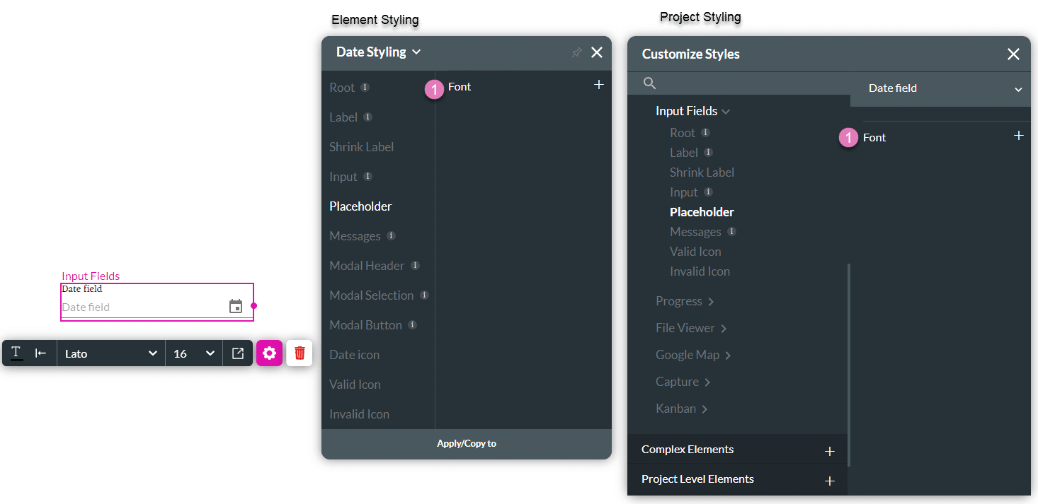
| # | Option | Function | Available in Project or Element
|
|---|---|---|---|
| 1 | Font | This option allows you to style the text shown under the Date element when the date is valid or invalid. You can set the font for both messages and a separate color for the success and error messages. These colors will also be applied to the input border. |
|
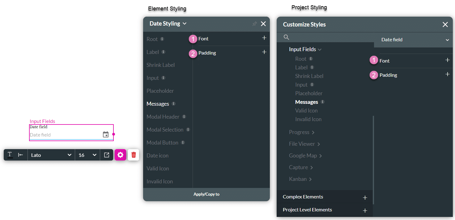
6. Messages
This option allows you to style the text shown under the Date input when the input text is valid or invalid.
| # | Option | Function | Available in Project or Element
|
|---|---|---|---|
| 1 | Font | This option allows you to style the texts shown under the Date element when the date is valid or invalid. You can set the font for both messages and a separate color for the success and error messages. These colors will also be applied to the input border. |
|
| 2 | Padding | The padding option allows you to control the space between the message and the content inside of it. |
|
7. Modal Header
This option allows you to modify the style of the date picker modal header: its font type, border, and fill (which is taken by default from the element’s primary color but can be overridden here).

| # | Option | Function | Available in Project or Element
|
|---|---|---|---|
| 1 | Fill | The Fill option allows you to set the background color of the Date Picker window header. The header’s fill color is taken by default from the element’s primary color but can also be overridden here. |
|
| 2 | Font | This option allows you to change the typography style of the text in the date picker header, for instance, font family, weight, color, and size. |
|
| 3 | Border | The Border option allows you to style the contour of the header in the Date Picker window: make the border visible or invisible, change its width, color, corner radius, and more. The border can be styled as a whole or separated into top, bottom, left, and right border lines. |
|
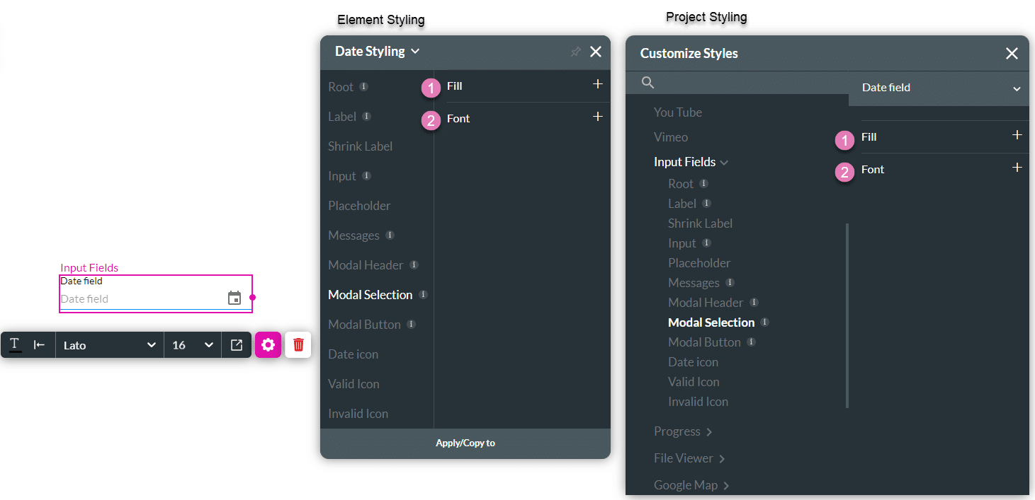
8. Modal Selection
You can use this option to modify the date displayed on the Date Picker window.
| # | Option | Function | Available in Project or Element
|
|---|---|---|---|
| 1 | Fill | This option allows you to set a background color to the selected date in the Date Picker window. The fill color is taken by default from the element’s primary color, but you can also override it from here. |
|
| 2 | Font | This option allows you to change the typography style of the selected date, for instance, font family, weight, color, and size. |
|
9. Modal Button
This option allows you to modify the OK and Cancel buttons in the Date Picker window.

| # | Option | Function | Available in Project or Element
|
|---|---|---|---|
| 1 | Fill | The Fill option allows you to set a background color to the OK and Cancel buttons in the Date Picker window. The color can be set by selecting from a color pallet or providing a HEX color code. |
|
| 2 | Font | You can use the Font option to change the typography style of the buttons, for instance, font family, weight, color, and size. The button font color is taken by default from the element’s primary color, but it can be overridden here |
|
| 3 | Border | The Border option allows you to style the contour of the header in the Date Picker window: make the border visible or invisible, change its width, color, corner radius, and more. The border can be styled as a whole or separated into top, bottom, left, and right border lines. |
|
| 4 | Padding | You can control the padding space of the OK and Cancel buttons in the Date Picker window to make them larger or smaller. The padding could be set on the Top/Bottom to control the height of the button and also on the Left/Right to control the width. |
|
10. Date Icon
You can use this option to change the Date icon’s color and width.
Changing the width will also change the height accordingly in the same proportion.

| # | Option | Function | Available in Project or Element
|
|---|---|---|---|
| 1 | Color | The Color option allows you to set the icon’s color. The color can be set by selection from a color pallet or by specifying a HEX color code. |
|
| 2 | Stroke | This option refers to the outer contour of an icon. It allows you to make the icon’s border visible or invisible and change its weight and color. |
|
| 3 | Size | This option allows you to change the width and height of an icon. Since the Icon has a fixed ratio, Changing its width will automatically adjust its height. And vice versa. |
|
11. Valid Icon
Indicate that the provided input has passed the validation process.
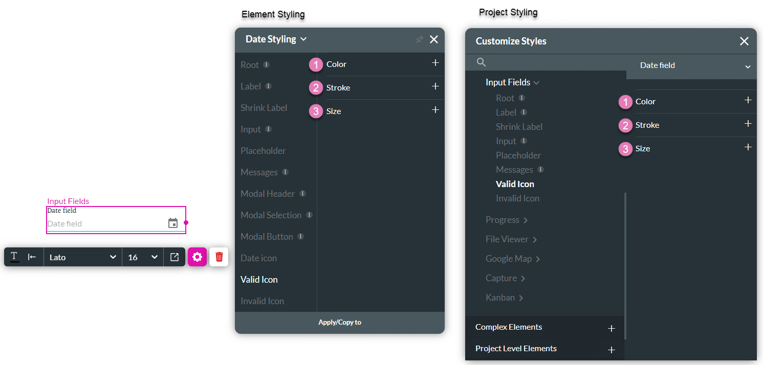
| # | Option | Function | Available in Project or Element
|
|---|---|---|---|
| 1 | Color | The Color option allows you to set the icon’s color. The color can be set by selection from a color pallet or by specifying a HEX color code. |
|
| 2 | Stroke | This option refers to the outer contour of an icon. It allows you to make the icon’s border visible or invisible and change its weight and color. |
|
| 3 | Size | This option allows you to change the width and height of an icon. Since the Icon has a fixed ratio, Changing its width will automatically adjust its height. And vice versa. |
|
12. Invalid Icon
Indicate that the provided input has not passed the validation process.

| # | Option | Function | Available in Project or Element
|
|---|---|---|---|
| 1 | Color | The Color option allows you to set the icon’s color. The color can be set by selection from a color pallet or by specifying a HEX color code. |
|
| 2 | Stroke | This option refers to the outer contour of an icon. It allows you to make the icon’s border visible or invisible and change its weight and color. |
|
| 3 | Size | This option allows you to change the width and height of an icon. Since the Icon has a fixed ratio, changing its width will automatically adjust its height. And vice versa. |
|