

Border Styling
Business Background
You can style the border of an element to complement your brand and business needs. You can change the entire border or each side separately.
How to Video
- 0:03 Introduction on how to design a text element with multiple borders.
- 0:10 Find your text elements easily by navigating your arrow.
- 0:25 Add a separate border option.
- 0:43 We show you how simple it is to modify the border around the text.
- 1:12 Change the width of the text.
- 1:25 Style and customize the border around the text as you wish.
- 1:51 You can add a single or double border – even change the color of the border.
- 2:00 Conclusion.
How to Guide
Use the border options to customize elements in web projects.
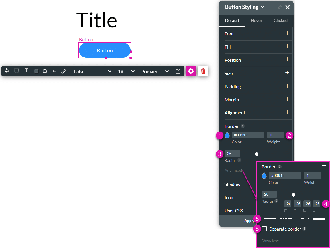
| # | Option | Function | Available in Project or Element 
|
|---|---|---|---|
| 1 | Color selector | Choose the color display of the border by selecting the color palette. | 

|
| 2 | Weight | This option allows you to adjust the weight of the element’s border. |
|
| 3 | Radius field and slider | Adjust the radius of the border by changing the value in the field or dragging the slider. |
|
| 4 | Radius differentiation per corner | Change the radius of a corner. |
|
| 5 | Border style selector | Use this option to select one of the styles: solid line, dashed, dotted or double line. |
|
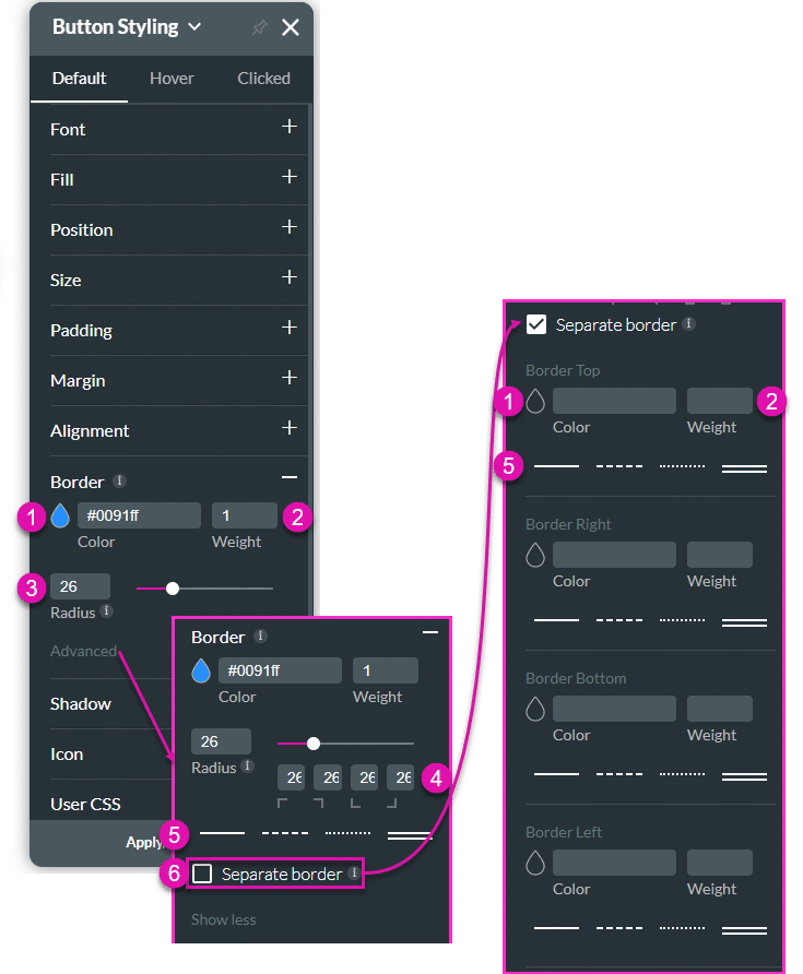
| 6 | Separate border checkbox | Click the checkbox to style each side separately. You can change the color (1), weight (2), and style (5) of the sides. |
|
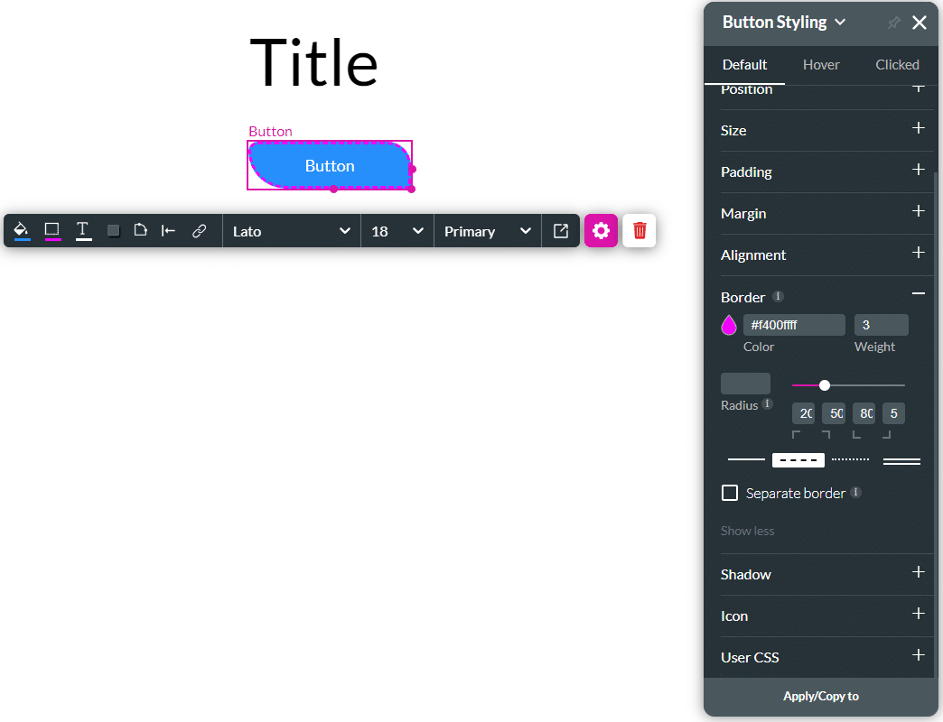
Real-Life Example of How to Configure Borders
Join us as we examine one of the many ways you can style an input element using the Border setting. Alternatively, contact us today if you have a specific business use case in mind.
The example below shows how to change the border of the element.
- Click the Input Styling icon to open the Styling panel.
- Click the Border option to expand it.
- Use the color selector to change the color.
- Add a value in the weight field to change the width of the border.
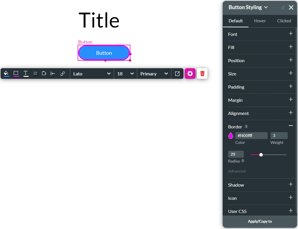
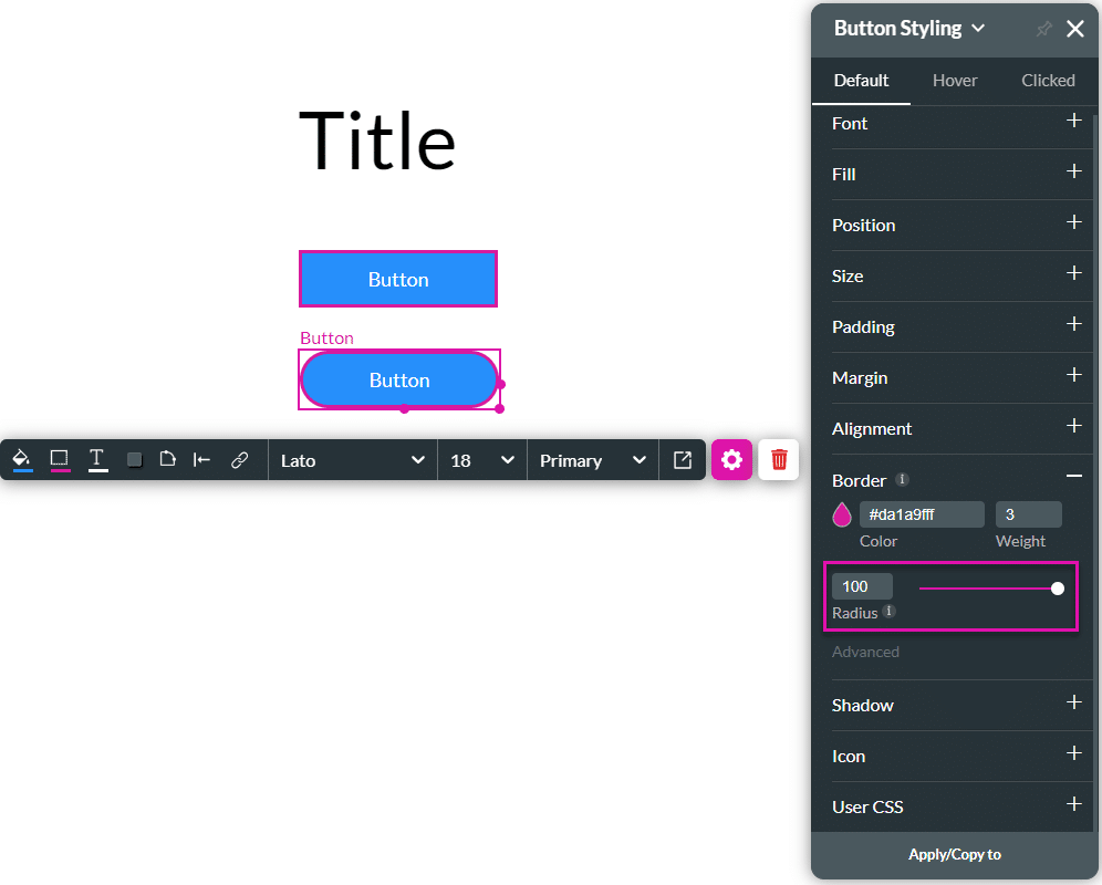
- Drag the radius slider to adjust the element’s corners. The higher the value, the rounder the corners.
- Alternatively, type a value in the Radius field.
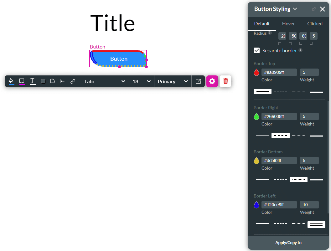
- Click the Advanced option.
- Add different values for the radius corners to change the button’s border.
- Click the Dashes icon to change the border style.
- Click the Separate border checkbox to configure separate borders for the element.
- Use the Color selector to change the color of a separate border.
- Use the Weight field to change the width of the separate border.
- Use the Style selector to change the style of the separate border.
You can do the same for other elements, for instance, a text element:

Hidden Title
Was this information helpful?
Let us know so we can improve!
Need more help?
Book Demo