Do you like this
feature?
If you like this feature and want to transform your business with Titan's zero code applications for Salesforce, then schedule a demo today!
Stacked Chart Settings
The stacked side chart attributes are configured using the Stacked Settings screen.
The following options are available:
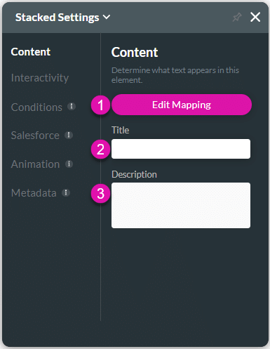
Content
Customize the content options and determine how other elements appear in the stacked chart.

| # | Option | Function |
|---|---|---|
| 1 | Edit Mapping | This option enables you to change the mapping option you initially configured from Salesforce. It shows the axes that you added to the chart. |
| 2 | Title | You can use this option to add a title to the Stacked Chart. |
| 3 | Description | This option allows you to add descriptive text, such as comments, for users. |
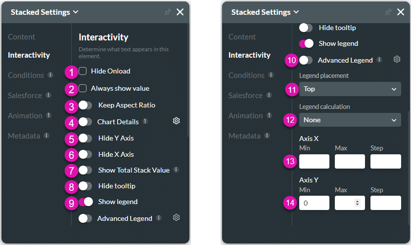
Interactivity
Customize the interactivity options and determine how your user can interact with the stacked chart.

| # | Option | Function |
|---|---|---|
| 1 | Hide Onload | Use the Hide Onload option to hide specific elements on load to control what the user sees. It allows you to hide an element when the page is loaded. |
| 2 | Always Show Value | The Always show value option allows you to hide or show values on each data point of the content on a chart. |
| 3 | Keep Aspect Ratio | Use the option to ensure that the ratio of the width to the height of the stacked chart is maintained. |
| 4 | Chart Details | This option allows you to view more details from Salesforce of a specific data point. The detailed data is shown in a table in a pop-up modal. |
| 5 | Hide Y Axis | This option allows you to set the chart to hide the value on the Y-axis. |
| 6 | Hide X Axis | This option allows you to set the chart to hide the value on the X-axis. |
| 7 | Show Total Stack Value | The Show Total Stack Value option is available for the Stacked Horizontal Bar Chart, Stacked Side Horizontal Bar Chart and the Stacked Line Chart. The total stack value is the sum of all the different stacks in each bar on the X axis. |
| 8 | Hide Tooltip | You can use this option to hide or show the tooltip. When this option is selected, a tooltip will appear when the user hovers the mouse pointer on the chart. |
| 9 | Show Legend | The Show Legend option allows you to hide or show the key or guide that explains the meaning of the symbols, colors, or patterns used in the chart. |
| 10 | Advanced Legend | You can show or hide the advanced legend. The advanced legend shows more information than the standard legend. |
| 11 | Legend Placement | The Legend placement option allows you to select the position for the legend on the chart. This option is not available when Advanced Legend is enabled. |
| 12 | Legend Calculations | You can use the Legend Calculations to count or sum the results in the legend or show no calculations. |
| 13 | Axis X Min, Max and Step | These options allow you to set a minimum, maximum, and step value on the X-axis. |
| 14 | Axis Y Min, Max and Step | These options allow you to set a minimum, maximum, and step value on the Y-axis. |
Conditions
Configure Conditions – Determine what will happen when your user interacts with this element.
Salesforce
Configure Integrations – Integrate data from Salesforce.
Animation
Animation – This option allows you to add visual interest to your screen. Create the illusion of movement when the element shows on the screen. You can set the duration and delay to control the movement and preview by default.
Metadata
Metadata – See how this element is identified in the backend, such as its purpose, content, or function. Your users won’t see this.

