Learn About Charts
What do Charts do?
Use Charts to display data from Salesforce using various diagrams or symbols. Charts give users more understanding as they group and display related information easily.
Types of Charts
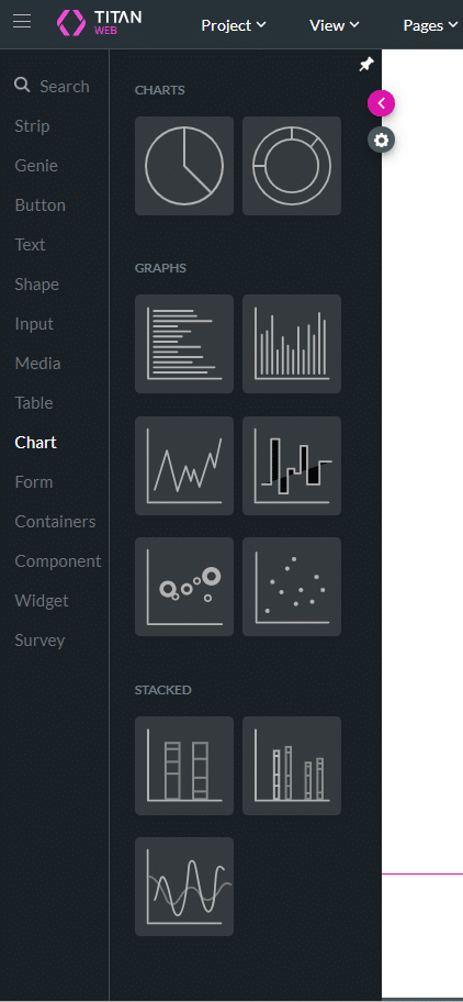
You can choose from various charts that display summarized data from Salesforce with no code. Below is a comprehensive list of available charts.
| Type of Chart | Description |
|---|---|
| Pie Chart | A pie chart visually represents the proportions or percentages of a whole. It’s effective for showing how parts make up a whole and allows viewers to quickly grasp the relative size of each component. Pie charts are useful for illustrating distributions, comparisons of categorical data, and identifying the largest and smallest segments within a dataset at a glance. |
| Doughnut Chart | The doughnut chart is similar to a pie chart but with a key visual difference: it has a hole in the center. This central hole can be used to display additional information, such as the total value of the data being represented or a key metric. |
| Horizontal Bar Chart | A horizontal bar chart is a graphical representation of data where individual bars extend horizontally from a central axis to indicate the values of different categories. Each bar’s length corresponds to the value of the category it represents, and the bars are arranged along a vertical axis. This chart is effective for comparing the values of different categories, especially when category names are long or when a large number of categories need to be displayed. |
| Bar Chart | A bar chart visually represents and compares the quantities of different categories or groups. It uses rectangular bars, with the length or height of each bar proportional to the value it represents. Bar charts are highly effective for displaying data and making comparisons. |
| Line Chart | A line chart shows trends and changes in data over time. It is particularly effective for illustrating continuous data and identifying patterns, such as increases, decreases, and fluctuations. Line charts help visualize the relationship between variables and forecast future data points. |
| Step Line Chart | A stacked line chart, also known as an area chart, displays multiple data series as cumulative values over time or another continuous variable. Each data series is represented by a line, and the area below each line is filled in to show its contribution to the total. Stacked line charts are useful for visualizing the overall trend and the individual contributions of each series, highlighting how parts contribute to the whole over time. |
| Bubble Chart | A bubble chart displays three dimensions of data using bubbles. Each bubble’s position on the x and y axes represents two variables, while the bubble’s size indicates a third variable. Bubble charts are useful for showing relationships and distributions among three variables and highlighting outliers or patterns. |
| Scatter Chart | Scatter charts use dots to represent values for two different numeric variables. Each point on the chart represents an individual data point, allowing viewers to observe the relationship, correlation, or distribution between the variables. Scatter charts are particularly useful for identifying trends, clusters, and outliers in datasets. |
| Stacked Chart | A stacked chart is a type of bar chart in which each bar is divided into segments, each representing a different subcategory. The bars are positioned horizontally, and the segments are stacked on top of each other, showing the cumulative total of all subcategories for each main category. This chart type is useful for comparing the overall size and composition of categories while highlighting the contribution of each subcategory to the total. |
| Stack Side Chart | The stacked side chart is similar to the stacked chart except that the bars are aligned horizontally and placed next to each other for easy comparison. It displays multiple bars for each category, with each bar representing a different subcategory. This chart is useful for comparing the values of subcategories within each main category and across different categories simultaneously. |
| Stacked Line Chart | A stacked line chart, also known as an area chart, displays multiple data series as cumulative values over time or another continuous variable. Each data series is represented by a line, and the area below each line is filled in to show the contribution of each series to the total. Stacked line charts are useful for visualizing the overall trend and the individual contributions of each series, highlighting how parts contribute to the whole over time. |
How to Guide
- Click the + icon to open the list of elements.
- Select the Chart option and click-and-drag a chart to the canvas.
- In this example, a pie chart is used.
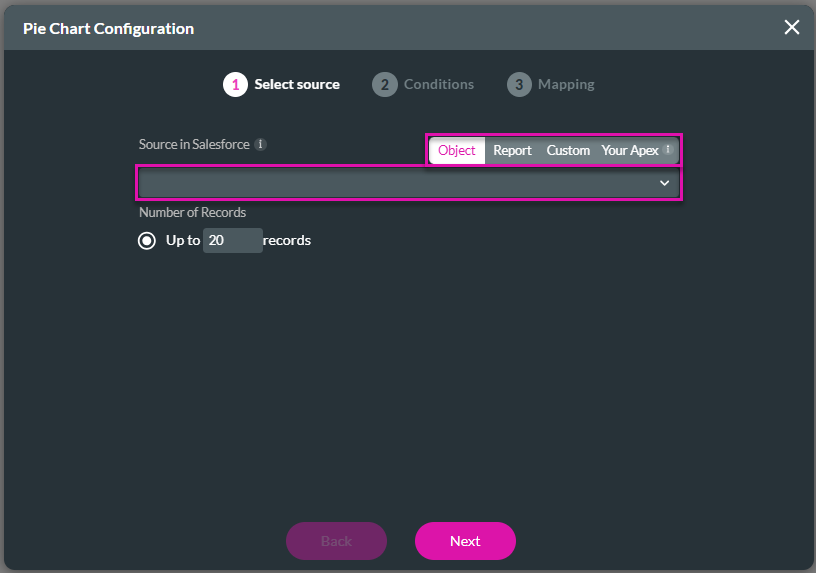
- Use the drop-down list to select a source in Salesforce.
- The source can be as follows:
- Object
- Report
- Custom – the mapping options are different.
- Your Apex – parameters instead of conditions must be configured.
- In this example, an object is used.
- The source can be as follows:
- Type the number of records that must be used. The default is 20.
- Click the Next button.
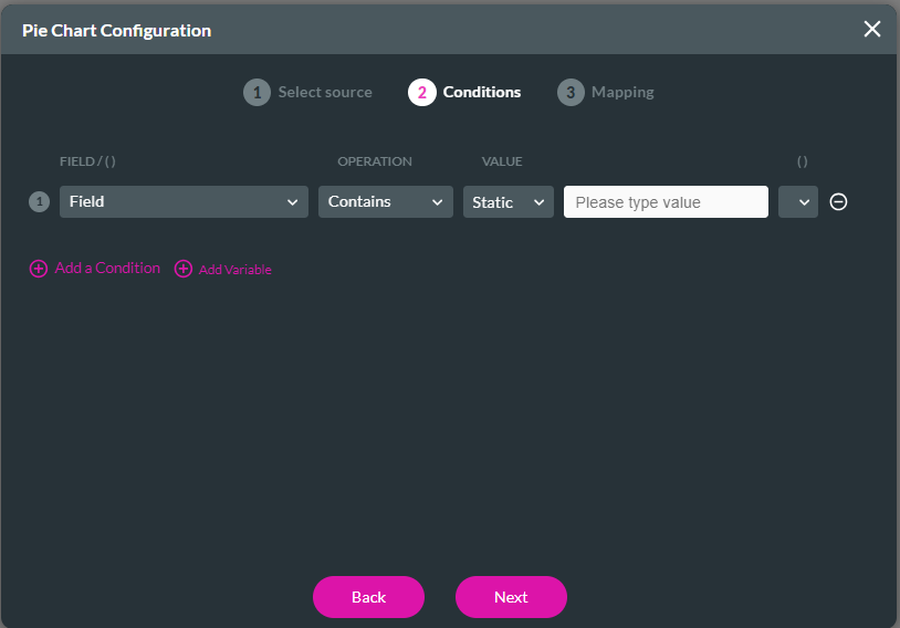
- Configure the conditions if necessary and click the Next button.
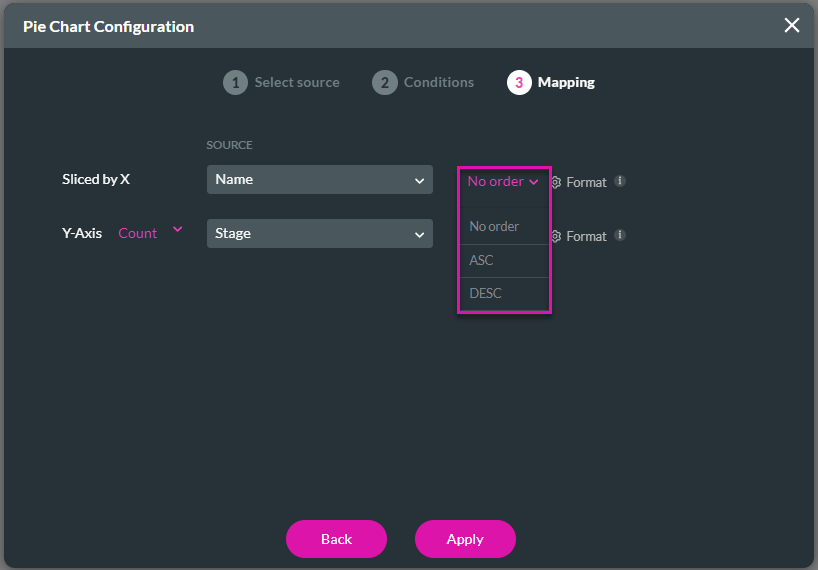
- Use the drop-down lists to select the sources for the x and y axes.
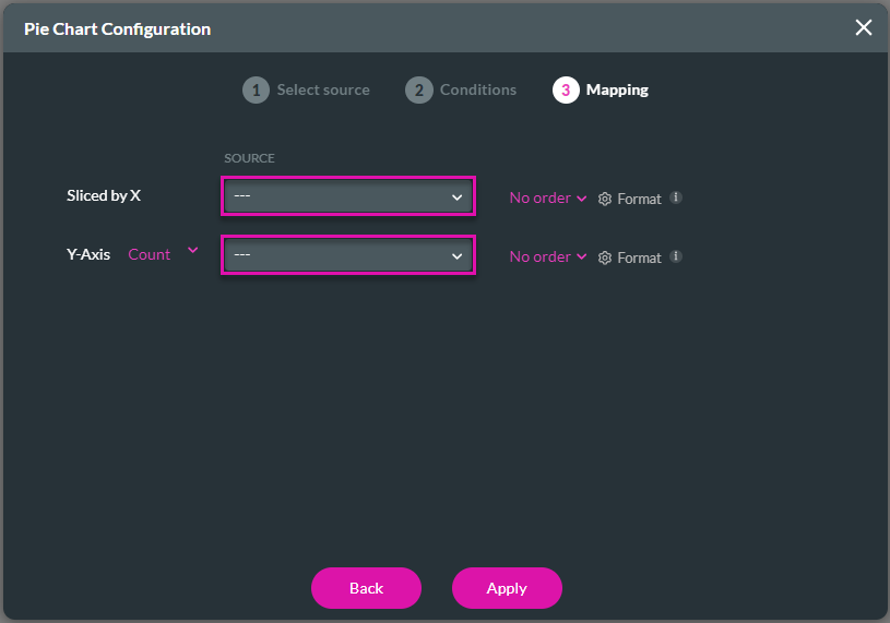
- Use the drop-down list to select an order, if necessary.
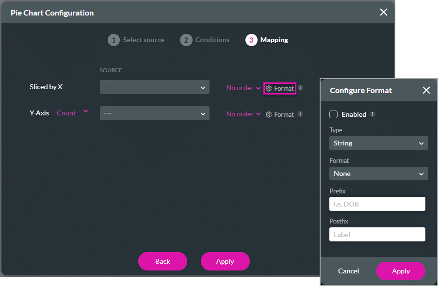
- Click the Gear icon to configure the format, if necessary.
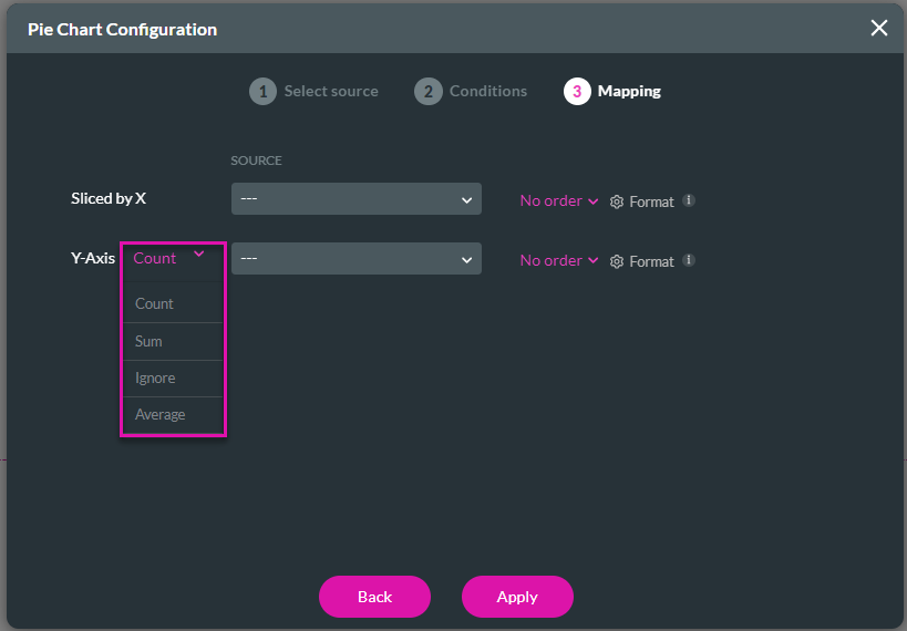
- Use the drop-down list to select an option for the Y-axis:
- Count
- Sum
- Ignore
- Average
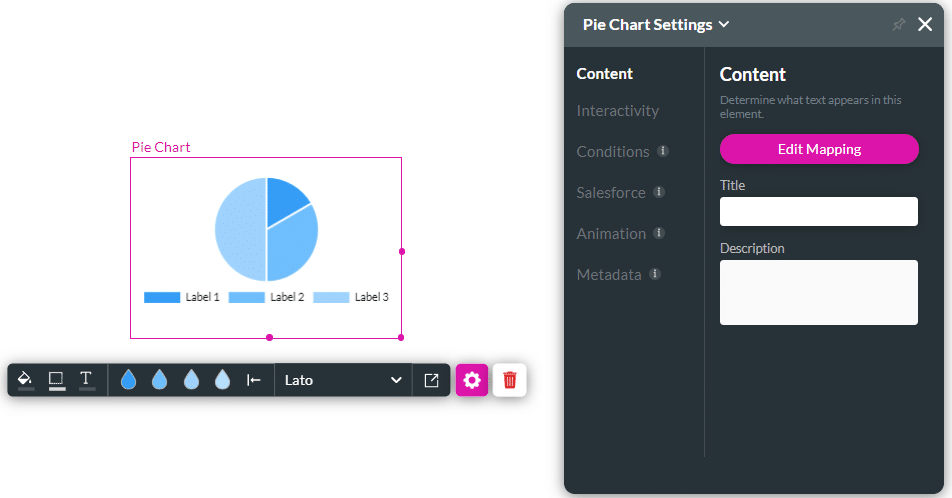
- Click the Next button. The chart is added to the screen.
Hidden Title
Was this information helpful?
Let us know so we can improve!
Need more help?
Book Demo

