

Currency Styling
The currency element is an input for collecting monetary values. It can display a currency symbol using a prefix and a suffix if needed. These values allow you to enter a decimal value or an integer, using a comma as a separator.
This element can be broken down into several parts, which can be styled individually, for example, the label, font, size, color, or the input fill color.
The currency element can be edited on both the Project Style Level and Element Style Level.

| # | Option | Function | Available in Project or Element 
|
|---|---|---|---|
| 1 | Root | This option enables you to set general properties that affect the currency element as a whole. | 

|
| 2 | Label | The Label option allows you to control the style of the descriptive text above the currency element. For example, its font size, color, and type. |
|
| 3 | Shrink Label | You can use the Shrink Label to control the style of the elevated label when the input label is configured as floating. The Shrink Label option is available under the Standard, Filled, and Outlined variants on the project styling properties, and is not found on the Classic and Fixed variants. |
|
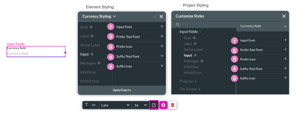
| 4 | Input | This option allows you to style the text entered inside the currency element, including the prefix texts, suffix texts, and icons that may be shown. |
|
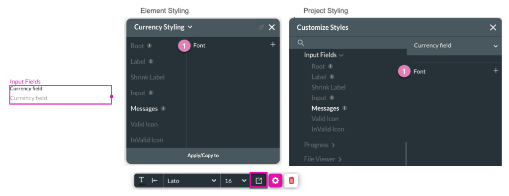
| 5 | Messages | This option allows you to style text shown under the currency element when the input text is found to be valid or invalid. You can select a font for both messages and set separate colors for success and error messages. These colors will be applied to the input border and the relevant message. |
|
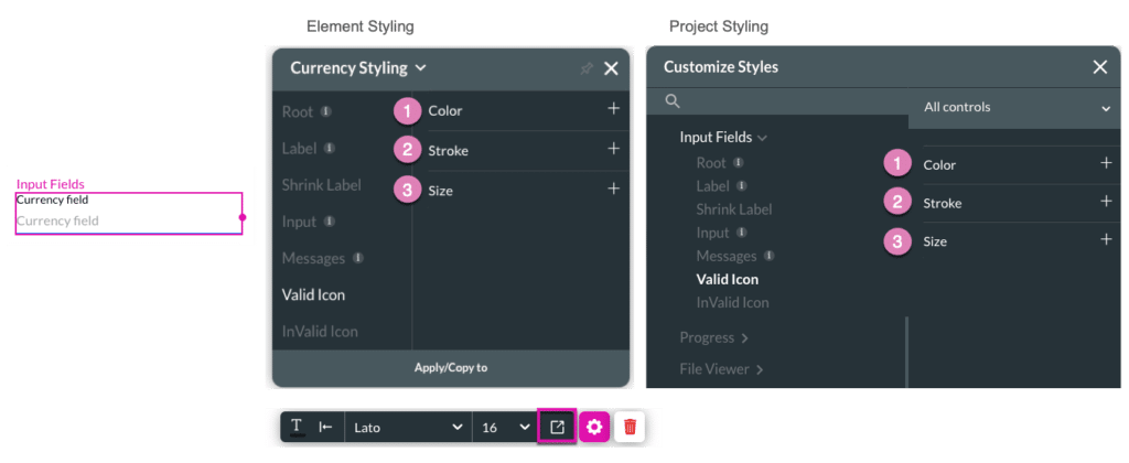
| 6 | Valid Icon | The Valid Icon is a simplified image used to represent input text is correct. It is a graphic symbol that can visually support and clarify your content. You can set a size, color, and stroke option for the Valid Icon. |
|
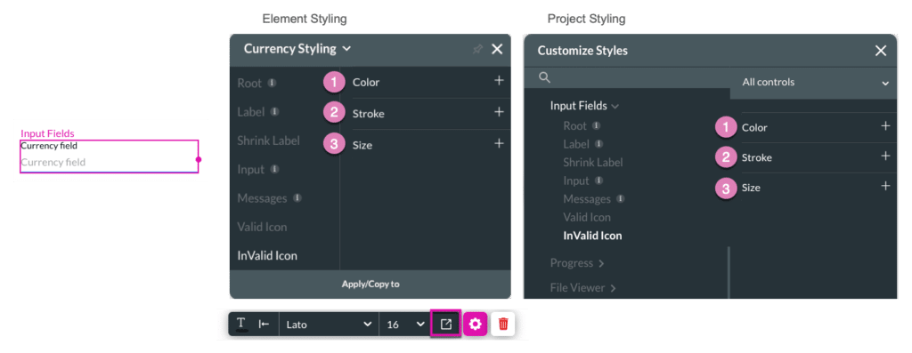
| 7 | Invalid Icon | The Invalid Icon is a simplified image used to represent input text is an error. It is a graphic symbol that can visually support and clarify your content. You can set a size, color, and stroke option for the Invalid Icon. |
|
1. Root
The Root option enables you to set general properties that affect the currency element as a whole, such as primary color, element size, position, and alignment.

| # | Option | Function | Available in Project or Element
|
|---|---|---|---|
| 1 | Primary | The Primary color given to the currency element affects its border color. |
|
| 2 | Position | You can use this option to change the currency’s location in the content area, on the x- and y-axis (left/right/top/bottom). Position also allows you to make the currency float over its parent container or over the entire page. “Float over Parent” allows to set the location of the currency within the box containing it, such as container or strip. “Float over Page” allows you to set the location of the currency inside of the entire page (and have it stay in the same location even when the user is scrolling it). |
|
| 3 | Size | This option allows you to change the width and height of the currency element. |
|
| 4 | Alignment | You can set the currency element to a vertical or horizontal position in relation to its container (left/center/right/top/middle/bottom). The Alignment option also allows you to set the position of a few elements in relation to each other. |
|
| 5 | User CSS | Cascading Style Sheets (CSS) allow the user to apply styles on the currency element with CSS code. Note: For Project styling, CSS is accessed via the Tools menu, which you can read about in our Style Elements Using User CSS article. |
|
| 6 | Input Variant | This option allows you to choose the general look of the input from five existing variants: Standard, Filled, Outlined, Fixed, and Classic. Except for the Fixed and Classic options, the labels in all variants can be set as Floating. |
|
2. Label
The Label setting allows you to control the style of the descriptive text above the currency element. For example, its font type, font size, and color.

| # | Option | Function | Available in Project or Element
|
|---|---|---|---|
| 1 | Font | The Font option lets you change the typography style, for instance, font family, weight, color, and size. |
|
| 2 | Margin | This option allows you to add space between the label and adjacent element parts. |
|
| 3 | Asterisk | This option allows you to set the style of the asterisk sign (*) that appears next to a label when an element is mandatory. |
|
3. Shrink Label
You can use the Shrink Label option to control the style of the elevated label when the input label is configured as floating.
The Shrink Label option is available under the Standard, Filled, and Outlined variants on the project styling properties and is not found on the Classic and Fixed variants.

| # | Option | Function | Available in Project or Element
|
|---|---|---|---|
| 1 | Font | This option enables you to turn on the Floating Label functionality (which is turned off by default), by switching off the “Always shrunk” checkbox. It then enables you to change the typography style of the floating label (for instance, font family, weight, color, and size) and set the Top and Left offset for the floating label. |
|
| 2 | Margin | This option allows you to add space between the Shrink Label and the adjacent element parts. |
|
4. Input
Input allows you to style the currency element and the text entered. You can also style the prefix texts, suffix texts, and icons that can be shown before or after the text.
| # | Option | Function | Available in Project or Element
|
|---|---|---|---|
| 1 | Input Font | You can use the Input Font setting to change the typography style, for instance, font family, weight, color, and size. |
|
| 2 | Prefix Text Font | You can use this option to style the static text that appears before the user input text. |
|
| 3 | Prefix Icon | The Prefix Icon allows you to style the static icon that appears before the user input text. |
|
| 4 | Suffix Text Font | This option allows you to style the static text that appears after the user input text. |
|
| 5 | Suffix Icon | You can use the Suffix Icon option to style the static icon that appears after the user input text. |
|
5. Messages
This option allows you to style text shown under the currency element when the input text is found to be valid or invalid. You can select a font for both messages and set separate colors for success and error messages. These colors will be applied to the input border and the relevant message.
| # | Option | Function | Available in Project or Element
|
|---|---|---|---|
| 1 | Font | This option allows you to change the error and success message typography style, such as the font family, weight, etc. The color set for these messages will also be applied to the input border and the message. |
|
6. Valid Icon
The Valid Icon is a simplified image used to represent input text is correct. It is a graphic symbol that can visually support and clarify your content.
| # | Option | Function | Available in Project or Element
|
|---|---|---|---|
| 1 | Color | The Color option allows you to set the Valid Icon’s color. The color can be set by selecting from a color palette or by specifying a HEX color code. |
|
| 2 | Stroke | This option refers to the outer contour of the Valid Icon. It allows you to make the icon’s border visible or invisible, and change its weight and color. |
|
| 3 | Size | This option allows you to change the width and height of the Valid Icon. |
|
7. Invalid Icon
The Invalid Icon is a simplified image used to represent input text is an error. It is a graphic symbol that can visually support and clarify your content.
| # | Option | Function | Available in Project or Element
|
|---|---|---|---|
| 1 | Color | The Color option allows you to set the Invalid Icon’s color. The color can be set by selecting from a color palette or by specifying a HEX color code. |
|
| 2 | Stroke | This option refers to the outer contour of the Invalid Icon. It allows you to make the icon’s border visible or invisible, and change its weight and color. |
|
| 3 | Size | This option allows you to change the width and height of the Invalid Icon. |
|