

Configure a Power Table
Business Background
A power table is a more customizable and feature-rich version of a standard table component. With no code, you can configure a power table to suit your business needs in a few clicks.
Titan Solution
Titan Web lets you configure power tables with enhanced features such as:
- Multi-column sorting: Users can sort the table by multiple columns.
- Multiple-column filtering: Users can filter the table by multiple columns and values.
- Global filtering: Users can search the entire power table.
- Selecting: Users can select one, several, or all the records in a power table.
- Quick updating: Users may update information in a power table.
- Paginating: A large power table could be shown across several pages.
- Dependent picklists: You can configure dependent picklists in a power table.
Note:
Compare to a list view and a table view.
How to Video
Coming soon.
How to Guide
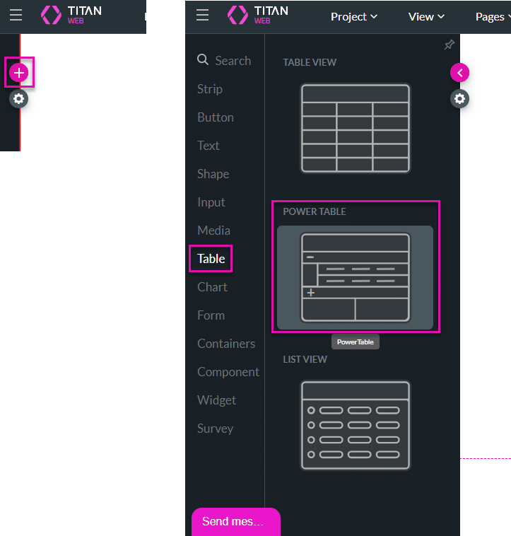
- Click the + icon to open the list of elements.
- Select the Table option and drag-and drop the power table to the canvas. The Salesforce Configuration screen opens.
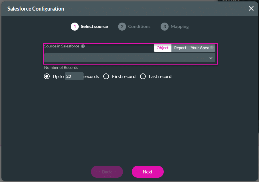
- Use the drop-down list to select a source.
- Data can be pulled from a Salesforce object, a report, or an Apex.
- For this example, the Account object was chosen as the source, but you can bring data from any object you have in Salesforce, such as standard, custom, or managed package objects.
- Click the Next button.
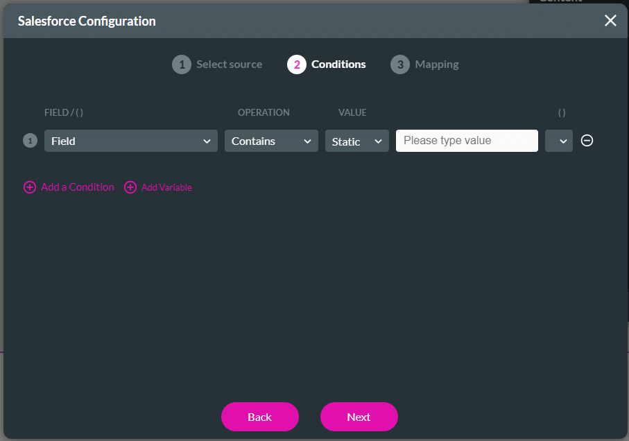
- Configure any condition.
- You can do complex conditions with many rules and or statements with parentheses.
- Titan can also reference fields from a project instead of using static values.
- Click the Next button.
Note:
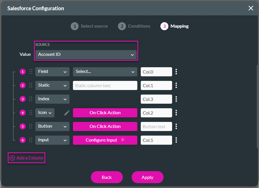
The Value field will usually be the Record ID for your object. This value sits behind the scenes for each row on your Power Table.
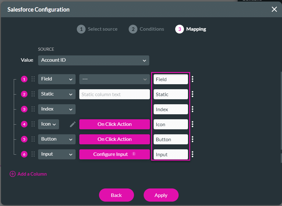
- Configure the mapping.
- Add columns to the power table by clicking on the Add a Column option. You can add any of the following:
- Field: Use the drop-down list to select a field from the Salesforce object.
- Static: Type static text in the field.
- Index: The rows will be numbered.
- Icon: Add an icon to the row and click the On Click Action button to configure an action on the icon.
- Button: Add a button to the row and click the On Click Action button to configure an action on the button.
- Input: Click the Configure Input button to configure the input using the modal that opens. The data is pushed to Salesforce.
- Input options include checkbox, date, text, currency, and many more.
- Add columns to the power table by clicking on the Add a Column option. You can add any of the following:
- Rename the auto-filled labels with descriptive column titles, if necessary.
- Use the Kebab icon to configure any of the following as necessary. Not all the options are available for all the row types.
- Add a Subheader: A line is added where you can configure a subheader by selecting one of the following:
- Field
- Static
- Index
- Icon
- Button
- Input
- Include an Action: Use the toggle switch to enable the option and then use the Gear icon to configure an On Click Action.
- Click on icon: Click the checkbox to use an icon for the on-click action and click the Edit icon to configure an icon.
- Allow Edit: Use this option to allow end users to edit the row and make updates in real-time in Salesforce.
- Configure component: Click this option to configure a component using the screens. You can configure a table, chart, or an IFrame. You can hide the expansion arrow.
- Configure Tooltip Mapping: Click this option to configure tooltip mapping.
- Delete Row: Click this option if you want to delete a row from the power table.
- Add a Subheader: A line is added where you can configure a subheader by selecting one of the following:

- Click the Apply button. The power table is added to the canvas.

- Save and Preview the project.
Hidden Title
Was this information helpful?
Let us know so we can improve!
Need more help?
Book Demo