

Icon Type Column in Power Tables
Business Background
Add custom icons, including SVG, to the power table to enhance the visual representation of data.
Adding icons to a power table has many different uses: Icons can trigger actions or convey messages. They provide a visual representation of important data points, making them easier to identify and understand quickly. Additionally, icons can help differentiate between various categories or statuses within your data. They are particularly beneficial for users with visual impairments or language barriers.
How to Guide
Note:
Prerequisite:
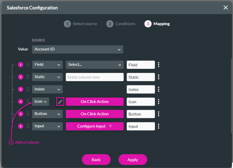
Configure a power table to the Web project.
- On the Mapping screen, add a column.
- Select the Icon option from the drop-down list.
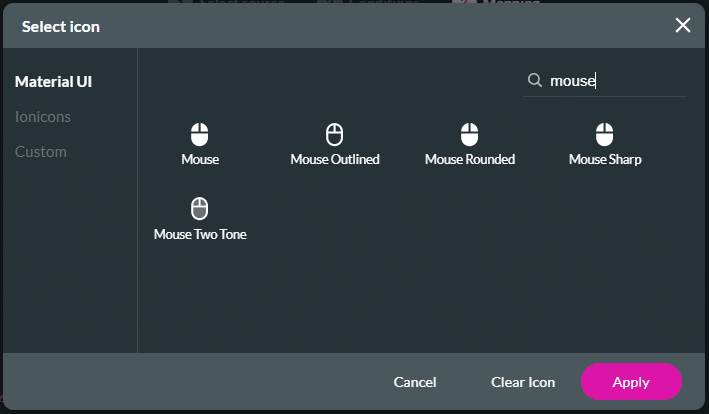
- Click the Edit icon to add an icon. The Select Icon screen opens.
- Under the Material UI option, use the Search field, if necessary, and click an icon to select it.
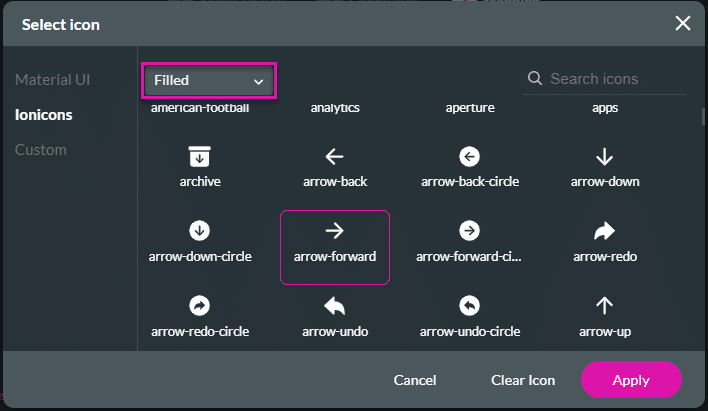
- As an alternative, click the Ionicons option.
- Use the drop-down list to select an option:
- Filled
- Outline
- Sharp
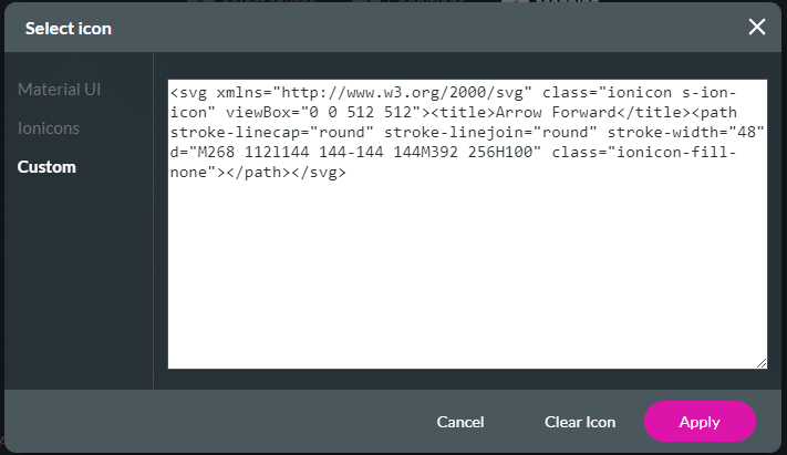
- Alternatively, click the Custom option and add SVG code.
- Click the Apply button.
- Click the button to Configure On Click Action.
- If necessary, change the column’s name in the field.
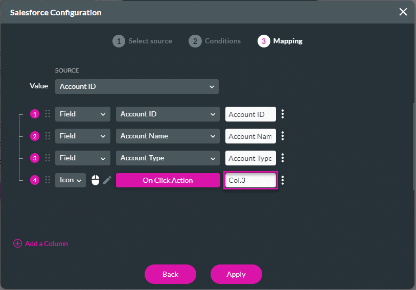
- Click the Apply button. The icon is added to the column where you configured it.
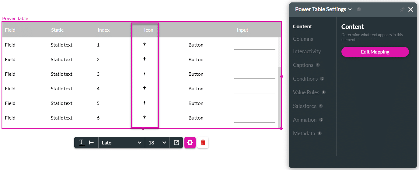
- Save and Preview the project.
Hidden Title
Was this information helpful?
Let us know so we can improve!
Need more help?
Book Demo