Comparison Card Settings
The comparison card attributes are configured using the Comparison Card Settings screen.
The following options are available:
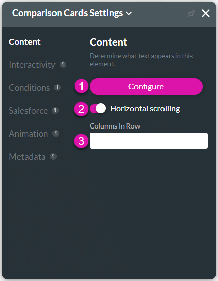
Content
Customize the content options and determine how other elements appear in the comparison card widget.

| # | Option | Function |
|---|---|---|
| 1 | Configure | Configure the widget to compare information in a card format with simple rows and columns. |
| 2 | Horizontal Scrolling | Add horizontal scrolling to the comparison card widget. |
| 3 | Columns in Row | Configure the columns in a row for the comparison card widget when you use a device size of tablet (s) and smaller. |
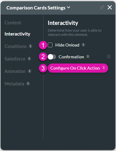
Interactivity
Customize the interactivity options and determine how your user can interact with the comparison card widget.

| # | Option | Function |
|---|---|---|
| 1 | Hide onload | Use the Hide Onload option to hide specific elements on load to control what the user sees. It allows you to hide an element when the page is loaded. |
| 2 | Confirmation | Use the Confirmation function to add a customized confirmation message to clickable elements. |
| 3 | Configure On Click Action | Use the Configure On Click Actions to run actions upon clicking. The On Click Actions option is available for multiple elements, such as text, buttons, shapes, images, and more. |
Conditions
Configure Conditions – Determine what will happen when your user interacts with this element.
Salesforce
Configure Integrations – Integrate data from Salesforce.
Animation
Animation – This option allows you to add visual interest to your screen. Create the illusion of movement when the element shows on the screen. You can set the duration and delay to control the movement and preview by default.
Metadata
Metadata – See how this element is identified in the backend, such as its purpose, content, or function. Your users won’t see this.

