Button Settings
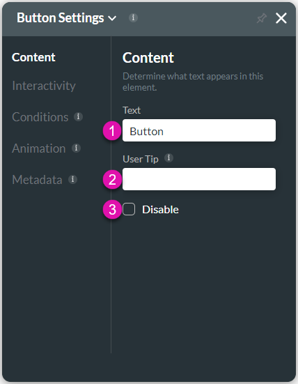
The button attributes are configured using the Button Settings screen.
Content
Customize the content options and determine how the text appears in the button element.

| # | Option | Function |
|---|---|---|
| 1 | Text | This option allows you to add meaningful text or a name for the button. The Text option is available for the Button and Text elements. |
| 2 | User tip | This option allows you to add brief instructions or context to each input field by using User Tips to assist the user in understanding how the data provided contributes to your business. The user tip displays to users when they hover over the element. The User Tip is available for input elements, such as the rich text area, number, text area, and email. |
| 3 | Disable | This option allows the user to view only and will not be able to type any text in this field. The Disable option is similar to the read-only option. This option is available for input elements, such as the rich text area, number, time, and email. |
Interactivity
Customize the interactivity options and determine how your user can interact with the button element.

| # | Option | Function |
|---|---|---|
| 1 | Hide Onload | You can use the Hide Onload option to hide specific elements and to control what the user sees. |
| 2 | Confirmation | The confirmation option is available for different elements, including buttons, shapes, images, text, etc. This option allows the user to confirm their previously selected option. |
| 3 | Inline Progress | You can use this option to show the progress status of a questionnaire in a Form. The Inline Progress is available for the Button element. |
| 4 | Disable on Execution | Use the Disable on Execution option to disable the button when conditions, rules, or actions are running. This option is especially valuable when you don’t want a user to be able to click the button when complex logic is running in the background. |
| 5 | Icon | Use this option to add an illustration drawing to a button. The Icon option displays images or symbols that enable you to identify information easily. You can choose from a variety of custom icons. You can also select icons from Material UI and Ionicons options or write an SVG code to customize an icon. |
| 6 | Tab Order | You can use this option to set which fields must show when the user presses the Tab key. This assists the visually impaired who need to navigate using the Tab key. The Tab Order option is available for different elements, such as the Date Range, Email, or Number field. |
| 7 | Hover Modal | This option can display a custom modal to the user when they hover over the button. You can set an Action Flow that will display when the user hovers on the button. The Hover Modal is available for the Button and Shape elements. |
| 8 | Configure On Click Action | You can use this option to build a process that will be triggered when the button is selected. The On Click Actions option is available for multiple elements, such as text, buttons, shapes, images, and more. |
Conditions
Configure Conditions – Determine what will happen when your user interacts with this element.
Animation
Animation – This option allows you to add visual interest to your screen. Create the illusion of movement when the element shows on the screen. You can set the duration and delay to control the movement and preview by default.
Metadata
Metadata – See how this element is identified in the backend, such as its purpose, content, or function. Your users won’t see this.
Hidden Title
Was this information helpful?
Let us know so we can improve!
Need more help?
Book Demo

