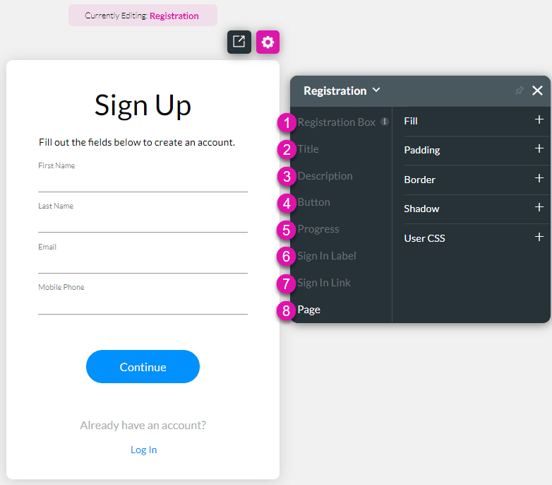
SmartV Styling Registration Screen
You can style the SmartV Registration screen to complement your brand and business needs.
Visit the SmartV Registration page for more information on configuring the SmartV Registration page.

The SmartV Registration screen has several different aspects that you can style in numerous ways, for instance, changing the font (family, color, or size), adding borders, or changing colors and margins.
Below is an example of some of the changed options:

1. Registration Box
Change the styling of the Registration Box. This is the entire registration screen excluding the Page setting (number 8 on the images).
2. Title
Change the styling of the Title, for instance, “Sign Up.”
3. Description
Change the styling of the Description, for instance, “Fill out the fields below to create an account.”
4. Button
Change the styling of the Buttons (Default, Hover, and Clicked), for instance, “Continue.” You can set different styling to default, hover, and clicked buttons. The options are the same under Default, Hover, and Clicked.
5. Progress
Change the styling of the Progress bar. The progress bar that is shown when the user has entered their details and clicked on the button.
6. Sign In Label
Change the styling of the Sign In Label. This is the text that prompts the user to sign up, for instance, “Already have an account?”
7. Sign In Link
Change the styling of the Sign In Link. This is the link that the user must click to open the Registration screen, for instance, “Log in.”
8. Page
Change the styling of the Page. This is the page background behind the Registration Box.
Use the Captions option to change the wording of the following:
- Title
- Description
- Sign In Label
- Sign In Link

