Drawer Settings
The drawer attributes are configured using the Custom Drawer Settings screen.
The following options are available:
Content
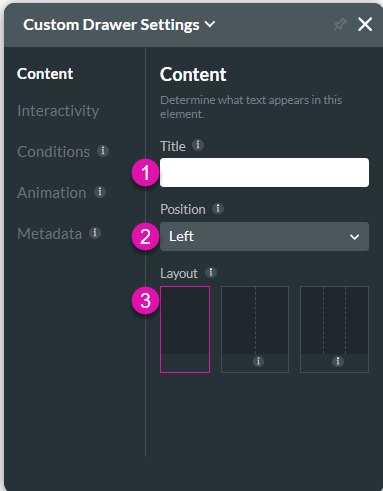
Customize the content options and determine how other elements appear in the Custom Drawer container.

| # | Option | Function |
|---|---|---|
| 1 | Title | The Layout option is available for the Modal and Custom Drawer elements. It allows you to change the column layout. |
| 2 | Position | Use this option to change the position of the modal or drawer on the page. |
| 3 | Layout | The Layout option is available for the Modal and Custom Drawer elements. Use this option to change the column layout. |
Interactivity
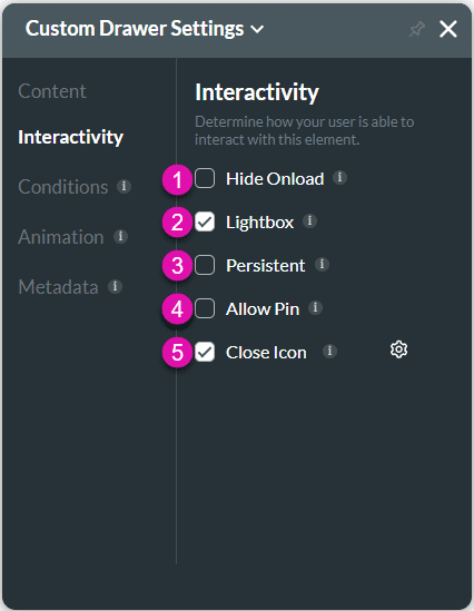
Customize the interactivity options and determine how your user can interact with the Custom Drawer container.

| # | Option | Function |
|---|---|---|
| 1 | Hide onload | Use the Hide Onload option to hide specific elements on load to control what the user sees. It allows you to hide an element when the page is loaded. |
| 2 | Lightbox | The Lightbox option is available for the Custom Drawer element. Use this option to close a drawer by clicking anywhere on the page. If this option is disabled, the drawer must be closed with the Close icon. |
| 3 | Persistent | Use this option to keep the drawer persistently open as part of the web page. |
| 4 | Allow Pin | Use this option to pin the drawer to the web page. You can change the pin and unpin icons. |
| 5 | Close Icon | This option shows the close icon, which you can change. |
Conditions
Configure Conditions – Determine what will happen when your user interacts with this element.
Animation
Animation – This option allows you to add visual interest to your screen. Create the illusion of movement when the element shows on the screen. You can set the duration and delay to control the movement and preview by default.
Metadata
Metadata – See how this element is identified in the backend, such as its purpose, content, or function. Your users won’t see this.

