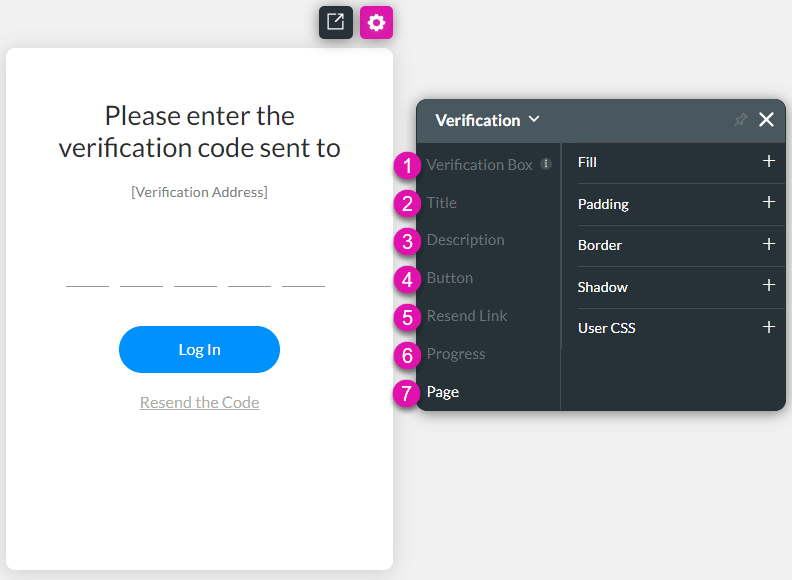
SmartV Verification Screen Styling
You can style the SmartV Verification screen.
Visit the SmartV Verification page for more information on screen for more information on configuring the SmartV Verification screen.

The SmartV Verification screen has several different aspects that you can style in numerous ways, for instance, changing the font (family, color, or size), adding borders, or changing colors and margins.
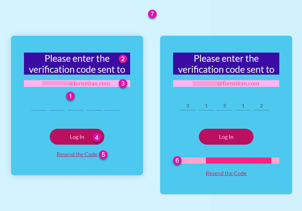
Below is an example of a Verification screen, which has been styled using the above options.

Verification Box
Change the styling of the Verification Box. This is the entire verification screen excluding the Page setting (number 7 on the images).
Title
Change the styling of the Title, for instance, “Please enter the verification code sent to.”
Description
Change the styling of the Description, for instance, “[email protected].”
Button
Change the styling of the Buttons (Default, Hover, and Clicked), for instance, “Continue.” You can set different styling to default, hover, and clicked buttons. The options are the same under Default, Hover, and Clicked.
Progress
Change the styling of the Progress bar. The progress bar that is shown when the user has entered the verification code and clicked on the button.
Resend Link
Change the styling of the Resend Link. This is the link that the user must click to have the verification code resent.
Page
Change the styling of the Page. This is the page background behind the Verification Box.
Use the Captions option to change the wording of the following:
- Title
- Resend Link
Use the static text for the verification address on the Log In screen’s settings to change the wording of the Description.

