

Shapes Styling
Shapes are simple, closed geometric elements used for visual purposes, such as rectangles, circles, triangles, and stars.
These shapes can also be made interactive to increase user engagement and trigger actions. For this reason, Titan provides three states for the shapes: Default, Hover, and Clicked. Setting different colors, strokes, or sizes will create the effect you want.
The ratio of the shape elements is fixed, and changing their width automatically adjusts their height and vice versa. It is not possible to drag input fields, such as text, inside a shape.
You can configure different styling options for shape elements on the Project Style Level and Element Style Level.
The Three Shape States

| # | Option | Function | Available in Project or Element 
|
|---|---|---|---|
| 1 | Default | The Default option refers to the basic state of a shape element. This state is when it is not hovered or clicked on but simply visible. | 

|
| 2 | Hover | This refers to the state of the shape element once the user hovers over it with the mouse. |
|
| 3 | Clicked | This refers to the state of the shape when the user clicks it. |
|
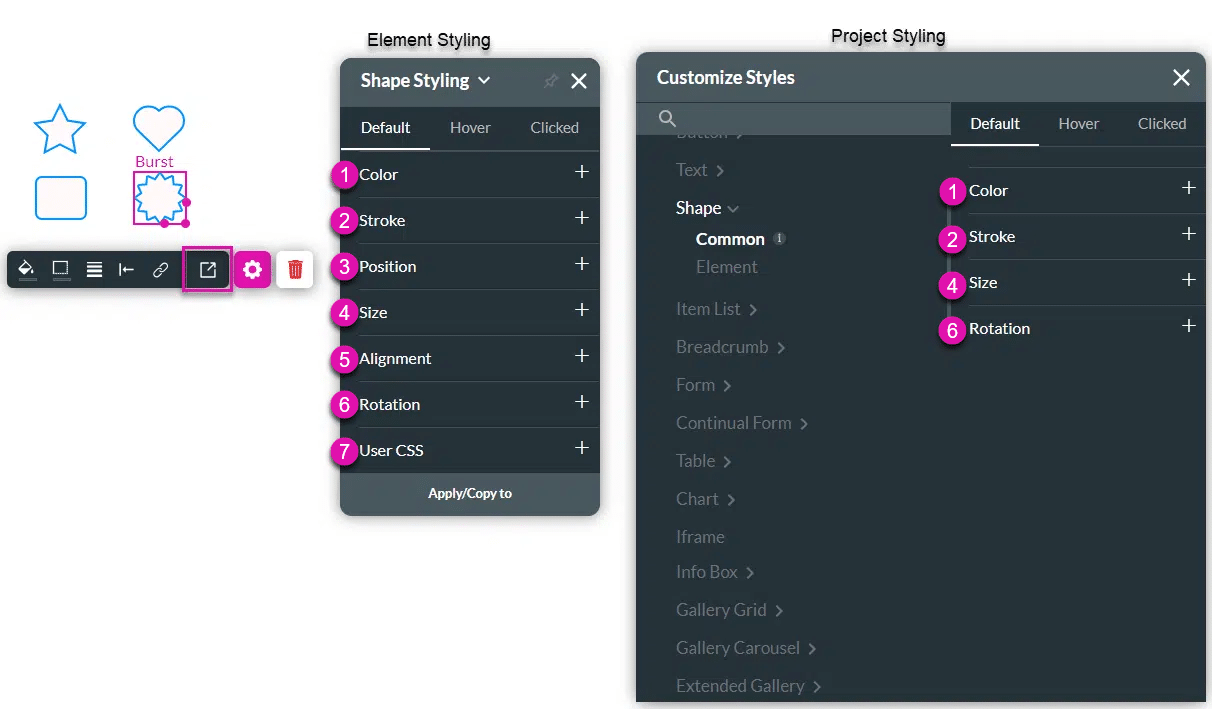
| # | Option | Function | Available in Project or Element
|
|---|---|---|---|
| 1 | Color | This option allows you to set a fill color for the shape. The color can be selected from a color palette or by specifying a HEX color code. |
|
| 2 | Stroke | The Stroke option refers to the outer contour of the shape. It allows you to make the stroke visible or invisible and change the weight or color. |
|
| 3 | Position | You can use this option to change the shape’s location in the content area on the x- and y-axis (left/right/top/bottom). Position also allows you to make the shape float over its parent container or over the entire page. “Float over Parent” allows you to set the location of the shape within the box containing it, e.g. container or strip. “Float over Page” allows a user to configure the location of the shape inside of the entire page (and have it stay in the same location even when the user is scrolling in it). |
|
| 4 | Size | This option allows you to change the width and height of the shape element. Since the shape has a fixed ratio, changing its width will automatically adjust its height and vice versa. |
|
| 5 | Alignment | Use Alignment to set the shape element to a vertical or horizontal position in relation to its container (left/center/right/top/middle/bottom). It also allows you to set the position of a few elements in relation to each other. |
|
| 6 | Rotation | You can adjust the shape to rotate in different directions (in 90-degree jumps): 0, 90, 180, or 270 degrees. |
|
| 7 | User CSS | Cascading Style Sheets (CSS) allow a user to apply styles to the shape with CSS code. Note: For Project styling, CSS is accessed via the Tools menu, which you can read about in our Style Elements Using User CSS article. |
|
Hidden Title
Was this information helpful?
Let us know so we can improve!
Need more help?
Book Demo