

Customize the Y-Axis Format on a Chart
Business Background
Customize the axis of a chart to suit your business needs.
Titan Solution
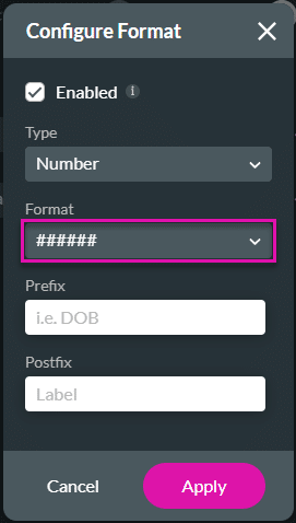
- You can now define the Y-axis of a chart with a different structure (#####.## for a number field).
- When you sum percentages or long decimal numbers from Salesforce, you could shorten them by using formatting in Titan Web so that the labels will fit the chart and won’t be too long.
How to Guide
This functionality applies to all charts.
Path:
As an example:
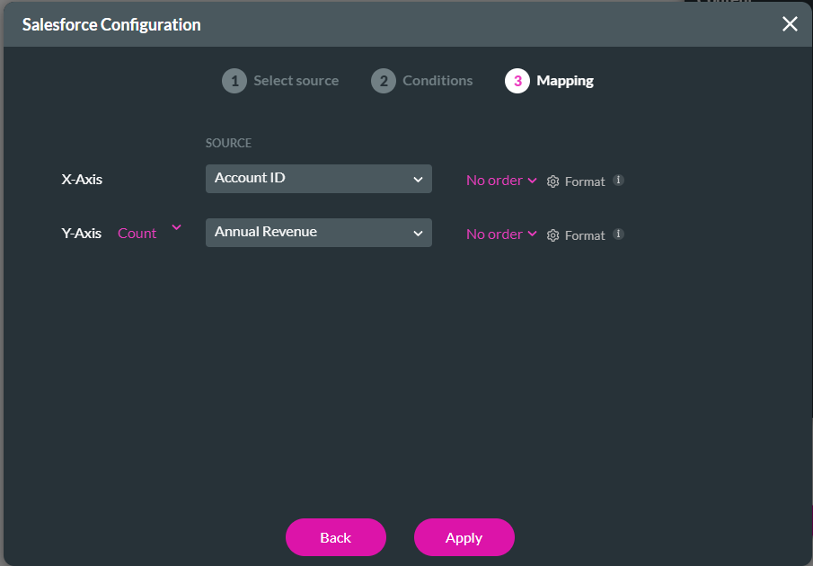
Customize the Y-Axis format: Add (new) element > Chart > Bar Chart Configuration > Mapping Y-Axis > Format settings
Customize the X-Axis format for existing element: Bar Chart > Settings > Content > Edit Mapping > X-Axis > Format settings
- Click the + icon to open the list of elements.
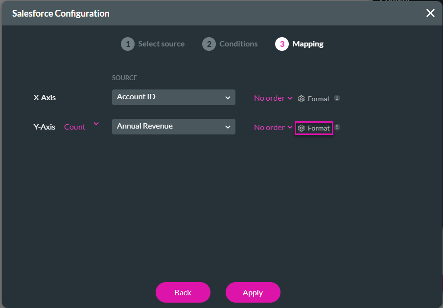
- Click-and-drag the Bar Chart element to the canvas. The Chart Configuration screen.
- Configure the Source and Conditions as required.
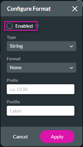
- Click the Format Gear icon. The Configure Format screen opens.
- Click the Enabled checkbox.
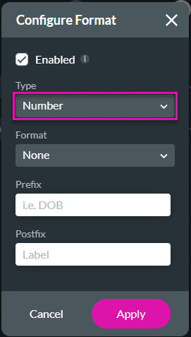
- Use the drop-down list and select a type, for instance, Number.
- Use the drop-down to choose a format, for example, ######.
- Click the Apply button.
- Click the Apply button.
Hidden Title
Was this information helpful?
Let us know so we can improve!
Need more help?
Book Demo