

Custom Themes – Affected Elements
Business Background
Custom website themes provide your business with several advantages, including:
- Branding: Create a unique look and feel for your website that reflects your brand identity. Use custom colors, fonts, and other design elements and create a website that stands out and reinforces your brand message.
- User experience: Improve the user experience by making the website more visually appealing and easier to navigate. A well-designed theme can make it easier for your users to find what they’re looking for. This will make them more likely to stay on the site and engage with the content.
- Competitive edge: Create a unique and memorable website, and gain a competitive edge over other companies in your industry. A well-designed website can help to establish a strong online presence and make your business more visible and inviting to existing and potential customers.
Titan Solution
It has always been easy to configure a unique and effective online presence by using custom styling for the elements in Titan’s products. Now it is even easier as you can add custom themes to your web page that will affect all the elements in the project.
- You can customize the font, colors, and inputs to enhance your branding and customer experience.
- Make sure you have a competitive advantage and improved accessibility with Titan Web’s custom themes that can be used across all your projects (if necessary) for a consistently branded appearance.
How to Guide
Learn how to create your custom themes.
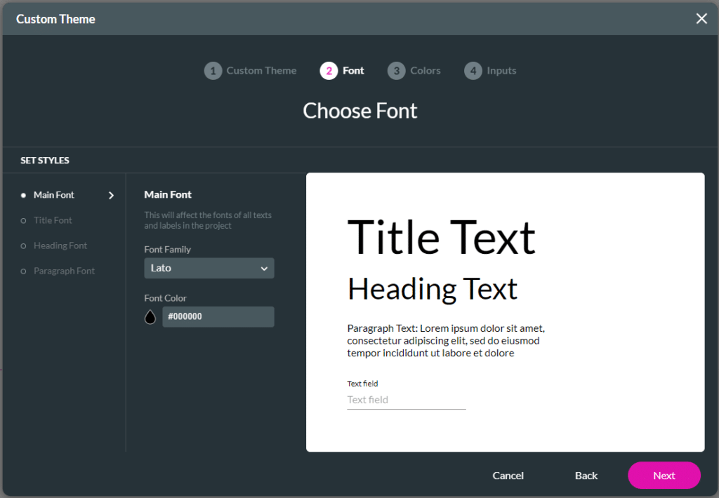
Font
The following elements are affected when you change the font.
| Font | Type | Affected Elements |
|---|---|---|
| Main Font | Font Family | All text elements |
| Font Color | Title, heading, subhead, paragraph, caption Line color | |
| Title Font | Font Family | |
| Font Color | Only title | |
| Heading Font | Font Family | |
| Font Color | Only heading | |
| Paragraph Font | Font Family | |
| Font Color | Only paragraph |
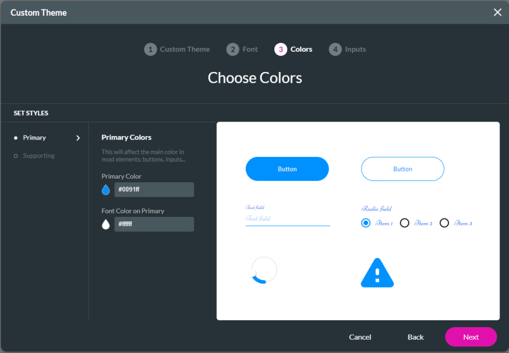
Colors
The following elements are affected when you change the colors.
| Color | Affected Elements |
|---|---|
| Primary Color | Primary button – fill and border color Secondary button – border color and text of button Link default color (hover and clicked use secondary color) Shape stroke color Icon – color Standard inputs – primary color mainly for line/border Date modal – header fill, selected fill, button text Circular slider – slider – knob color, and also strip – progress File upload – input – border, icon – color Signature – input border Table view – scrollbar – thumb color, icon – color Power table – scrollbar – thumb color, icon – color Chart – first color Tab – indicator – fill, icon-color, selected tab – font color Stepper – icon – color – active and completed Drawer – toolbar – fill Infobox (widget) – icon- color Progress (widget) – root-color Badge counter (widget) – badge – fill Log in form (widget) – button – fill Scheduler – calendar – calendar -selected day – fill, border Scheduler – time slot button – hover and clicked – fill Table pricing – group header – fill Table pricing – total block – fill Tracker – group track value – fill Yes No – yes – default – color Range – handle – hover/clicked/selected – fill Range – bubble – color Matrix – radio – color Ecommerce – product – add to cart button – fill Ecommerce – cart icon – badge – fill |
| Font color on primary | Primary button – text of button Date modal – header font, selected font, Stepper – icon text – color – active Drawer – title -font, icon-color Badge counter (widget) – badge – font Log in form (widget) – button – font Scheduler – calendar – calendar -selected day – color Scheduler – time slot button – hover and clicked – font Table pricing – group header title – font Table pricing – group header subtotal – font Table pricing – group header sub price – font Table pricing – group icon – color Table pricing – group checkbox – color Table pricing – total label – font Table pricing – total value – font Range – label – font Ecommerce – product – add to cart button – font Ecommerce – cart icon – badge – font |
| Secondary Color | Item list – item – fill -default (for hover and clicked use primary) Multi-select picklist – item – fill Modals header/footer – fill Table view – table header – fill, button – fill Power table – header row – fill Table list – list header – fill Chart – second color Form – submit button-fill (also prev/next/reset buttons) Continual form – back button /next button – fill, and also progress – color Accordion – panel – fill Stepper – button – fill – default Multi-step container – button – fill Date range (widget) – control – selected range – fill, border Scheduler – profile – root – fill Scheduler – form – button – default – fill Scheduler – confirm modal – button – fill Scheduler – time slot – hover and clicked – font Scheduler – time slot button – default – fill Stripe – button – default – fill Rating scale – item – hover/clicked/selected – fill Star rating – icon – hover and selected – color Yes No – yes – hover and clicked – color Range – active line – fill Range – handle – default – fill Survey ranking – handle – color |
| Font color on secondary | Item list – item – font – default (for hover and clicked use primary color) Multi-select picklist – item – font Modals header/footer – font Table view – table header – font, button-font Power table – header row – font Table list – list header – font Form – submit button-font (also prev/next/reset buttons) Continual form – back icon /next icon – color Accordion – root – font, accordion panel icon – color Stepper – button -font – default Multi-step container – button – font Date range (widget) – control – selected range -color Scheduler – profile – name – font, profile – header – font, profile – description – font Scheduler – form – button – default – font Scheduler – confirm modal – button – font Scheduler – time slot button – default – font Stripe – button – default – font Rating scale – item – hover/clicked/selected – font |
Learn more about Titan for Salesforce.
Hidden Title
Was this information helpful?
Let us know so we can improve!
Need more help?
Book Demo