

Contact Us Form Template
Business Background
Templates are pre-designed structures that help streamline form creation, data collection, or workflow automation. They ensure consistency, save time, and reduce manual effort across various applications.
Add structured forms to your project to enable you to add input or text fields to cells. You can design the form, add conditional logic, or merge cells in a row to suit your requirements.
Titan Solution
Titan provides a basic template for quickly creating a simple form in just a few clicks. This article demonstrates the creation of a Contact Us form, but the same steps can be used to create similar forms, such as Event Registrations.
How to Video
- 0:00 – Introduction
- 0:25 – How to Set a Responsive Contact Us Form
- 0:37 – Edit the Form
- 1:12 – Add Input Fields to the Form
- 2:19 – Rename Input Fields
- 2:51 – Add Static Values to Radio Element
- 3:30 – Add a Submit Button
- 4:12 – Save and Preview the Project
- 4:27 – Change Device Layouts
- 4:40 – Quick Overview of the Template
- 4:55 – Quick Reference to Styling
- 5:11 – Conclusion
How to Guide
Download the template
- Download the Titan Web project zip file.
- On the Titan Dashboard, click the Kebab icon to import the project. The standard Open file dialog is shown.
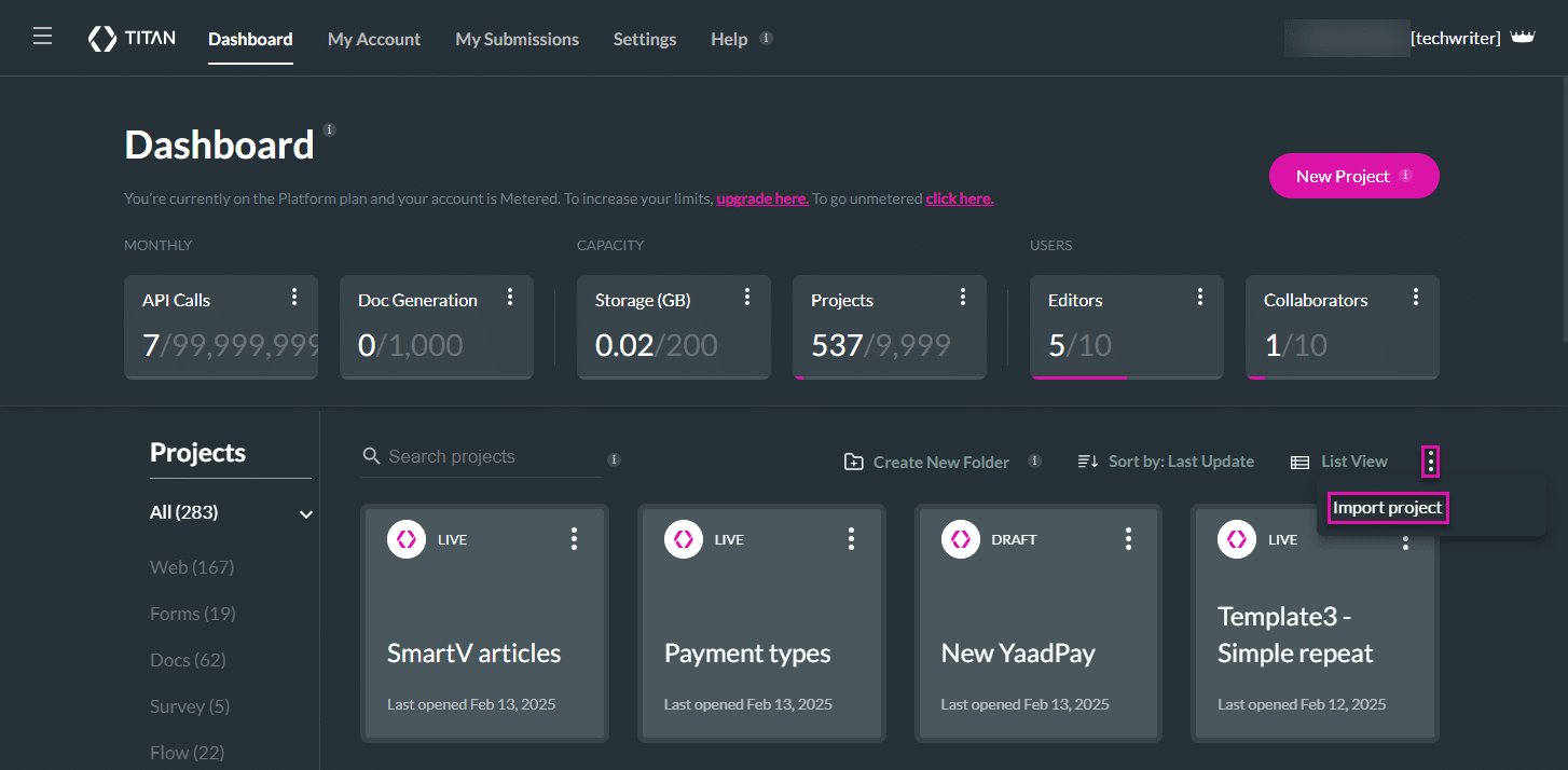
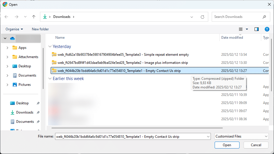
- Select the downloaded zip file and click the Open button.
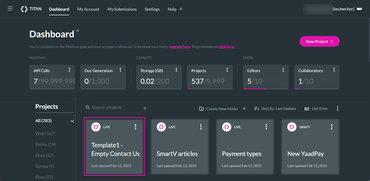
- Click the template project to open it.
Configure a Contact Us form
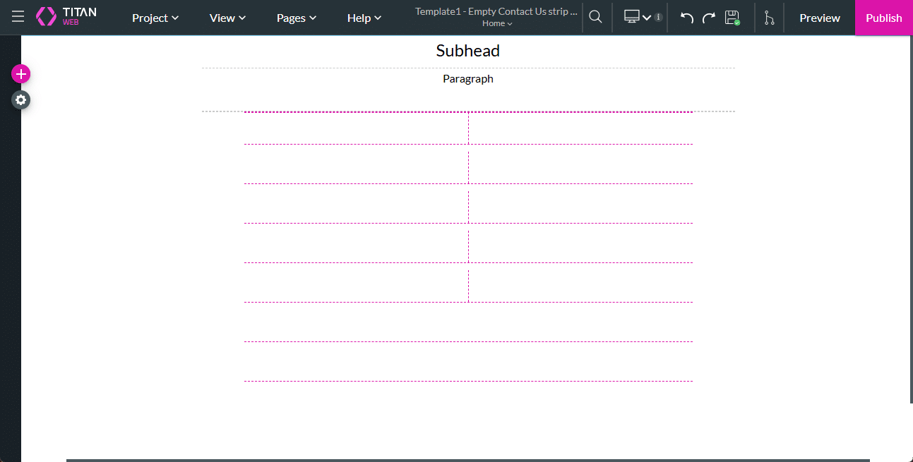
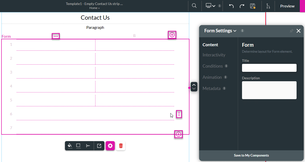
The Titan Web project will open with the following:
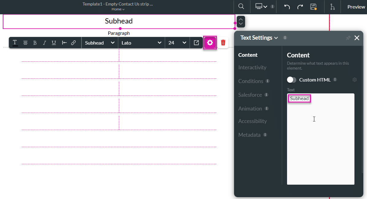
- Subhead text element
- Paragraph text element
- Form element with 2 columns
- Click the Subhead text element’s Gear icon and change the text to “Contact Us.”
- Edit the form if necessary.
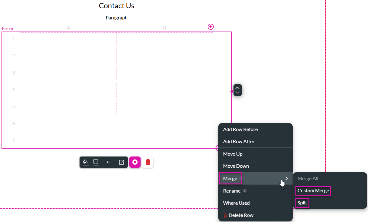
- Learn more about adding and editing columns
- Learn more about adding and editing rows
- Click the + icon(s) to add columns or rows.
- Click the Kebab icon(s) to edit columns or rows.
- Merge or split rows.
- Click the + icon to open the list of elements.
- Select the Input option and drag-and-drop the required elements to the form.
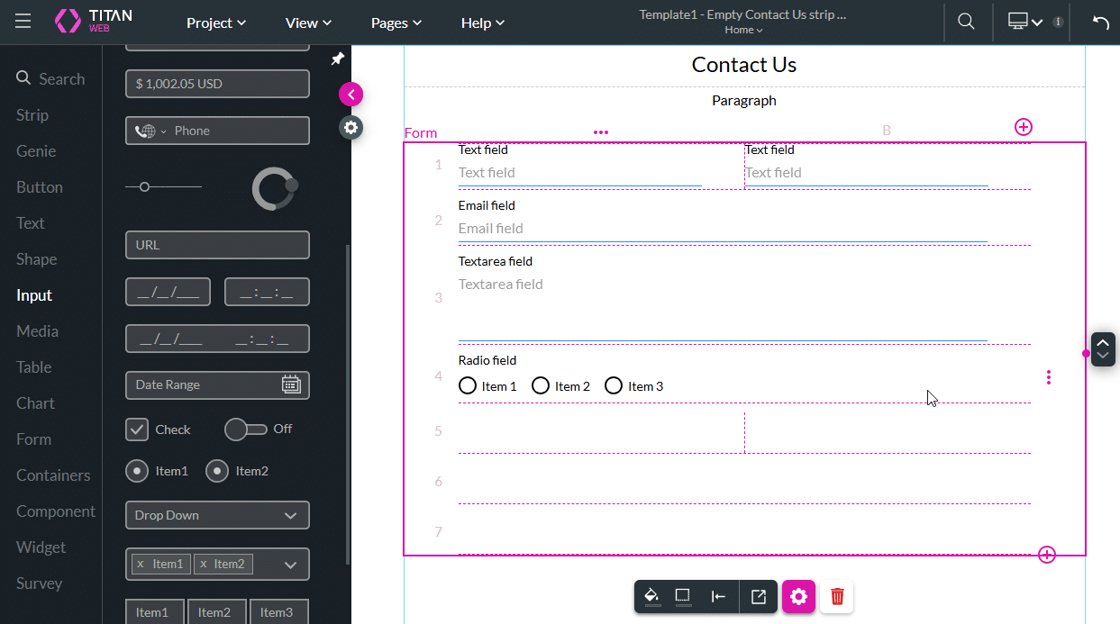
- Rename the input fields by clicking the Gear icon of the element and changing the label.
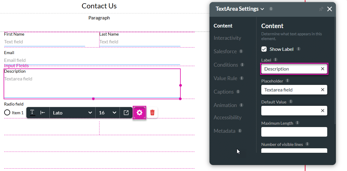
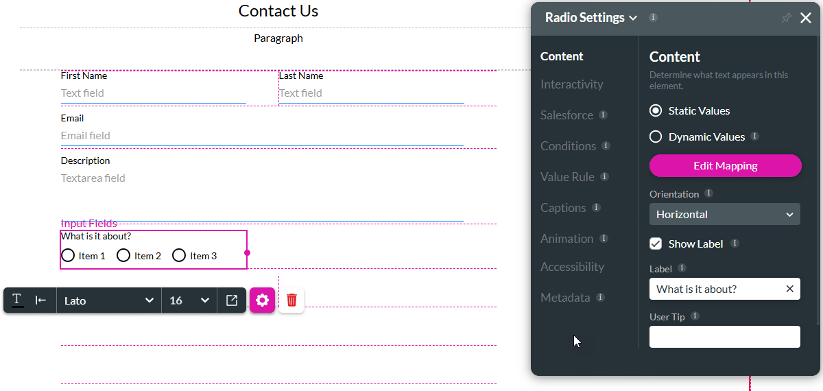
- Click the radio field element’s Gear icon and change the label.
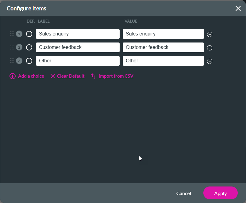
- Click the Edit Mapping button to add static values.
- Type the required text in the label and value fields.
- Click the Apply button.
- Click the + icon to open the list of elements.
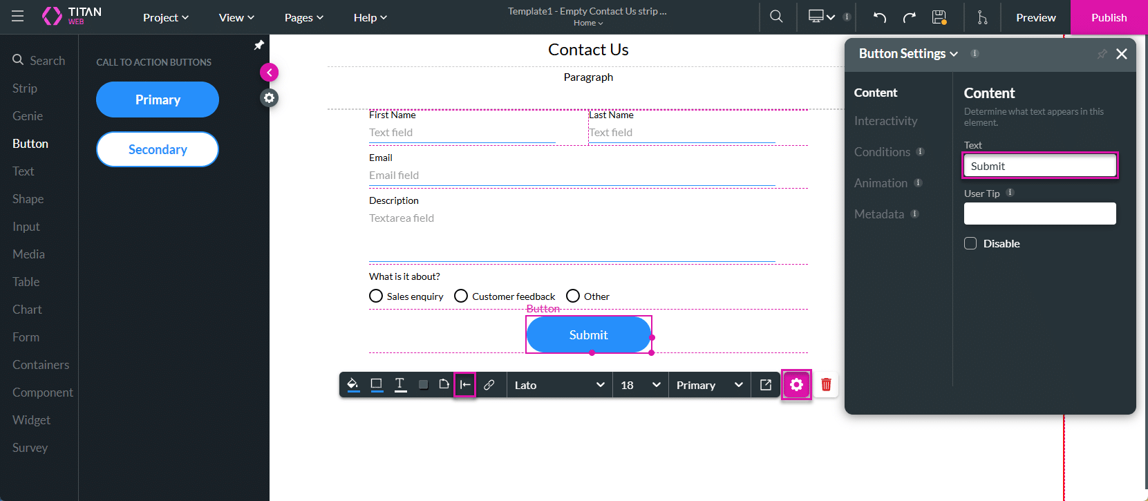
- Select the Button option and drag-and drop a button to the form.
- Click the button’s Gear icon and change the text field.
- Use the Alignment icon to center the button.
- If necessary, use the Paragraph text field to add any information to the form, such as company details and logo. In this example, the element is deleted.
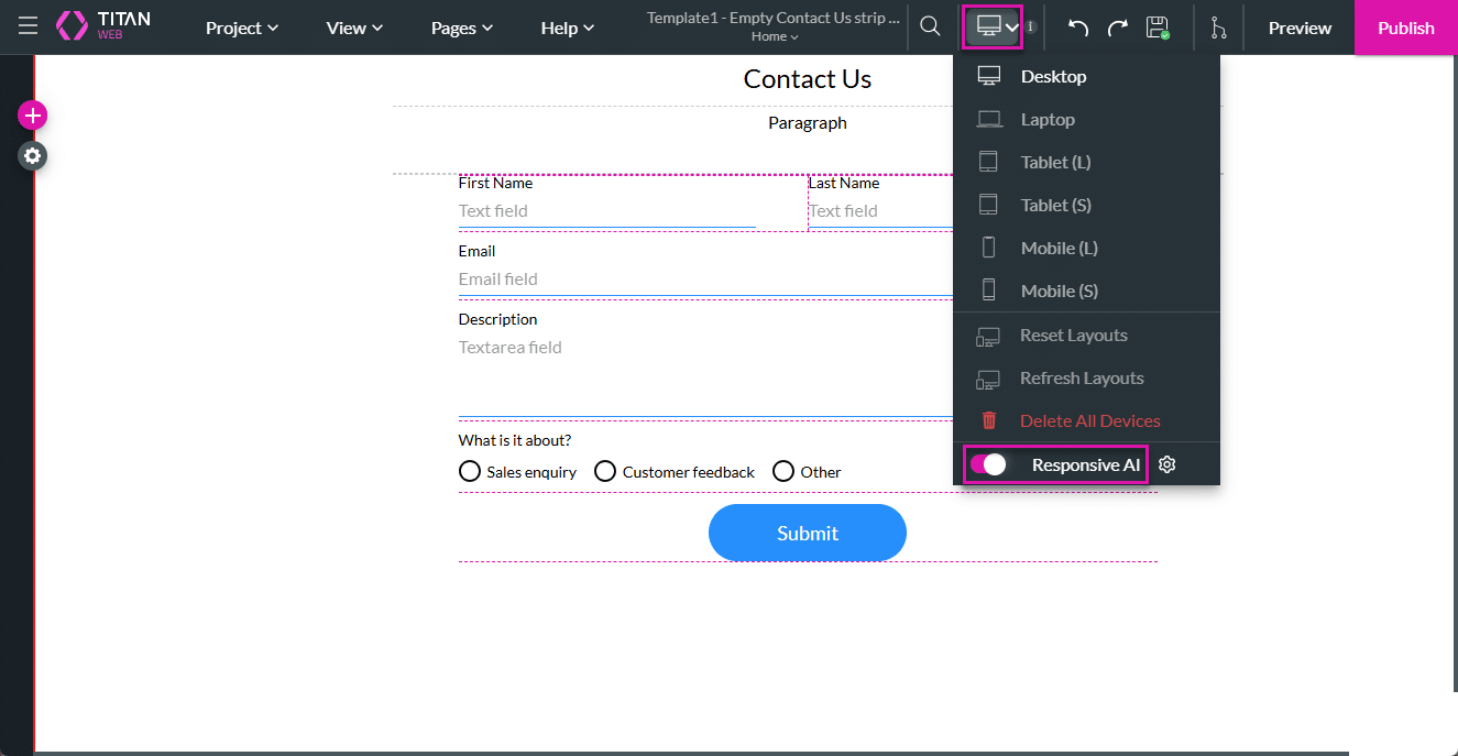
- Click the Device drop-down icon.
- None of the device layouts were configured.
- The Responsive AI option is enabled by default. Titan doesn’t change the structure of your project; it just makes it smaller to match the device.
- Save and Preview the page.
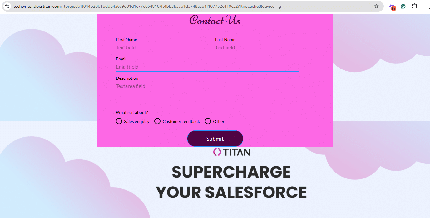
The page is, by default, shown for desktop size (device=lg).
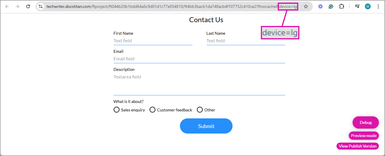
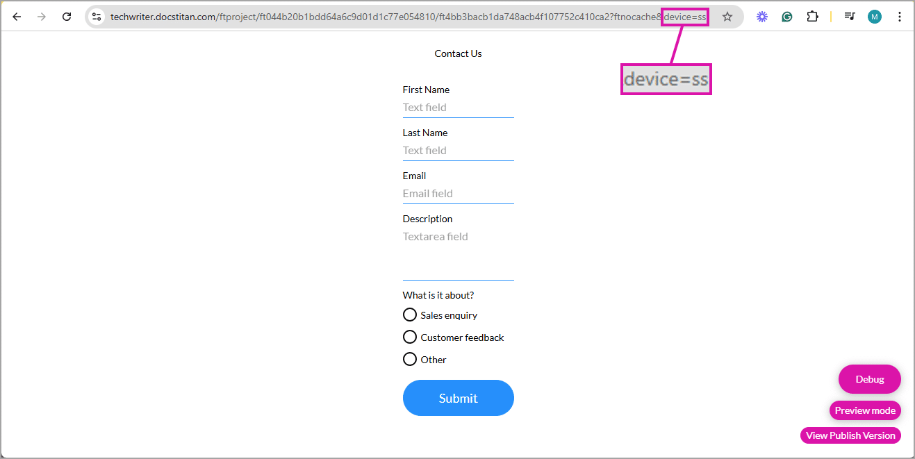
Change the query string to specify the device layout. You can edit the URL to match the device type by using the required device code:
- lg – desktop
- md – laptop
- sml – tablet large
- sm – tablet small
- xs – mobile large
- ss – mobile small
This template allows users to create versatile forms for gathering information from end users, which will display seamlessly on any device size.
Style the contents
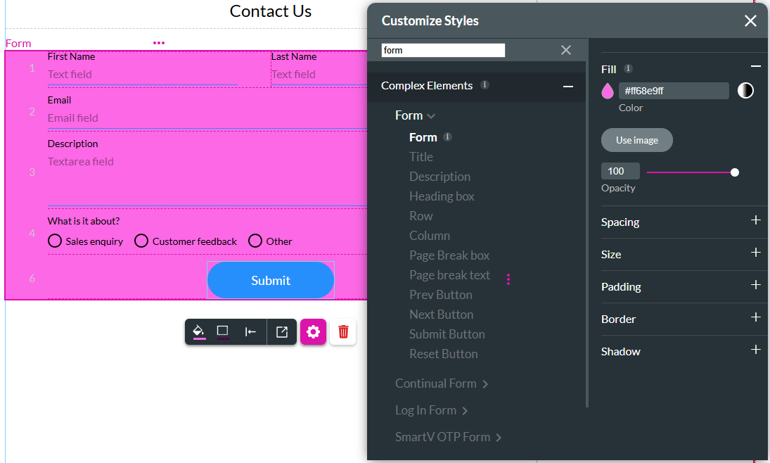
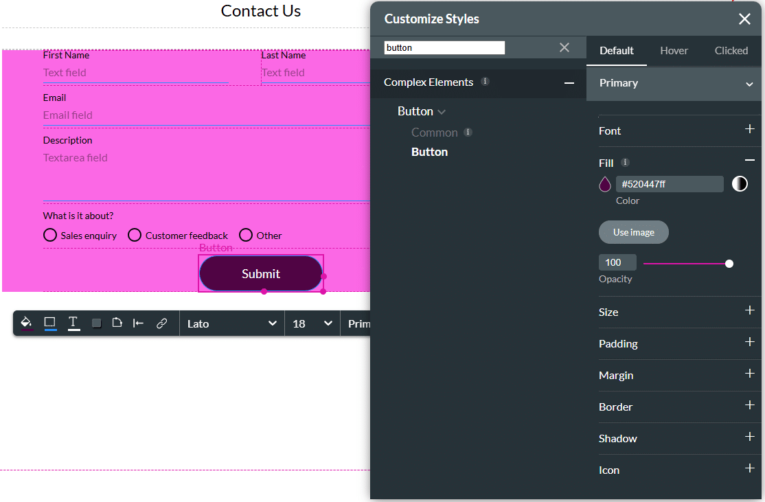
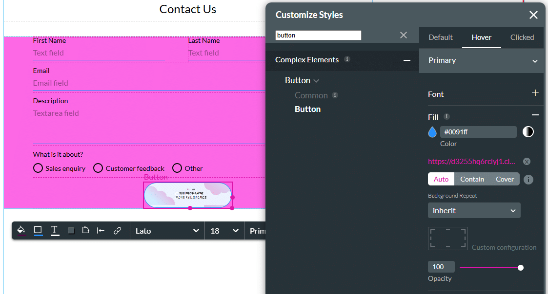
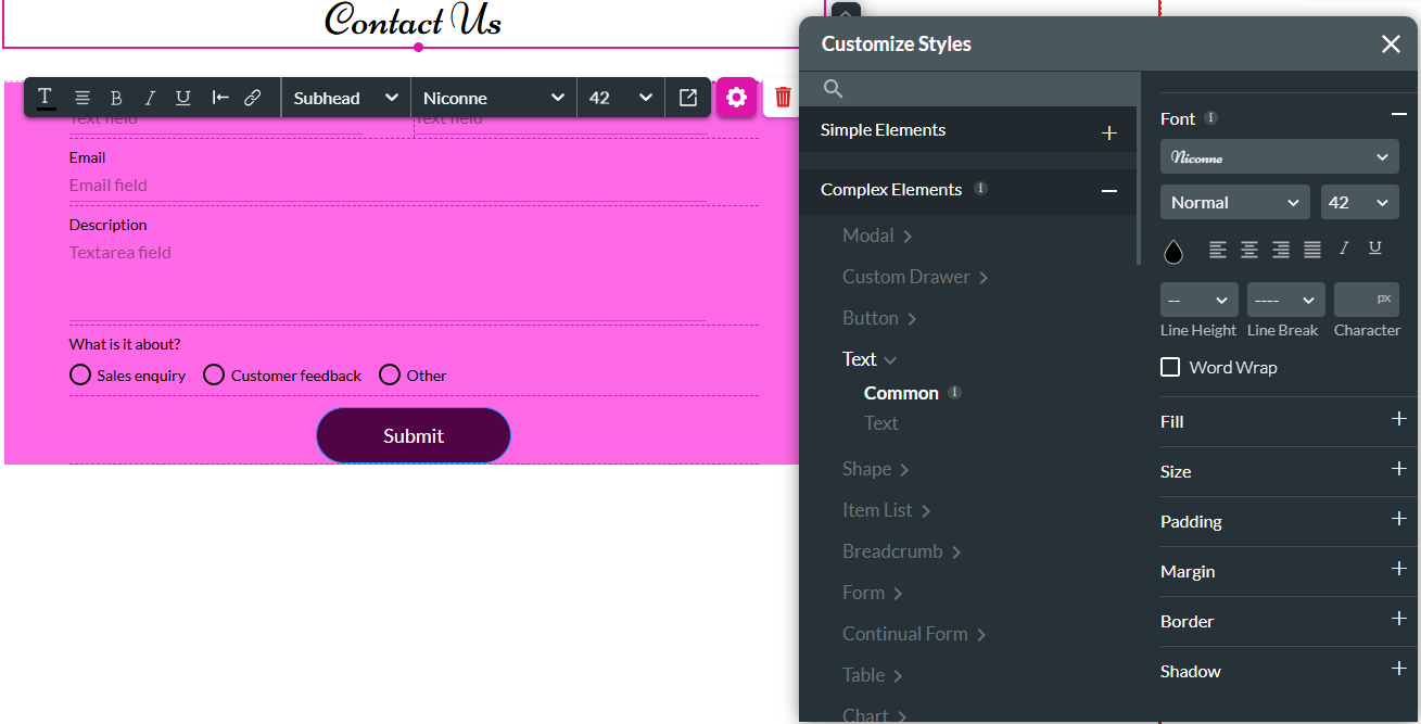
The form can be styled using the following option:
Project > Style > Configure
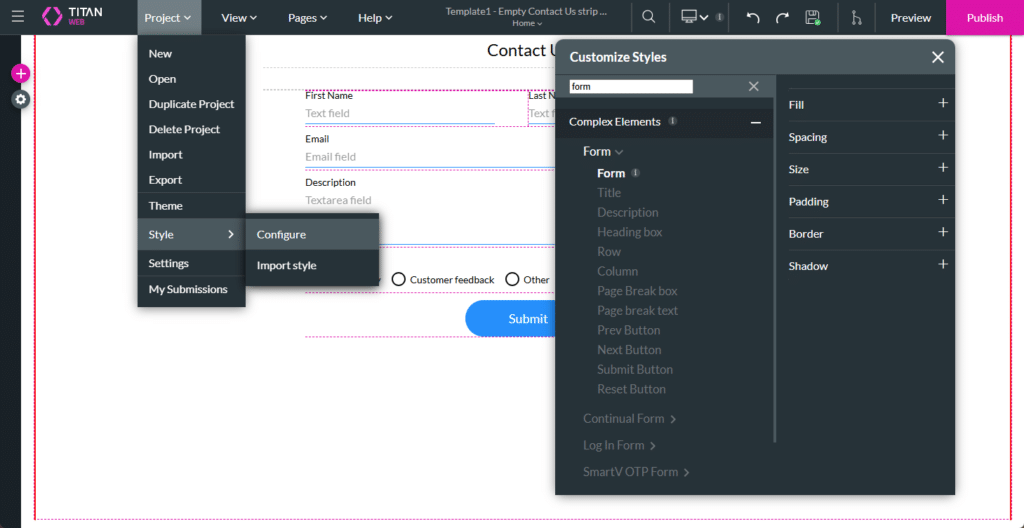
You can style the page in different ways. Here are some examples:
- Change the form’s fill to any color that suits your branding.
- Style the default, hover and clicked states of the button.
- Add an image to the button.
- Change the font qualities of the text elements.
- Add a background image to the strip.
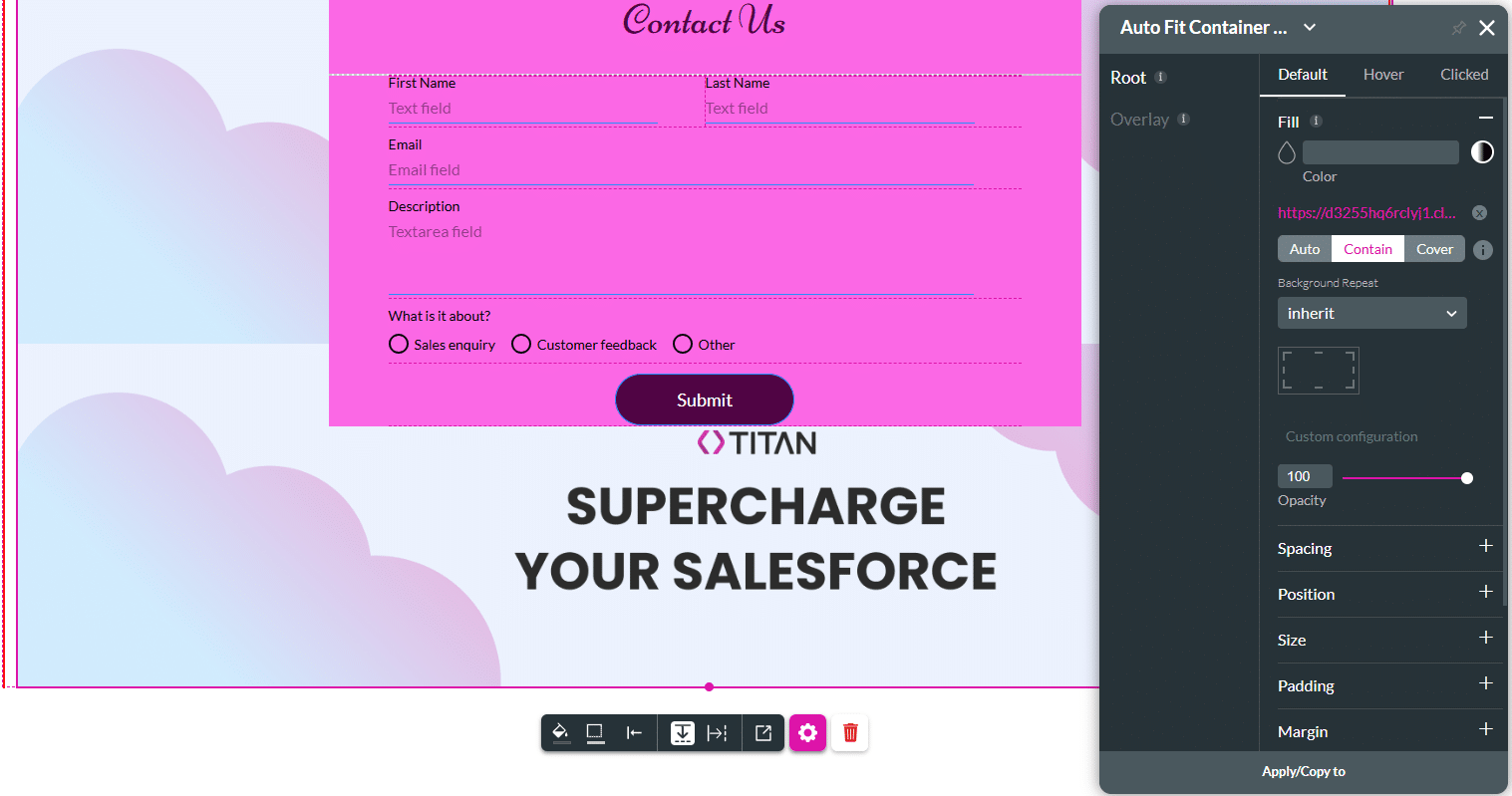
The styling is shown in the preview.
For more information about My Strips, watch the following video: