Configure Element Settings
Business Background
Create custom settings for each interactive element. This can improve user experience and help build brand identity. Set a uniform style for each element or signer for consistency in the document’s look and feel.
Titan Solution
Titan lets you style the interactive elements in a few simple clicks. The styling is applied per element, making the document customizable for your business.
How to Video
Video Coming Soon!
How to Guide
Learn how to Configure elements of your document.
The following tabs are used to change the settings of the interactive elements. Different elements have different options for these tabs.
General
Some General options are unique to an element, but several are the same for different elements.
Here are some examples of General settings that are unique for the following elements:
Date
Add a date to your document.
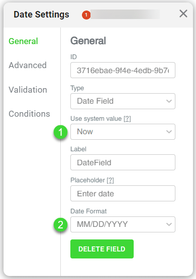
- Use the drop-down list to select a system value:
- None
- Now
- Current year
- Current month
- Current day
- Use the drop-down list to select the date format for the Signature Date, Date Field, and Date Time Field elements. The options are as follows:
- MM/DD/YYYY
- DD/MM/YYYY
- On the Time and Date/Time elements, use the dropdown list to select a time format.
- 12
- 24
Signature
Change the settings for the signature element.
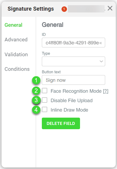
- Create custom button text to provide instructional information to signers.
- Use the textbox to activate the facial recognition mode and add an extra layer of security. The signer’s facial photo must be saved in Salesforce, for instance, as a URL or in a rich text field.
- Use the textbox to disable the option to upload a file to the element.
- Use the textbox to activate the inline draw mode for the element for a user to sign directly on the element.
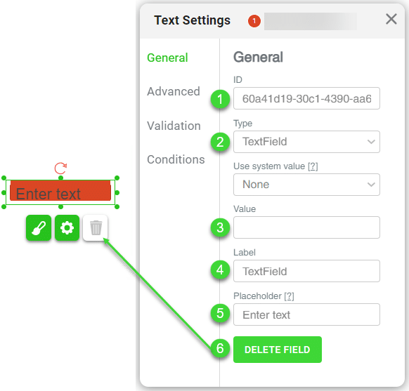
Text
Allow signers to provide free-form text information.

- Use the drop-down list to select a system value option:
- None
- Language
- Current year
- Current month
- Current day
- Current hour
- Current minute
- Browser
- IP
- Now
- Today
- User agent
- Link
Use email addresses from Salesforce.

- Use the drop-down list to select a system value option:
- None
- Language
- Current year
- Current month
- Current day
- Current hour
- Current minute
- Browser
- IP
- Now
- Today
- User agent
- Link
- Use the checkbox to send the email to the filler to send an email to the person who filled in the form. An Edit button is added to the screen, and you can configure the email that will be sent.
- Use the following fields that are the same for most elements:
- ID: The ID field contains the unique system ID of the interactive element and is not editable.
- Type: Use the Type drop-down list to change the selected element to another type of element.
- Value: Type a value that will be shown on the element.
- Label: Use the label to track and map and identify elements.
- Placeholder: The placeholder text is shown in the element on the document.
- Delete button: Use the Delete button to delete the element. The Delete icon next to the Gear icon does the same.
Advanced
Here are some examples of Advanced settings for the following representative elements:
Date
Change the settings for the date element.
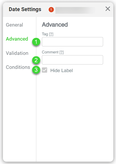
- Use the field to add the following:
- Tag: Give each element a unique name. This helps a lot when you have many elements on a document.
- Comment: Add more identifying information to the element. This makes tracking the element easier if the comment describes, for instance, the purpose.
- Use the checkbox to unhide the label if necessary.
Signature
Change the settings for the signature element.

- Use the field to add the following:
- Tag: Give each element a unique name. This helps a lot when you have many elements on a document.
- Comment: Add more identifying information to the element. This makes tracking the element easier if the comment describes, for instance, the purpose.
- Use the checkboxes to add the following:
- Personal Signature: This is a person’s own signature as opposed to a company signature.
- Company Signature: The company signature usually contains the name and registration number of the company and often includes the authorized person’s written signature above it.
- Use the fields to set the following:
- Tag: Define a meaningful name for the element in the back end.
- Comment: Provide a short description.
- Click in the checkbox to unhide the label. The label is hidden by default.
Validation
Here are some examples of General settings for the following elements:
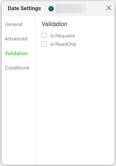
Date
Use the checkboxes to select whether a date is required and/or read-only.
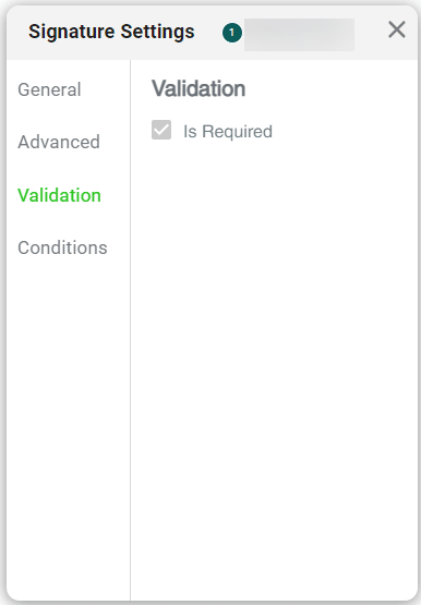
Signature
Use the checkboxes to select whether a signature is required.
Text
Use the checkboxes to select options for the text element:
- Is Required: This element is mandatory and the user must complete it.
- Is ReadOnly: This element is read-only and the user cannot make any changes.
- Use RegExp: Force a user to only add information according to the regular expressions you configured.
- Use Mask: Set the format for an input field. The chosen option will display once the user has completed the field with the valid information. For example, you can type a phone number mask as follows: nnn-nnn-nnnn.
- Max length: Add a maximum length for the text field in the field.

- Click in the checkbox to set the validation as follows:
- Is Required: Enable mandatory fields.
- Is ReadOnly: Enable read-only fields.
- Use RegExp: Enable regular expression search.
- Use Mask: Enable to display the data filter masking.
- Use the field to add a maximum length for inputs.

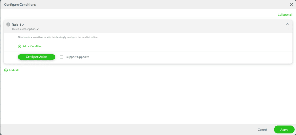
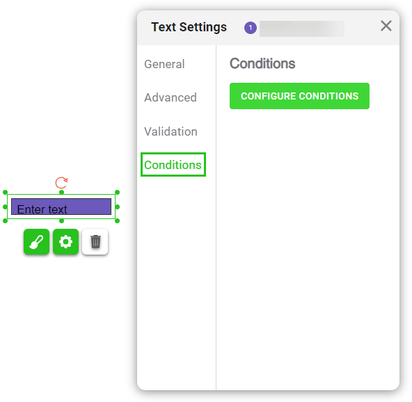
Conditions
- Click on the Configure Condition button to configure conditions for the interactive element.
- You can create custom conditions to validate the data provided and the results.
The Configure Conditions screen opens.