

Size Styling
Business Background
Change the size of the root on an input element.
How to Guide
Use the Size option to customize elements in Web projects.

| # | Option | Function |
|---|---|---|
| 1 | Width and Height | The width option allows you to adjust the value of the element’s width and/or height. |
| 2 | Inherit from styles | This option allows you to inherit style from other elements except for the size. |
| 3 | Auto-resize height | The Auto-resize height checkbox allows you to resize the element according to the height of the contents vertically. |
| 4 | Auto-resize width | You can use the Auto-resize width checkbox to resize the element according to the width of the contents horizontally. |
| 5 | Min and Max Height | You can adjust the minimum or maximum height in the fields. |
| 6 | Min and Max Width | You can adjust the minimum or maximum width in the fields. |
Real-Life Example of How to Configure Size
Join us as we examine one of the many ways you can style an input element using the Size setting. Alternatively, contact us today if you have a specific business use case in mind.
The example below shows how to change the size of the root.
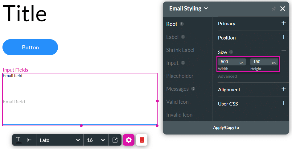
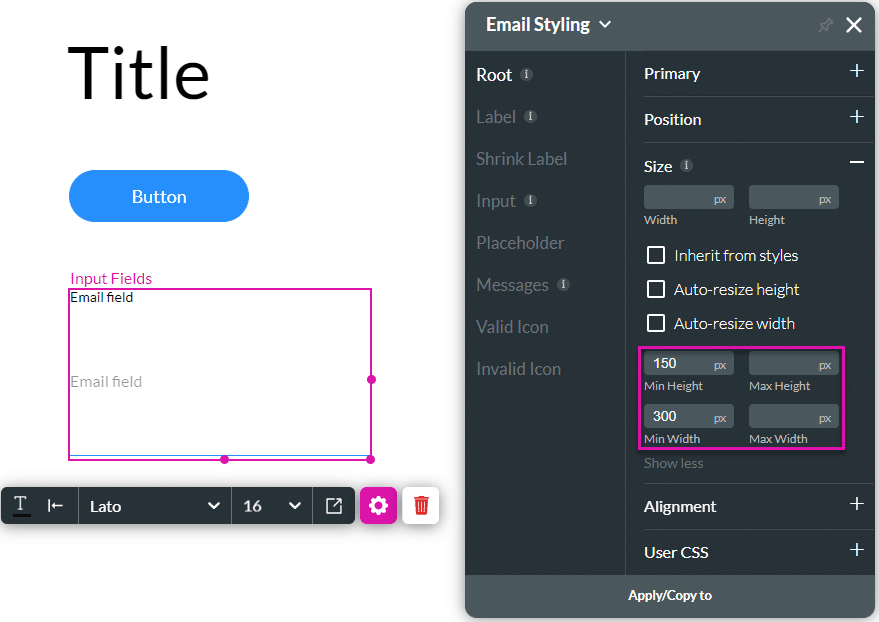
- Click the Input Styling icon to open the Styling panel.

- Click the Size option.
- Change the width and/or height.
- Click the drop-down list to open the size units.
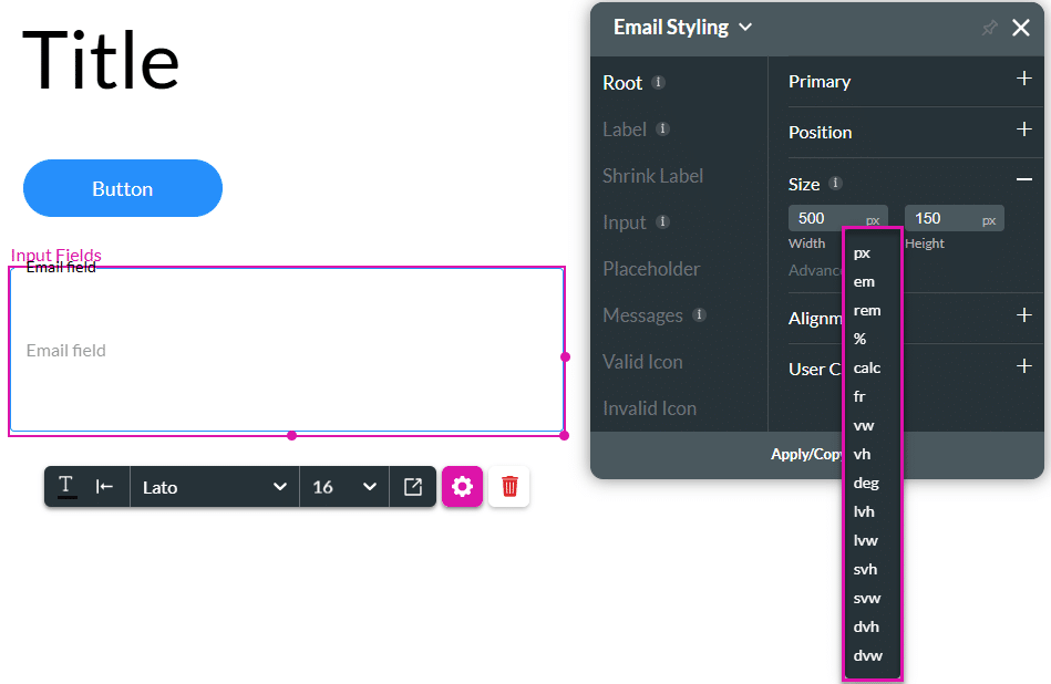
| Size | Description |
|---|---|
| px | The size represents a fixed number of screen pixels. Example: font-size: 16px; will always be 16 pixels on screen, regardless of parent elements. |
| em | A size of 1em equals the font size of the parent element. Example: If the parent is 16px, then 1.5em = 24px. |
| rem | A size of 1rem equals font size of the root element (<html>).Example: If html { font-size: 16px; }, then 2rem = 32px. |
| % | Size is a percentage of the parent element’s corresponding property (width, height, etc.). Example: width: 50%; means 50% of the parent’s width. |
| calc | The size is described using math in CSS using other units (+, -, *, /).Example: width: calc(100% - 50px); subtracts 50px from 100% of the parent’s width. |
| fr | The size represents a fraction of the available space in a grid container. Example: grid-template-columns: 1fr 2fr; splits space 1/3 and 2/3. |
| vw | A size of 1vw equals 1% of the viewport’s width. Example: width: 100vw; fills the full width of the visible browser window. |
| vh | A size of 1vh equals 1% of the viewport’s height. Example: height: 100vh; fills the full height of the visible browser window. |
| deg | This option is used for rotation and other angle-based CSS properties. Example: transform: rotate(45deg); rotates an element 45 degrees. |
| lvh | A size of 1lvh equals 1% of the largest possible height that the viewport can be (ignores browser UI like address bars). This option is helpful when you want to size elements based on the full screen space. |
| lvw | A size of 1lvw equals 1% of the largest possible width the viewport can be. |
| svh | A size of 1svh equals 1% of the smallest possible height of the viewport. This option is useful when the browser UI may shift the actual height This option is useful when transient UI (like scrollbars) narrows the viewport; elements stay sized from their largest width. |
| svw | A size of 1svw equals 1% of the smallest width of the viewport. This option is often relevant on mobile when the screen rotates or UI elements appear. |
| dvh | A size of 1dvh equals 1% of the current height of the visible viewport, and it updates automatically as the viewport changes (e.g., when mobile browser bars appear or disappear). This option is more accurate than vh on mobile devices. Example: height: 100dvh; fills the actual visible height of the screen, adjusting it for Chrome or the keyboard. |
| dvw | A size of 1dvw equals 1% of the current width of the visible viewport, and it updates dynamically if the viewport width changes. This option helps ensure layouts reflect real-time screen width. Example: width: 100dvw; fills the actual visible width of the screen. |
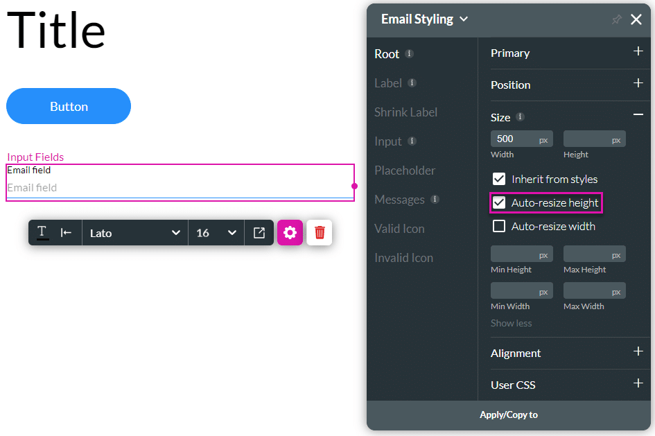
- Click the Advanced option for more size settings.
- Click the Auto-resize height checkbox. The element was resized according to the height of the contents
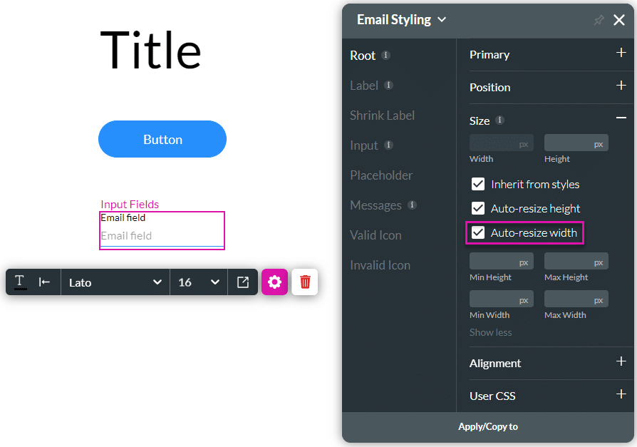
- Click the Auto-resize width checkbox. The element was resized according to the width of the contents.
- Configure the minimum and/or maximum height and/or width.
Hidden Title
Was this information helpful?
Let us know so we can improve!
Need more help?
Book Demo