

Signature Styling
The Titan signature is an electronic handwritten depiction of someone’s name, nickname, or mark that a person writes as proof of their identity and intent. It can easily be collected online using a mouse, finger, or stylus. The signature element in Titan can also collect company signatures that are sometimes required for formal validation purposes.
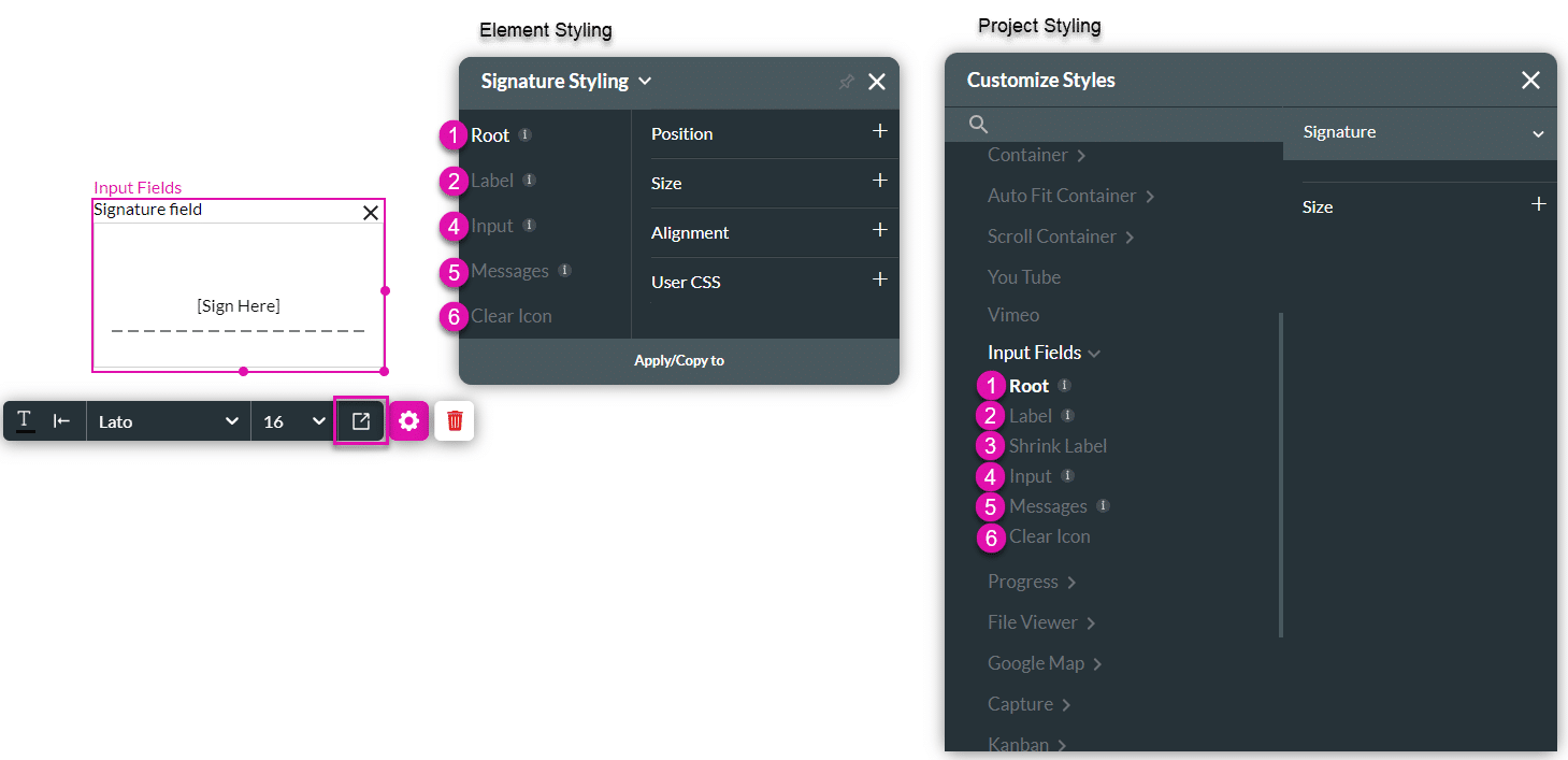
The signature element can be broken down into several parts, which can be styled individually, for example, Label Font, Input Border, and Message Colors. You also have the option to style the element as a whole using the “Root” option.
This element can be edited on both the Element and the Project Style levels.
| # | Option | Function | Available in Project or Element 
|
|---|---|---|---|
| 1 | Root | This option enables you to set general properties that affect the signature element as a whole. | 

|
| 2 | Label | The Label option allows you to control the style of the descriptive text above the signature element. For example, its font type, font size, and color. |
|
| 3 | Shrink Label | You can use the Shrink Label option to control the style of the elevated label when the input label is configured as floating. The Shrink Label option is only available under the Standard, Filled, and Outlined variants on the project styling properties and may not be applied on the Classic and Fixed variants. |
|
| 4 | Input | The Input option allows you to style the Input box, fill, border, and company data, which could also be shown when the element is used to collect company signatures. |
|
| 5 | Messages | This option allows you to style the text shown under the signature element when it is found to be valid or invalid. You can set the font for both messages and a separate color for the error and success messages. The colors set for errors or valid outcomes also affect the Input border. |
|
| 6 | Clear Icon | Insert a clear icon to assist users in clearing all input in a field. |
|
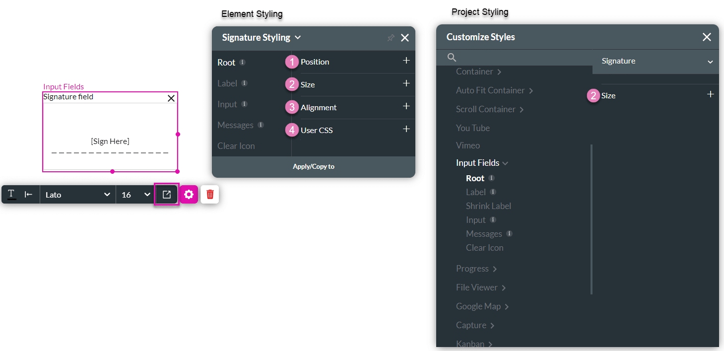
1. Root
The Root option enables you to set general properties that affect the signature element as a whole, such as position, size, alignment, and use of CSS.
| # | Option | Function | Available in Project or Element
|
|---|---|---|---|
| 1 | Position | You can use this option to change the signature element’s location in the content area on the x- and y-axis (left/right/top/bottom). The position also allows you to make the signature element float over its parent container or the entire page. “Float over Parent” allows you to set the location of the signature element within the box containing it, such as a container or strip. “Float over Page” allows you to set the location of the signature element inside of the entire page (and have it stay in the same location even when the user is scrolling in it). |
|
| 2 | Size | This option allows you to change the width and height of the signature element. |
|
| 3 | Alignment | You can set the signature element to a vertical or horizontal position in relation to its strip (left/center/right/top/middle/bottom). The Alignment option also allows you to set the position of a few elements in relation to each other. |
|
| 4 | User CSS | Cascading Style Sheets (CSS) allow a user to apply styles on the signature element with CSS code. Note: For Project styling, CSS is accessed via the Tools menu, which you can read about in our Style Elements Using User CSS article. |
|
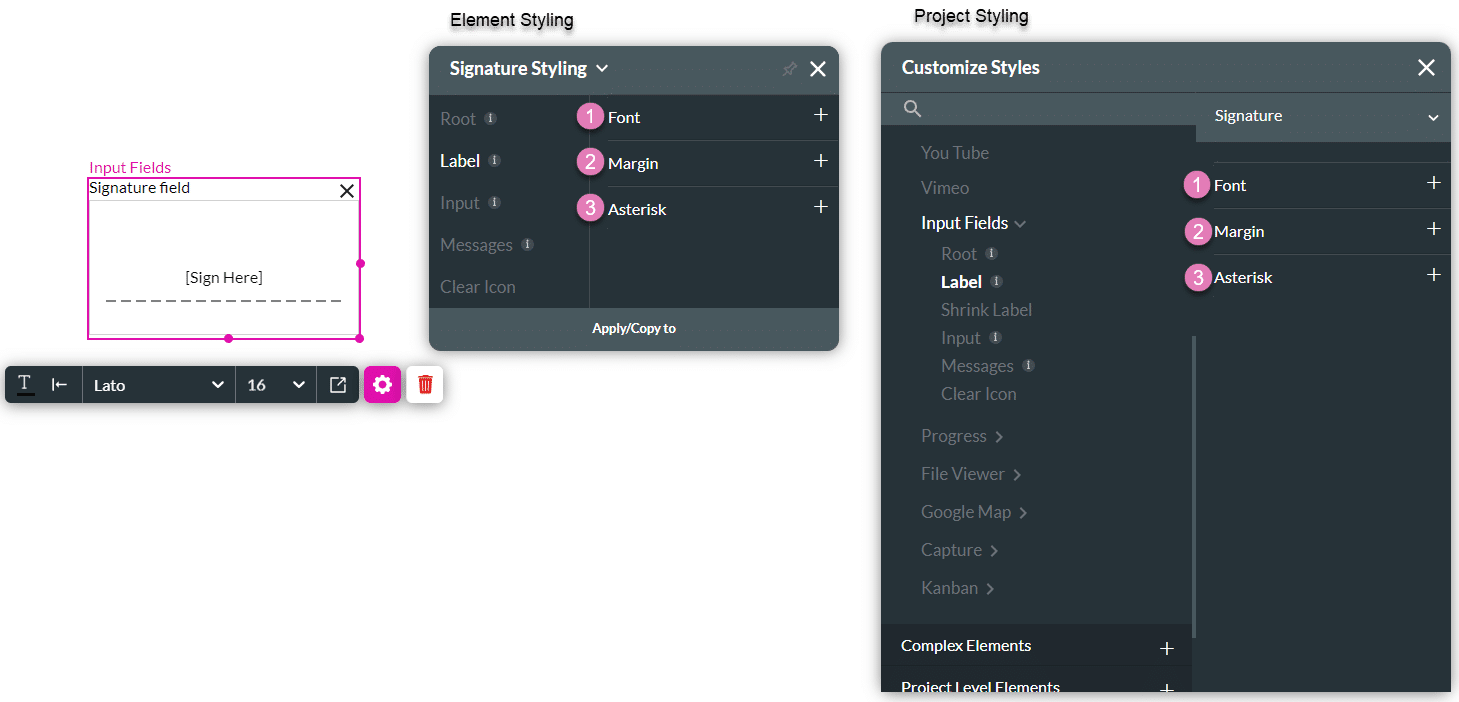
2. Label
The Label option allows you to control the style of the descriptive text above the signature element box. For example, its font type, font size, and color.
| # | Option | Function | Available in Project or Element
|
|---|---|---|---|
| 1 | Font | The Font enables you to change the typography style, for instance, font family, weight, color, and size. |
|
| 2 | Margin | This option allows you to set the outer space between the label and the adjacent element parts. |
|
| 3 | Asterisk | This option lets you set the style of the asterisk sign (*) that appears next to the label when the element is mandatory. |
|
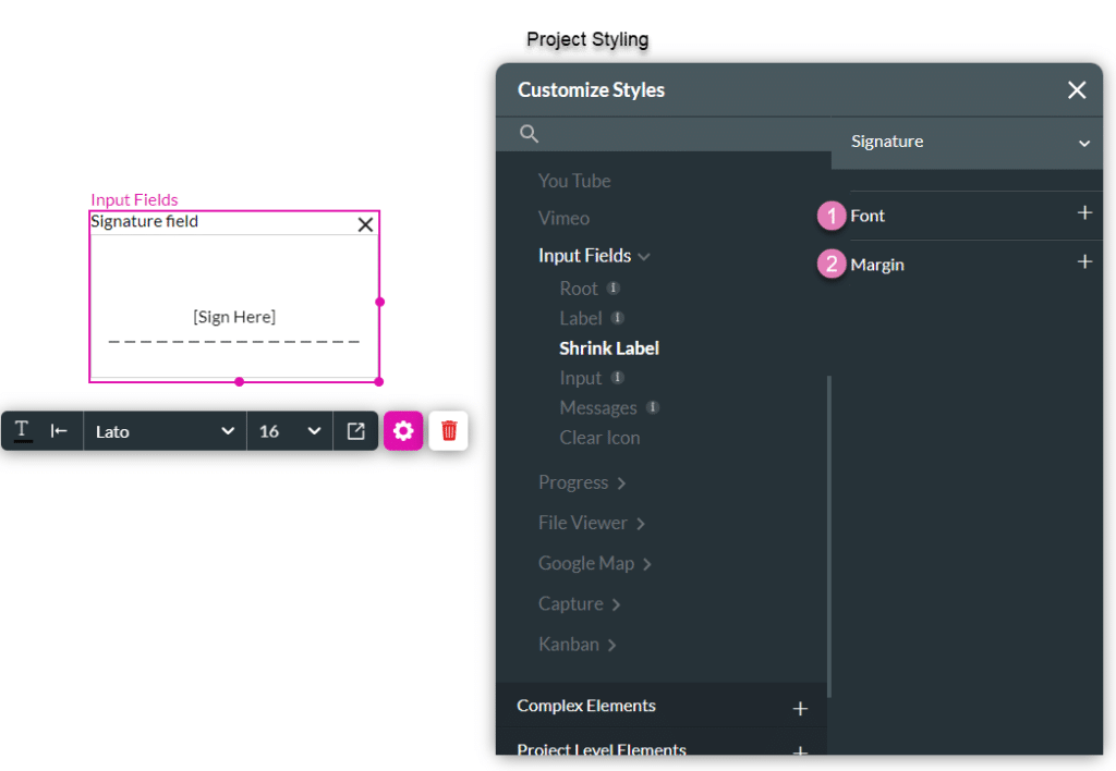
3. Shrink Label
You can use the Shrink Label option to control the style of the elevated label when the input label is configured as floating.
The Shrink Label option is only available under the Standard, Filled, and Outlined variants on the project styling properties and may not be applied to the Classic and Fixed variants.
| # | Option | Function | Available in Project or Element
|
|---|---|---|---|
| 1 | Font | The Font enables you to change the typography style, for instance, font family, weight, color, and size. |
|
| 2 | Margin | This option allows you to set the outer space between the label and the adjacent element parts. |
|
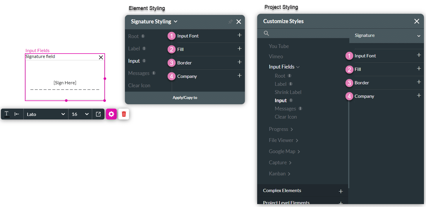
4. Input
The Input option allows you to style the Input box, fill, border, and company data, which could also be shown when the element is used to collect company signatures.
| # | Option | Function | Available in Project or Element
|
|---|---|---|---|
| 1 | Input Font | The Fill option allows you to set the background color of the signature element, the color of the signature drawing, and the color of the dashed line that indicates where to sign. |
|
| 2 | Fill | This option allows you to style your company information embedded in the company signature: the font family, size, color, spacing, and position. |
|
| 3 | Border | The Border option allows you to style the contour of the header in the signature element: make the border visible or invisible, change its width, color, corner radius, and more. The border can be styled as a whole or separated into top, bottom, left, and right border lines. |
|
| 4 | Company | This option allows you to style your company information embedded in the company signature: the font family, size, color, spacing and position. |
|
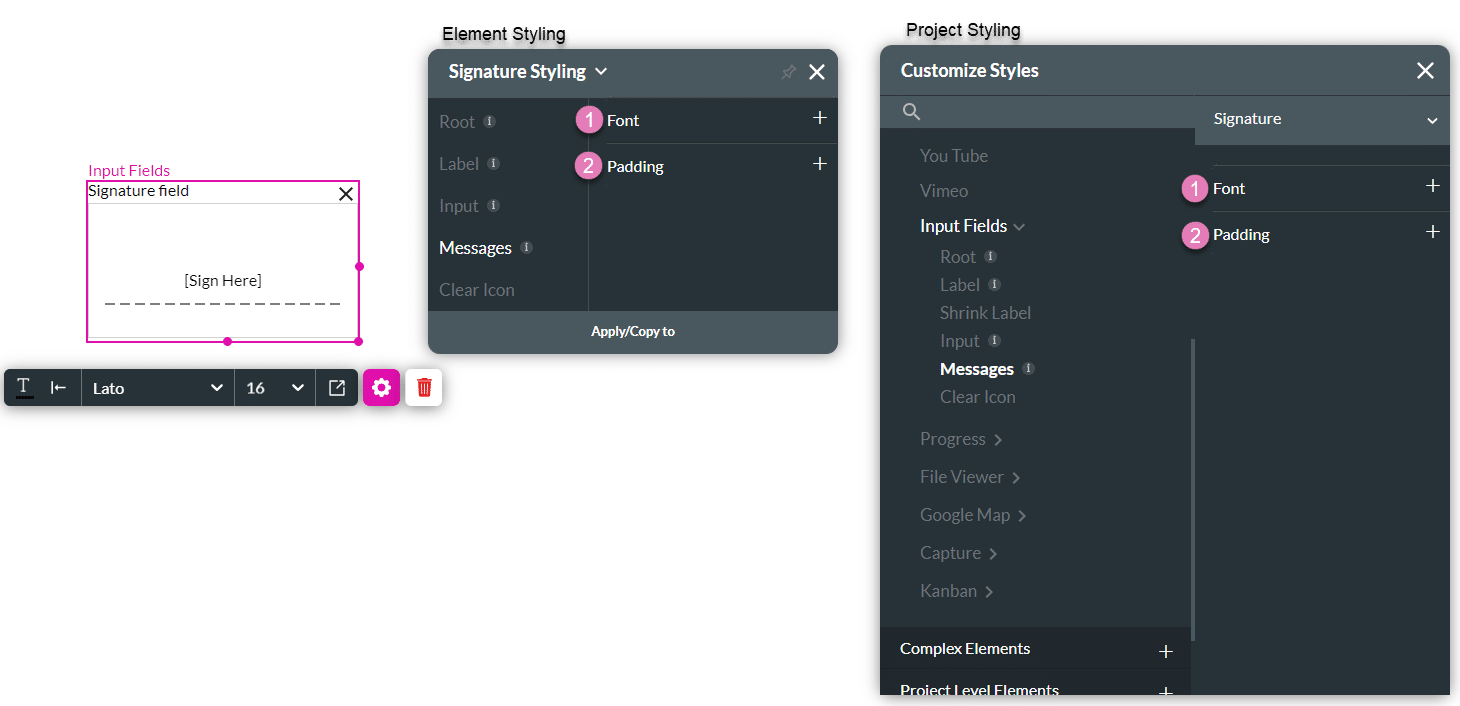
5. Messages
This option allows you to style the text shown under the signature element when it is found to be valid or invalid.
| # | Option | Function | Available in Project or Element
|
|---|---|---|---|
| 1 | Font | This option allows you to style the text shown under the signature when it is found to be valid or invalid. You can set the font for both messages and a separate color for the error and success messages. |
|
6. Clear Icon
Insert a clear icon to assist users in clearing all input in a field.

| # | Option | Function | Available in Project or Element
|
|---|---|---|---|
| 1 | Color | The Color option allows you to set the icon’s color. The color can be set by selecting from a color palette or by specifying a HEX color code. |
|
| 2 | Stroke | This option refers to the outer contour of an icon. It allows you to make the icon’s border visible or invisible and change its weight and color. |
|
| 3 | Size | This option allows you to change the width and height of the Items. |