

Rich Text Area Styling
The Rich Text Area element is an editor that grants users the opportunity to enter, edit, and format text that needs to be submitted.
It has a toolbar, which provides text format options such as font family, bold, italics, alignments, and much more. It also allows you to open the source code and change the HTML manually.
This element can be broken down into several parts, which can be styled individually, for example, Labels, Messages, and Character Count. You also have the option to style the element as a whole using the “Root” option.
This element can be edited on both the Element Style Level and the Project Style Level.

| # | Option | Function | Available in Project or Element 
|
|---|---|---|---|
| 1 | Root | This option enables you to set general properties that affect the Rich Text Area as a whole. | 

|
| 2 | Label | The Label option allows you to control the style of the descriptive text above the Rich Text Area box. For example, its font type, font size, and color. |
|
| 3 | Messages | This option allows you to style the text shown under the Rich Text Area when the input text is found to be valid or invalid. You can set the font for both messages and a separate color for the error and success messages. |
|
| 4 | Char Count | This option allows you to style the character counter under your Rich Text Area box. This counter lets you know how many characters you have inserted and whether you have exceeded your character limit. You have the ability to set the font family, size, and color for the following texts: Char. Count Text, Char. Count Success, Char. Limit Warning, and Char. Count Error. Note: Character Count styling is only applicable in cases where you have enabled the Character Count feature under the Rich Text Area Settings. |
|
| 5 | Placeholder | Insert filler content to occupy an element with possible content until the user replaces the placeholder with data. |
|
| 6 | Valid Icon | Indicate that the provided input has passed the validation process. |
|
| 7 | Invalid Icon | Indicate that the provided input has not passed the validation process. |
|
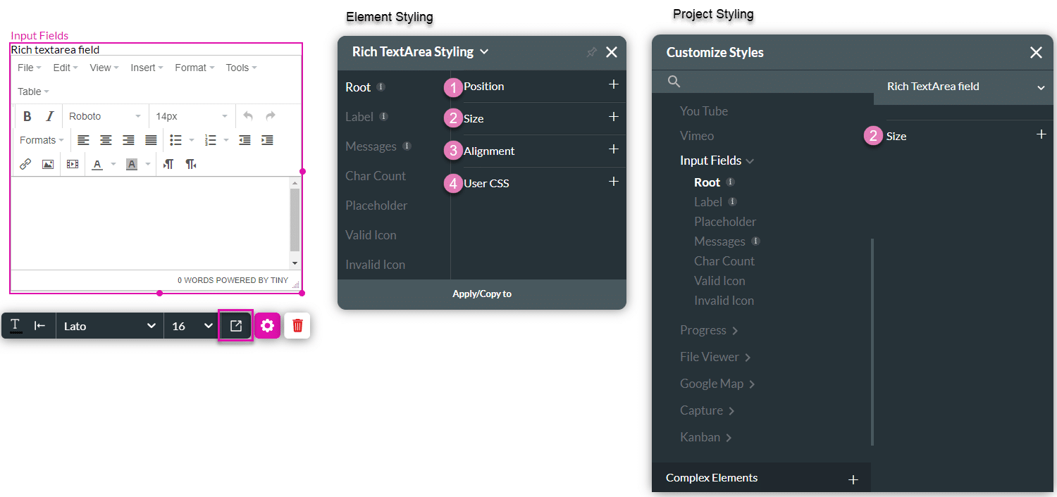
1. Root
The Root option enables you to set general properties that affect the Rich Text Area as a whole, such as position, size, alignment, and user CSS.
| # | Option | Function | Available in Project or Element
|
|---|---|---|---|
| 1 | Position | You can use this option to change the Rich Text Area box’s location in the content area, on the x- and y-axis (left/right/top/bottom). The position also allows you to make the Rich Text Area float over its parent container or over the entire page. “Float over Parent” allows you to set the location of the Rich Text Area within the box containing it, such as the container or strip. “Float over Page” allows you to set the location of the Rich Text Area box inside of the entire page (and have it stay in the same location even when the user is scrolling in it). |
|
| 2 | Size | This option allows you to change the width and height of the Rich Text Area element. |
|
| 3 | Alignment | You can set the Rich Text Area element to a vertical or horizontal position in relation to its container (left/center/right/top/middle/bottom). The Alignment option also allows you to set the position of a few elements in relation to each other. |
|
| 4 | User CSS | Cascading Style Sheets (CSS) allow a user to apply styles to the Rich Text Area with CSS code. Note: For Project styling, CSS is accessed via the Tools menu, which you can read about in our Style Elements Using User CSS article. |
|
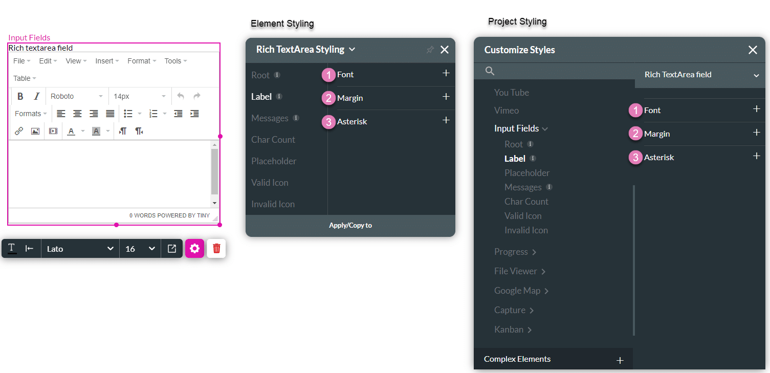
2. Label
The Label option allows you to control the style of the descriptive text above the Rich Area Text box, such as its font type, font size, and color.
| # | Option | Function | Available in Project or Element
|
|---|---|---|---|
| 1 | Font | The Font enables you to change the typography style, for instance, font family, weight, color, and size. |
|
| 2 | Margin | This option allows you to set the outer space between the label and adjacent element parts. |
|
| 3 | Asterisk | This option lets you set the style of the asterisk sign (*) that appears next to the label when the element is mandatory. |
|
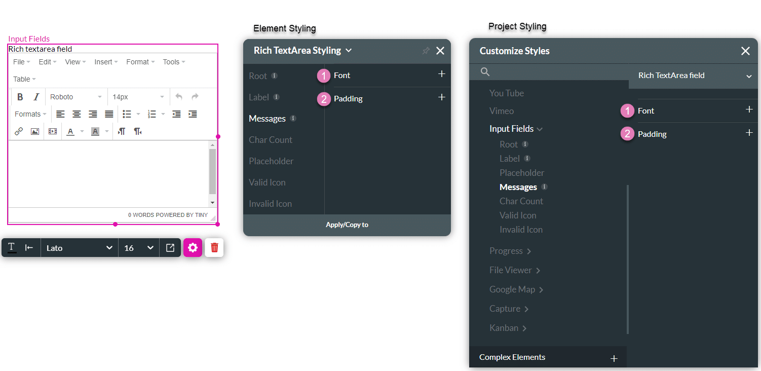
3. Messages
This option allows you to style the text shown under the Rich text Area when the content inside it is found to be valid or invalid.
| # | Option | Function | Available in Project or Element
|
|---|---|---|---|
| 1 | Font | The Font enables you to change the typography style, for instance, font family, weight, color, and size. |
|
| 2 | Padding | The Padding option allows you to add inner space inside the messages container, making the text in it move (for example, adding 10 px top padding will push the caption text 10 px down). |
|
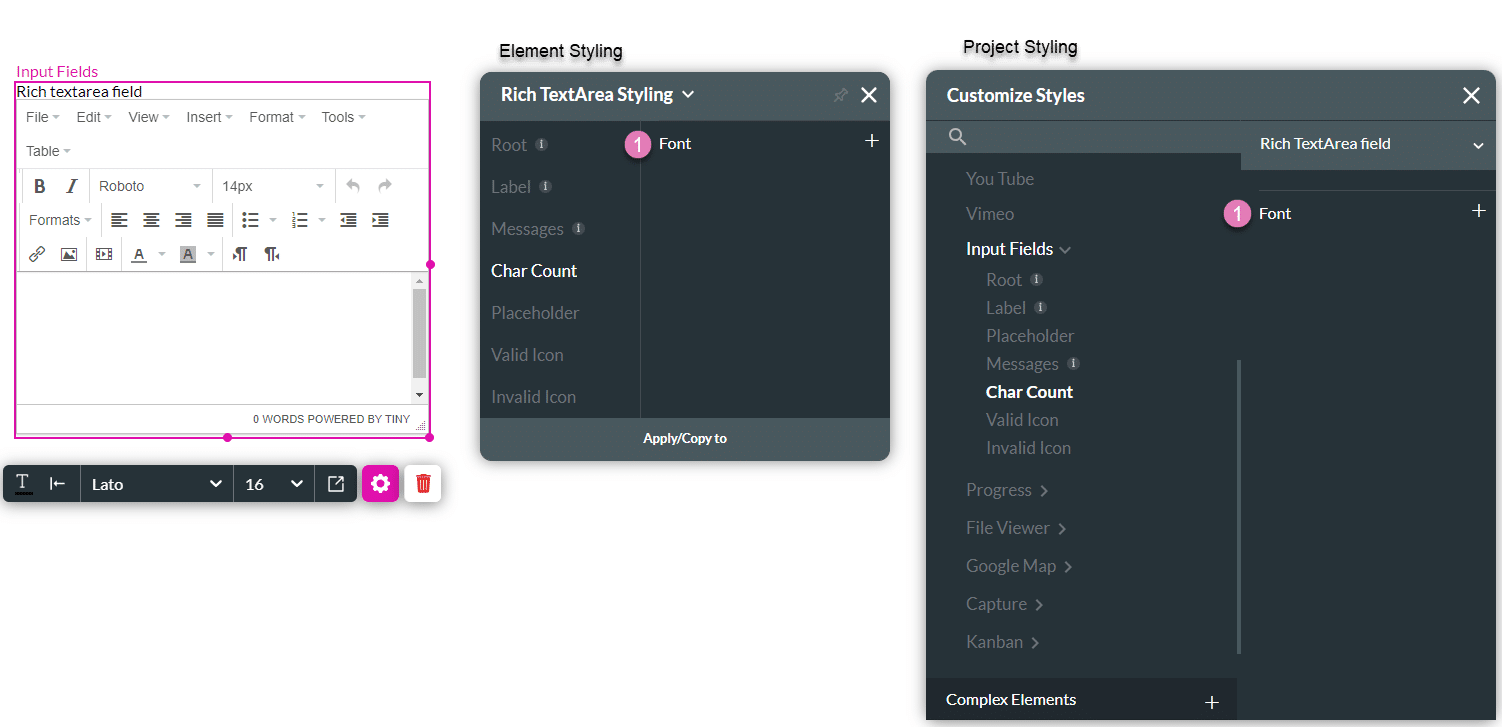
4. Char Count
This option allows you to add a dynamic character count to your Rich Text Area box that calculates and reacts to user input. The character count displays beneath the Rich Text Area box.
| # | Option | Function | Available in Project or Element
|
|---|---|---|---|
| 1 | Font | The Font enables you to change the typography style, for instance, font family, weight, size, and text colors (char count text, char count success, char limit warning, and char count error). |
|
5. Placeholder
Insert filler content to occupy an element with possible content until the user replaces the placeholder with data.
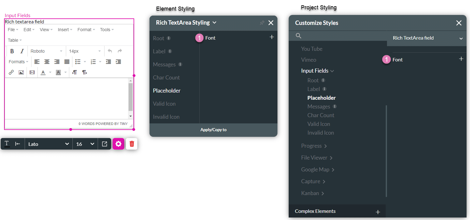
| # | Option | Function | Available in Project or Element
|
|---|---|---|---|
| 1 | Font | The Font enables you to change the typography style, for instance, font family, weight, color, and size. |
|
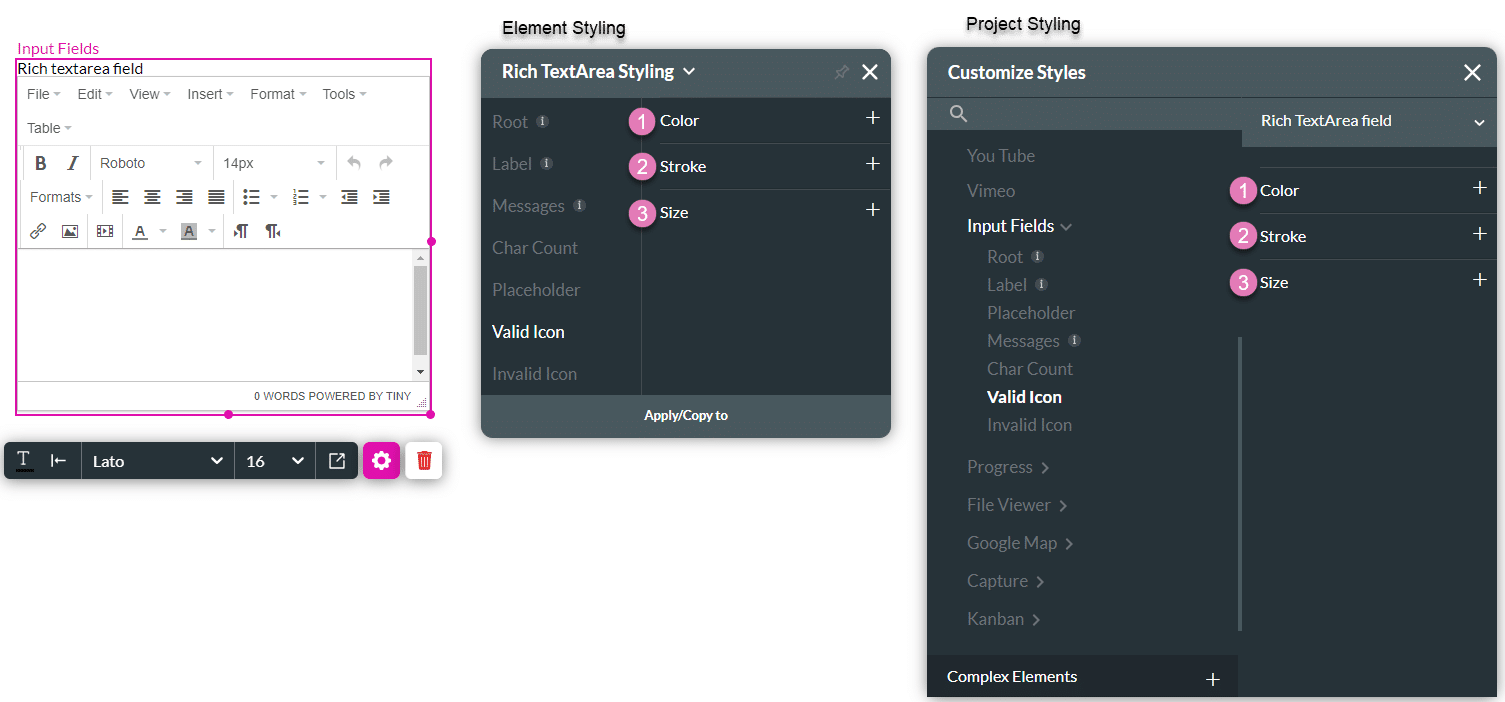
6. Valid Icon
Indicate that the provided input has passed the validation process.
| # | Option | Function | Available in Project or Element
|
|---|---|---|---|
| 1 | Color | The Color option allows you to set the icon’s color. The color can be set by selecting it from a color palette or by specifying a HEX color code. |
|
| 2 | Stroke | This option refers to the outer contour of an icon. It allows you to make the icon’s border visible or invisible, and change its weight and color. |
|
| 3 | Size | This option allows you to change the width and height of an icon. Since the Icon has a fixed ratio, changing its width will automatically adjust its height and vice versa. |
|
7. Invalid Icon
Indicate that the provided input has not passed the validation process.

| # | Option | Function | Available in Project or Element
|
|---|---|---|---|
| 1 | Color | The Color option allows you to set the icon’s color. The color can be set by selecting it from a color palette or by specifying a HEX color code. |
|
| 2 | Stroke | This option refers to the outer contour of an icon. It allows you to make the icon’s border visible or invisible, and change its weight and color. |
|
| 3 | Size | This option allows you to change the width and height of an icon. Since the Icon has a fixed ratio, changing its width will automatically adjust its height and vice versa. |
|