

Radio Styling
The Radio element allows a user to choose only one option from a set of given items. Using the settings properties, you can align these options horizontally or vertically.
We have two types of radio elements: static and dynamic values. The static value option offers multiple items to select from a static list that you create manually. The dynamic value also offers multiple items to select from; however, the items in this list are pulled dynamically from Salesforce.
This element can be broken down into several parts, which can then be styled individually. For example, the label font size, color, or input fill color can all be styled.
You also have the option to style the element as a whole using the “Root” option. This element can be edited on both the Element Style Level and the Project Style Level.

| # | Option | Function | Available in Project or Element 
|
|---|---|---|---|
| 1 | Root | This option lets you set general properties that affect the radio element as a whole. | 

|
| 2 | Label | The Label option allows you to control the style of the descriptive text above the input. For example, its font size, color, and type. |
|
| 3 | Captions | This refers to the text that appears next to the radio element’s icon. You can change the default or selected text’s font color, padding, margin, and alignment. |
|
| 4 | Input | This option allows you to adjust the radio element’s selection fill color (which is taken from the primary color by default). It also enables you, when using a custom icon (instead of the Radio), to adjust its size. |
|
| 5 | Messages | This option allows you to style the texts shown under the radio element when the selection is valid or invalid. You can set the font for both messages and set a separate color for the success message and error message. |
|
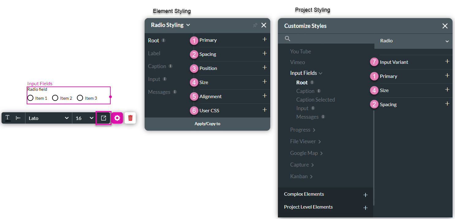
1. Root
The Root option enables you to set general properties that affect the radio element as a whole, such as primary color, element size, position, and alignment.
| # | Option | Function | Available in Project or Element
|
|---|---|---|---|
| 1 | Primary | The Primary color given to the input fields affects their fill color when selected. |
|
| 2 | Spacing | In a multiple-selection radio element(either static or dynamic), you can display the items horizontally or vertically by setting columns. The spacing property enables you to set the horizontal (column gap) or vertical (row gap) space between the radio items. |
|
| 3 | Position | You can use this option to change the radio element’s location on the x- and y-axis of the strip (left/right/top/bottom). The Position option also allows you to make the radio element float over its parent container or over the entire page. Float over Parent allows you to set the location of the input within the box containing it, for instance, the container or strip. Float over Page allows you to set the location of the radio element inside the entire page and have it stay in the same location even when the user scrolls over it. |
|
| 4 | Size | This option allows you to change the width and height of the radio element. |
|
| 5 | Alignment | This option allows you to set the radio element to a vertical or horizontal position in relation to its container (left/center/right/top/middle/bottom). It also allows you to set the position of a few elements in relation to each other. |
|
| 6 | User CSS | The CSS (Cascading Style Sheets) allows the user to apply styles on the radio element via CSS code. Note: For Project styling, CSS is accessed via the Tools menu, which you can read about in our article on CSS. |
|
| 7 | Input Variant | This option allows you to set the size of the radio element to be medium or small. |
|
2. Label
The Label option allows you to control the style of the descriptive text above the input. For example, its font type, font size, and color.

| # | Option | Function | Available in Project or Element
|
|---|---|---|---|
| 1 | Font | The Font option enables you to change the typography style, for instance, font family, weight, color, and size. |
|
| 2 | Margin | This option allows you to set the outer space between the label and the adjacent element parts. |
|
| 3 | Asterisk | When a checkbox is mandatory, an asterisk is added to the element. You can style the asterisk using this option. |
|
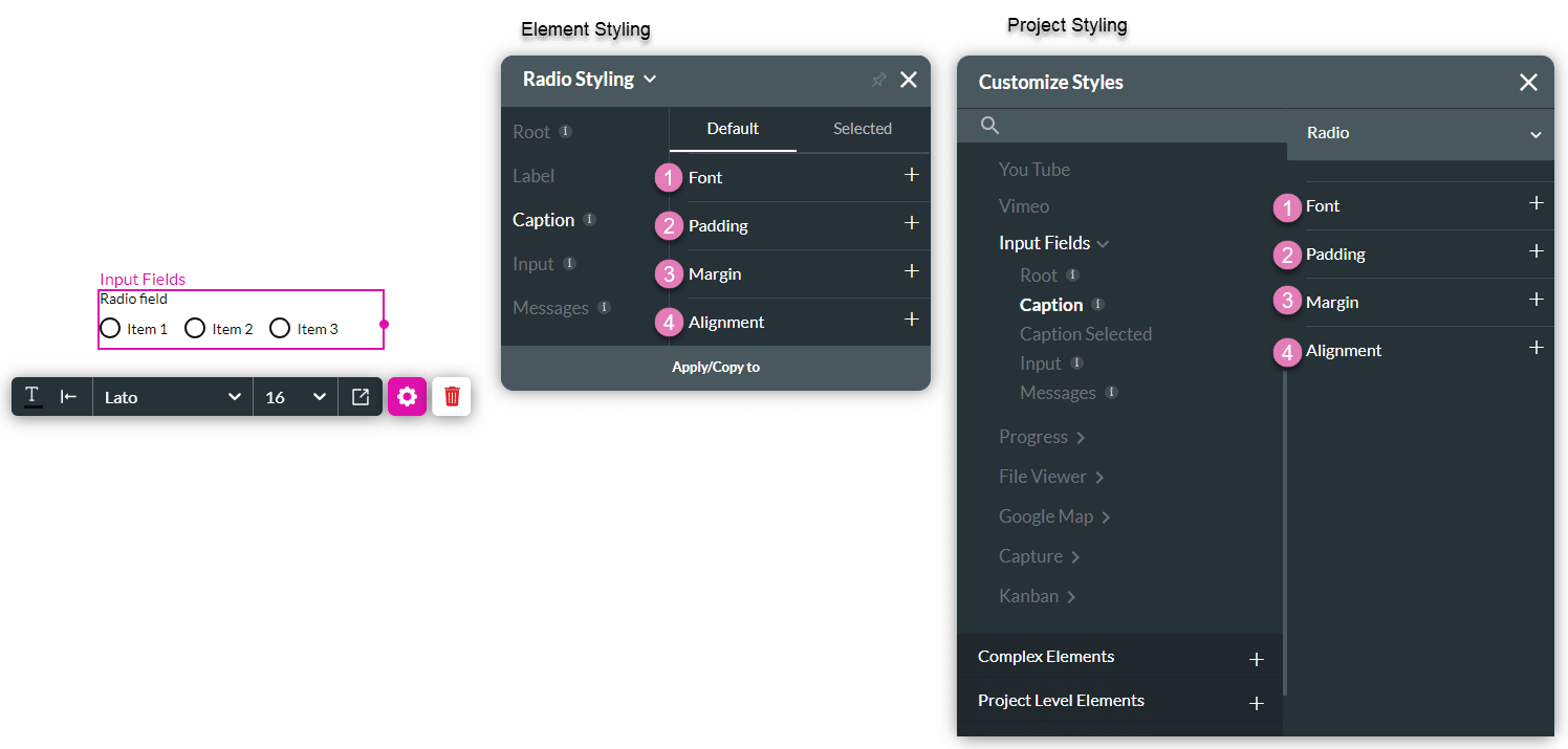
3. Default or Selected Caption
This option refers to the text that appears next to the radio element. It allows you to set the style for the caption’s default and selected states, enabling you to change the text’s font style, padding, margin, and alignment.
| # | Option | Function | Available in Project or Element
|
|---|---|---|---|
| 1 | Font | The Font option enables you to change the radio element’s caption typography, for instance, font family, weight, color, and size. |
|
| 2 | Padding | The padding option allows you to add inner space inside of the caption container, making the text in it move (for example, adding 10 px top padding will push the caption text 10 px down). |
|
| 3 | Margin | This option lets you set the outer space between the caption and the adjacent element parts. |
|
| 4 | Alignment | The alignment enables you to set the caption’s vertical position (top, center, bottom) in relation to the radio element next to it. |
|
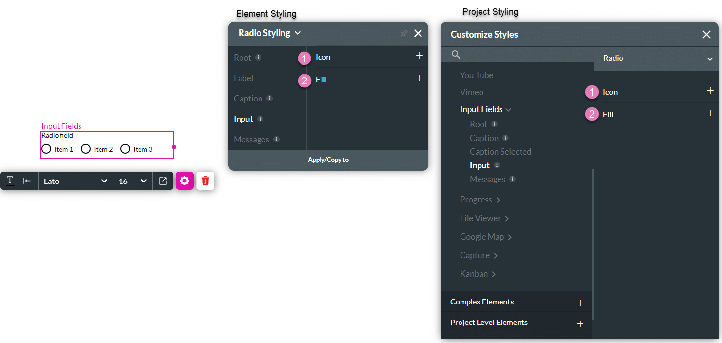
4. Input
The input allows you to style the radio element’s border and selected fill color (which will override the default taken from the primary color). It also enables you, when using a custom icon, to set its size (width and height).
| # | Option | Function | Available in Project or Element
|
|---|---|---|---|
| 1 | Icon | This option allows you to adjust the custom icon’s width and height. |
|
| 2 | Fill | This option allows you to override the default color of the radio element (taken from the primary color). Setting a color will apply to the border of the checkbox and its fill color when selected. |
|
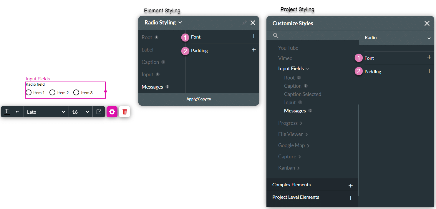
5. Messages
This option allows you to style the texts shown under the radio element when the selection is valid or invalid.
| # | Option | Function | Available in Project or Element
|
|---|---|---|---|
| 1 | Font | This option allows you to style the texts shown under the radio element when the selection is valid or invalid. You can set the font for both messages and set a separate color for the success message and error message. |
|
| 2 | Padding | The Padding option allows you to add inner space inside the message, making the text in it move (for example, adding 10 px top padding will push the caption text 10 px down). |
|