

Custom Icon
Business Background
The Custom Icon option is available for different elements, such as the radio element. Choose from a variety of Custom Icons. This creates visual interest in your forms and can convey a purpose so users can easily understand and recognize the required information.
How to Guide
- Click the + icon to open the list of elements.
- Select the Input option from the list.
- In this example, the Radio element is used.
- Click-and-drag the Radio element to the canvas.
- Click the Radio settings Gear icon. The Radio Settings screen opens.
- Select the Interactivity option from the list.
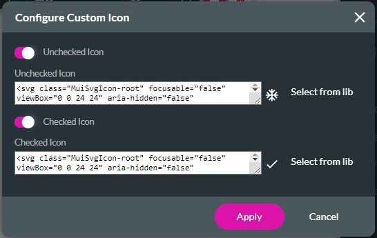
- Click the Custom Icon checkbox and click the settings Gear icon. The Configure Custom Icon screen opens.

- Use the toggle switch to enable the Unchecked Icon option to add an icon. The Select icon screen opens.
- Alternatively, enable the Checked option to add an icon.

- Click the Select from lib option. The Select icon screen opens.

- Select an icon and click the Apply button. The added icons show on the Custom Icon screen.

- Click the Apply button.
- Save and Preview the project.
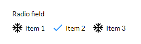
The configured unchecked and checked icons will be shown:
Hidden Title
Was this information helpful?
Let us know so we can improve!
Need more help?
Book Demo