Older Releases
Improvement - Email Templates
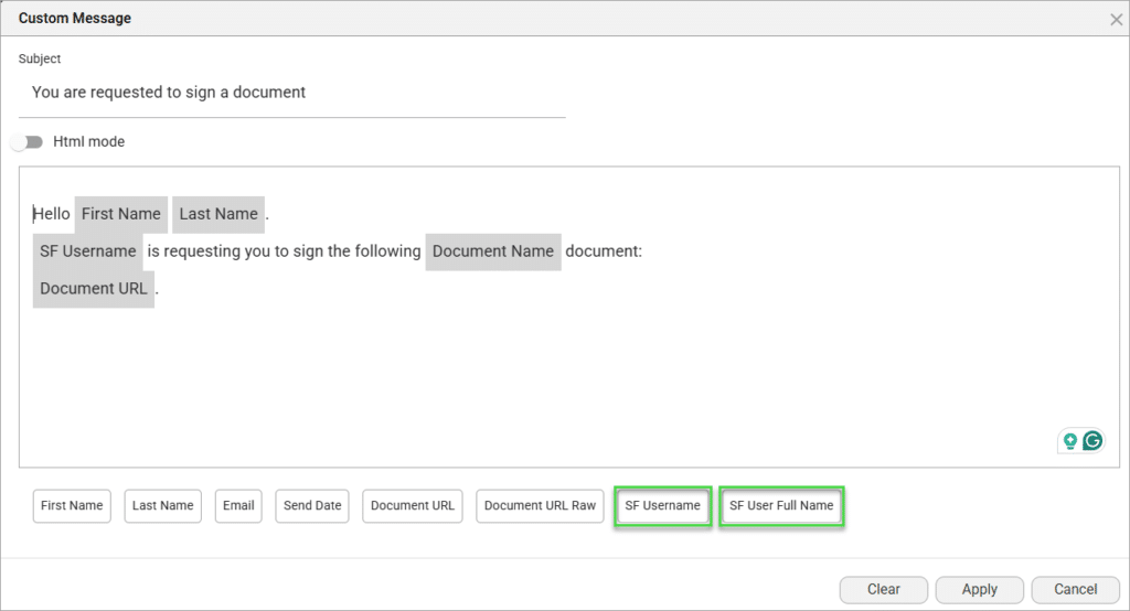
We improved the clarity of the dynamic merge field tags of the email template in Titan Sign.
- The existing ‘SF User Full Name‘ label merge field now displays the first and last names of the Salesforce user who triggered the signing process.
- We have also added a new merge field, ‘SF Username,’ which will dynamically bring the email address of the person who triggered the process in Salesforce.

Improvement - Project Settings
To enhance user experience and improve efficiency, we did the following:
- Debug Mode is now enabled by default for all new Web projects, providing immediate access to valuable debugging tools. Read more about the debug mode.
- Enable Versions is now the default setting for all new Web projects. This ensures automatic version history to help you revert changes when needed. Read more about versions.
These settings can still be adjusted manually in the project settings if desired.
Automatically Detect and Add Interactive Fields
We’re excited to introduce a powerful new feature in Titan Sign that will revolutionize your document preparation process: Automatic Field Detection!
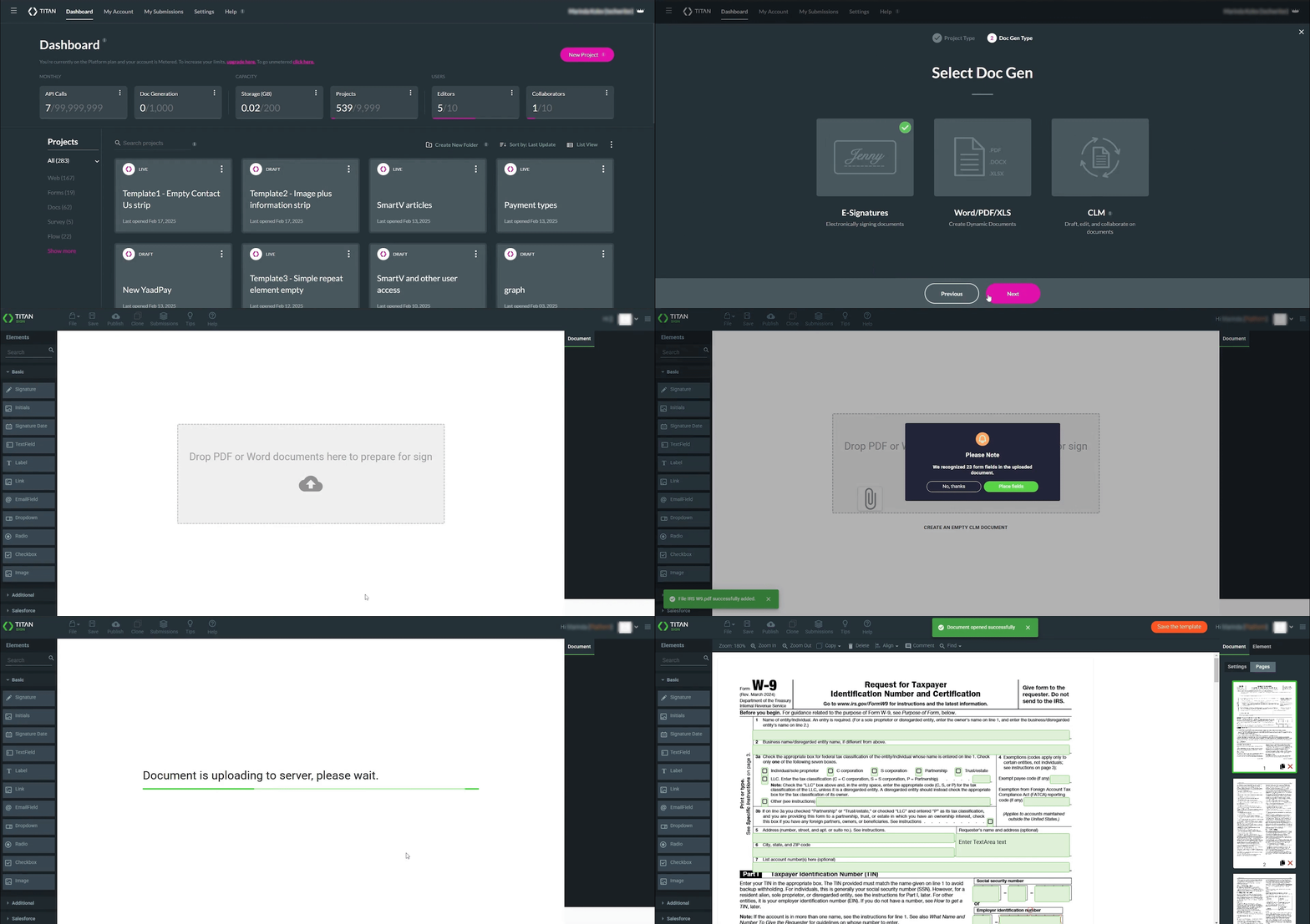
Now, when you upload a PDF with pre-existing fillable fields (annotations), Titan Sign will automatically detect and map them into the builder, eliminating the need for manual setup. This intelligent enhancement saves you valuable time and effort, allowing you to quickly get your documents ready for signature.
Here’s how it works: When you upload a PDF containing fillable fields, you’ll be presented with a dialog box with two options:
- Place fields option: Automatically use the detected fields to populate your document instantly.
- No, thanks option: Start with a blank document if you prefer to build from scratch.
This feature simplifies your workflow, reduces setup time, and ensures accuracy while offering flexibility. We’re confident this new update will make your document signing process faster and more efficient.
YaadPay Improvement
Titan now supports recurring payments with YaadPay. This allows you to create a monthly payment for a dynamically defined duration. Learn more about YaadPay.
Dynamic Translation Improvement
Text elements now support dynamic translation, providing a more consistent localization experience across the platform. When a language is selected, text elements display translated values if available; otherwise, they will fall back to the original value.
Dynamic picklist elements remain unchanged, retaining their current translation functionality. This update ensures a seamless multilingual experience for users.
Digital Signature Improvement
Added the signer’s physical location to the signed document certificate when a document is digitally signed.
Power Table Accessibility Improvements
Improved power table accessibility. Now, the screen readers announce the header for every data cell, making the table contents clearer and more structured. The order of announcements was also improved and always follows a static pattern.
Read more about accessibility.


