Multi-step Container Styling
A multi-step container is a design element that breaks down a complex process or form into multiple steps or stages, often presented within a single container or section of a webpage. Each step typically focuses on a specific set of inputs or actions, making the overall process more manageable and user-friendly.
For example, a multi-step container might be used in an e-commerce checkout process, where each step represents entering shipping information, selecting a payment method, and confirming the order. The container visually guides users through each step, providing a clear path to completion.
This element can be edited on both the Project Style Level and Element Style Level.
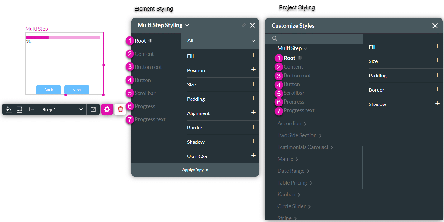
| # | Option | Function | Available in Project or Element 
|
|---|---|---|---|
| 1 | Root | This option enables you to set general properties that affect the multi-step container as a whole. | 
|
| 2 | Content | The Content option lets you style the contents of the multi-step container as a whole. | 
|
| 3 | Button root | Use this option to style the area around the button. | 
|
| 4 | Button | Style the button on the multi-step container. | 
|
| 5 | Scrollbar | This setting enables you to set general properties that affect the horizontal and vertical scrollbars. | 
|
| 6 | Progress | Style the progress bar that indicates the the progress the user is making in the multi-step container. | 
|
| 7 | Progress text | Style the progress text on the progress bar. | 
|
1. Root
This option enables you to set general properties that affect the container as a whole.
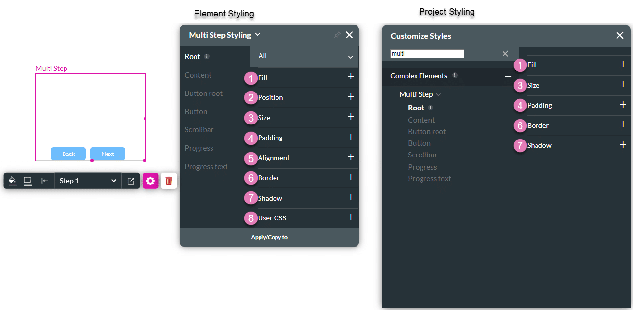
| # | Option | Function | Available in Project or Element 
|
|---|---|---|---|
| 1 | Fill | The Fill setting allows you to set the opacity level of the image. This setting also provides a “Fit Image” option that fills the given container dimensions while keeping the image aspect ratio intact. If the image is larger than the container, it will be clipped to fit it. | 
|
| 2 | Position | The Position option enables you to change the image location on the x- and y-axis of the strip (left/right/top/bottom). This option also allows you to make an Image element float over its parent container or over the entire page. Float over Parent allows you to set the location of an image within the box containing it, for instance, the container or strip. Float over Page allows you to set the location of an image inside the entire page and have it stay in the same location even when the user scrolls over it. | 
|
| 3 | Size | This option allows you to change the width and height of the Image element. | 
|
| 4 | Padding | This option allows you to set a space inside of the Auto Fit container border so that the content does not reach the edges. The padding could be set for the Top, Bottom, Left and Right sides. | |
| 5 | Alignment | Use Alignment to set the Image element to a vertical or horizontal position in relation to its container (left/center/right/top/middle/bottom). It also allows you to set the position of a few elements in relation to each other. | |
| 6 | Border | This setting refers to the outer contour of the image’s container. It allows you to make the border visible or invisible, change the width, color, corner radius, and more. You can also change the border style to a line, dashes, or dots. Use the Border option to create separate border styles per container side (left/right/top/bottom). | 
|
| 7 | Shadow | Shadow gives you the ability to add an Inner or Outer shadow effect to the Image container. You can set the X and Y offsets of the shadow as well as its blur and spread radius. | 
|
| 8 | User CSS | Cascading Style Sheets (CSS) allow you to apply styles to an Image via CSS code. Note: For Project styling, CSS is accessed via the Tools menu, which you can read about in our Style Elements Using User CSS article. |
2. Content
The Content option lets you style the contents of the multi-step container as a whole.

| # | Option | Function | Available in Project or Element 
|
|---|---|---|---|
| 1 | Fill | The Fill setting allows you to set the opacity level of the image. This setting also provides a “Fit Image” option that fills the given container dimensions while keeping the image aspect ratio intact. If the image is larger than the container, it will be clipped to fit it. | 
|
| 2 | Padding | This option allows you to set a space inside of the Auto Fit container border so that the content does not reach the edges. The padding could be set for the Top, Bottom, Left and Right sides. | 
|
| 3 | Margin | This option allows you to set the outer space between the content and the adjacent element parts. | 
|
| 4 | Border | This setting refers to the outer contour of the image’s container. It allows you to make the border visible or invisible, change the width, color, corner radius, and more. You can also change the border style to a line, dashes, or dots. Use the Border option to create separate border styles per container side (left/right/top/bottom). | 
|
| 5 | Shadow | Shadow gives you the ability to add an Inner or Outer shadow effect to the Image container. You can set the X and Y offsets of the shadow as well as its blur and spread radius. | 
|
| 6 | User CSS | Cascading Style Sheets (CSS) allow you to apply styles to an Image via CSS code. Note: For Project styling, CSS is accessed via the Tools menu, which you can read about in our Style Elements Using User CSS article. |
3. Button root
Use this option to style the area around the button.
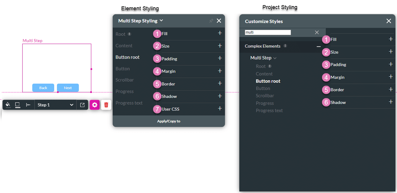
| # | Option | Function | Available in Project or Element 
|
|---|---|---|---|
| 1 | Fill | The Fill setting allows you to set the opacity level of the image. This setting also provides a “Fit Image” option that fills the given container dimensions while keeping the image aspect ratio intact. If the image is larger than the container, it will be clipped to fit it. | 
|
| 2 | Size | This option allows you to change the width and height of the Image element. | 
|
| 3 | Padding | This option allows you to set a space inside of the Auto Fit container border so that the content does not reach the edges. The padding could be set for the Top, Bottom, Left and Right sides. | 
|
| 4 | Margin | This option allows you to set the outer space between the content and the adjacent element parts. | 
|
| 5 | Border | This setting refers to the outer contour of the image’s container. It allows you to make the border visible or invisible, change the width, color, corner radius, and more. You can also change the border style to a line, dashes, or dots. Use the Border option to create separate border styles per container side (left/right/top/bottom). | 
|
| 6 | Shadow | Shadow gives you the ability to add an Inner or Outer shadow effect to the Image container. You can set the X and Y offsets of the shadow as well as its blur and spread radius. | 
|
| 7 | User CSS | Cascading Style Sheets (CSS) allow you to apply styles to an Image via CSS code. Note: For Project styling, CSS is accessed via the Tools menu, which you can read about in our Style Elements Using User CSS article. |
4. Button
Style the buttons on the multi-step container.
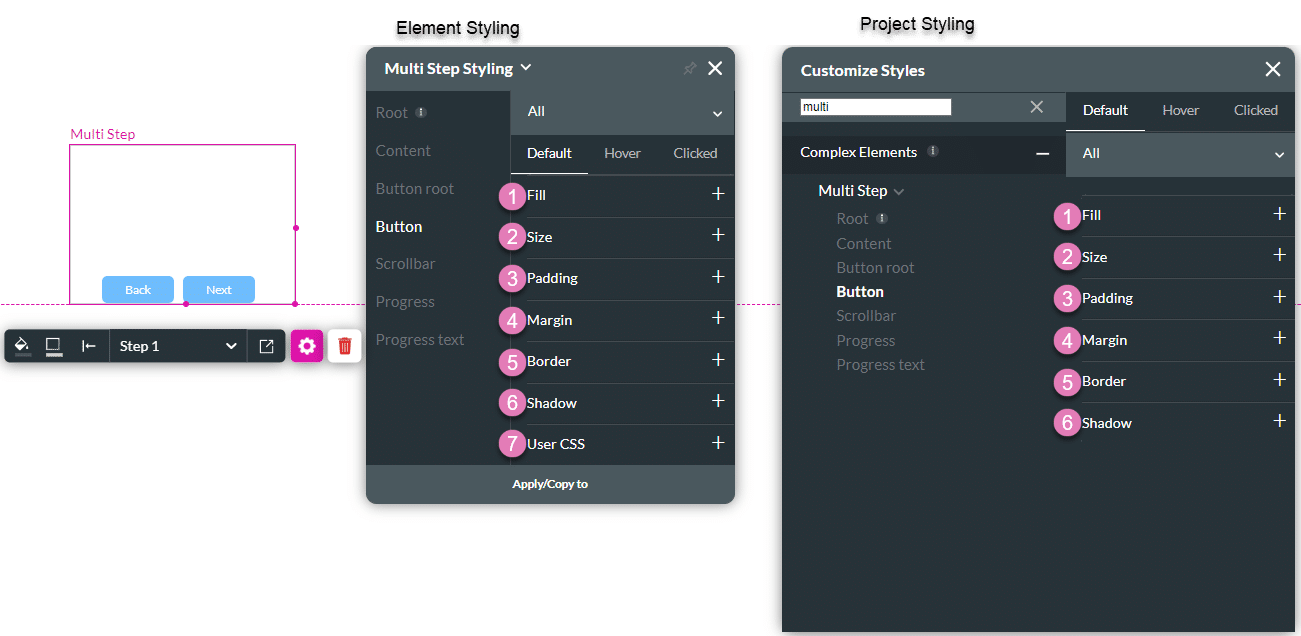
| # | Option | Function | Available in Project or Element 
|
|---|---|---|---|
| 1 | Fill | The Fill setting allows you to set the opacity level of the image. This setting also provides a “Fit Image” option that fills the given container dimensions while keeping the image aspect ratio intact. If the image is larger than the container, it will be clipped to fit it. | 
|
| 2 | Size | This option allows you to change the width and height of the Image element. | 
|
| 3 | Padding | This option allows you to set a space inside of the Auto Fit container border so that the content does not reach the edges. The padding could be set for the Top, Bottom, Left and Right sides. | 
|
| 4 | Margin | This option allows you to set the outer space between the content and the adjacent element parts. | 
|
| 5 | Border | This setting refers to the outer contour of the image’s container. It allows you to make the border visible or invisible, change the width, color, corner radius, and more. You can also change the border style to a line, dashes, or dots. Use the Border option to create separate border styles per container side (left/right/top/bottom). | 
|
| 6 | Shadow | Shadow gives you the ability to add an Inner or Outer shadow effect to the Image container. You can set the X and Y offsets of the shadow as well as its blur and spread radius. | 
|
| 7 | User CSS | Cascading Style Sheets (CSS) allow you to apply styles to an Image via CSS code. Note: For Project styling, CSS is accessed via the Tools menu, which you can read about in our Style Elements Using User CSS article. |
5. Scrollbar
This setting enables you to set general properties that affect the horizontal and vertical scrollbars.

| # | Option | Function | Available in Project or Element 
|
|---|---|---|---|
| 1 | Scrollbar | This setting enables you to set the size and color of the horizontal and vertical scrollbars. | 
|
| 2 | Border | This setting refers to the outer contour of the image’s container. It allows you to make the border visible or invisible, change the width, color, corner radius, and more. You can also change the border style to a line, dashes, or dots. Use the Border option to create separate border styles per container side (left/right/top/bottom). | 
|
| 3 | User CSS | Cascading Style Sheets (CSS) allow you to apply styles to an Image via CSS code. Note: For Project styling, CSS is accessed via the Tools menu, which you can read about in our Style Elements Using User CSS article. |
6. Progress
Style the progress bar that indicates the the progress the user is making in the multi-step container.

| # | Option | Function | Available in Project or Element 
|
|---|---|---|---|
| 1 | Progress color | Select the color of the progress bar. | 
|
| 2 | Line | Set the thickness of the progress line. | 
|
| 3 | Fill | The Fill setting allows you to set the opacity level of the image. This setting also provides a “Fit Image” option that fills the given container dimensions while keeping the image aspect ratio intact. If the image is larger than the container, it will be clipped to fit it. | 
|
| 4 | Size | This option allows you to change the width and height of the Image element. | 
|
| 5 | Padding | This option allows you to set a space inside of the Auto Fit container border so that the content does not reach the edges. The padding could be set for the Top, Bottom, Left and Right sides. | 
|
| 5 | Alignment | Use Alignment to set the Image element to a vertical or horizontal position in relation to its container (left/center/right/top/middle/bottom). It also allows you to set the position of a few elements in relation to each other. | 
|
| 6 | Border | This setting refers to the outer contour of the image’s container. It allows you to make the border visible or invisible, change the width, color, corner radius, and more. You can also change the border style to a line, dashes, or dots. Use the Border option to create separate border styles per container side (left/right/top/bottom). | 
|
| 7 | Shadow | Shadow gives you the ability to add an Inner or Outer shadow effect to the Image container. You can set the X and Y offsets of the shadow as well as its blur and spread radius. | 
|
| 8 | User CSS | Cascading Style Sheets (CSS) allow you to apply styles to an Image via CSS code. Note: For Project styling, CSS is accessed via the Tools menu, which you can read about in our Style Elements Using User CSS article. |
7. Progress text
Style the progress text on the progress bar.
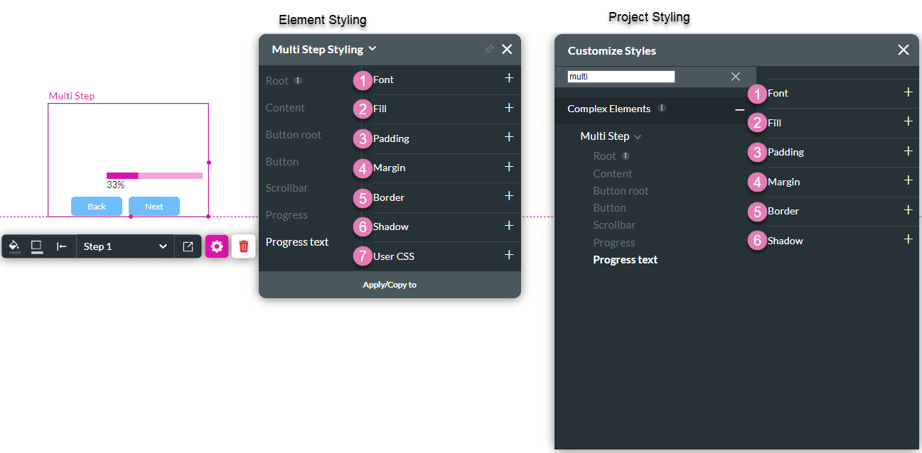
| # | Option | Function | Available in Project or Element 
|
|---|---|---|---|
| 1 | Font | Select the font family, size, color, alignment and more. | 
|
| 2 | Fill | The Fill setting allows you to set the opacity level of the image. This setting also provides a “Fit Image” option that fills the given container dimensions while keeping the image aspect ratio intact. If the image is larger than the container, it will be clipped to fit it. | 
|
| 3 | Padding | This option allows you to set a space inside of the Auto Fit container border so that the content does not reach the edges. The padding could be set for the Top, Bottom, Left and Right sides. | 
|
| 4 | Margin | This option allows you to set the outer space between the content and the adjacent element parts. | 
|
| 5 | Border | This setting refers to the outer contour of the image’s container. It allows you to make the border visible or invisible, change the width, color, corner radius, and more. You can also change the border style to a line, dashes, or dots. Use the Border option to create separate border styles per container side (left/right/top/bottom). | 
|
| 6 | Shadow | Shadow gives you the ability to add an Inner or Outer shadow effect to the Image container. You can set the X and Y offsets of the shadow as well as its blur and spread radius. | 
|
| 7 | User CSS | Cascading Style Sheets (CSS) allow you to apply styles to an Image via CSS code. Note: For Project styling, CSS is accessed via the Tools menu, which you can read about in our Style Elements Using User CSS article. |


