

Page Modal – Dynamic Size
Business Background
You can set the dynamic size for a page modal using Titan Web.
Titan Solution
Use Titan Web to set the dynamic size of a page modal so that it displays well on a laptop, tablet, as well as large and small mobile devices. Smaller screens will require different configurations to achieve the correct responsiveness.
How to Guide
- Click the + icon to open the list of elements.
- Add an element to the canvas, for instance, Text.
- Click the Text element Gear icon and select the Interactivity option.
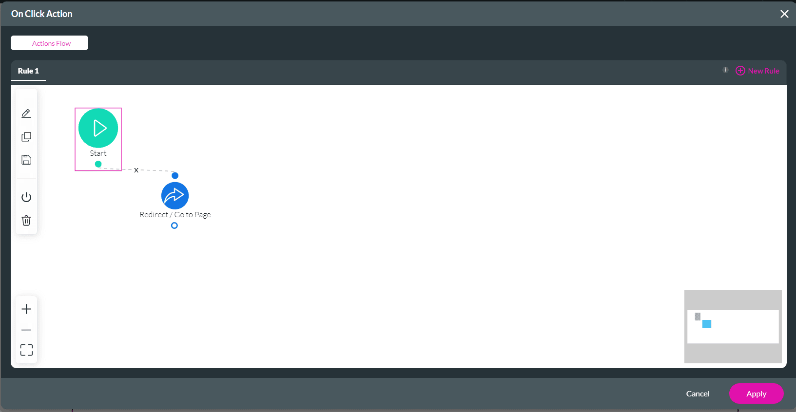
- Click the Configure On Click Actions icon. The Actions Flow screen opens.
- Click the + icon:

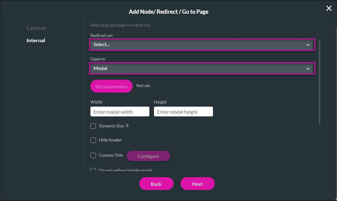
- On the Add Node screen, select the Redirect/ Go to Page option.

- Select the Internal option and use the drop-down list to select the Redirect URL.
- Use the drop-down list to select the Modal option.
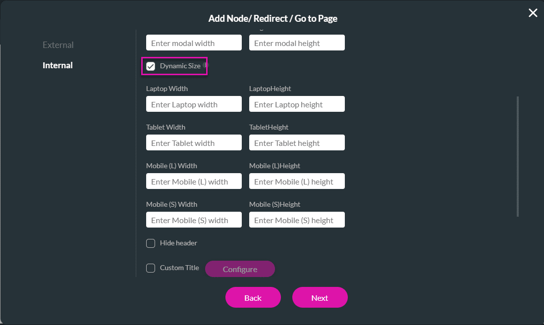
- Select the Dynamic checkbox. The screen expands to show the width and height fields for the following devices:
- Laptop
- Tablet
- Mobile (large)
- Mobile (small)
- Type the width and height of the devices in the corresponding fields. Set the different modal sizes for each of the above devices.
- If necessary, add a tag in the Tag field, and select the Insert button.
The Redirect/Go to Page node is added.
The display will resize appropriately when you preview the redirected screen on different-sized devices.
Hidden Title
Was this information helpful?
Let us know so we can improve!
Need more help?
Book Demo