Lightbox
Business Background
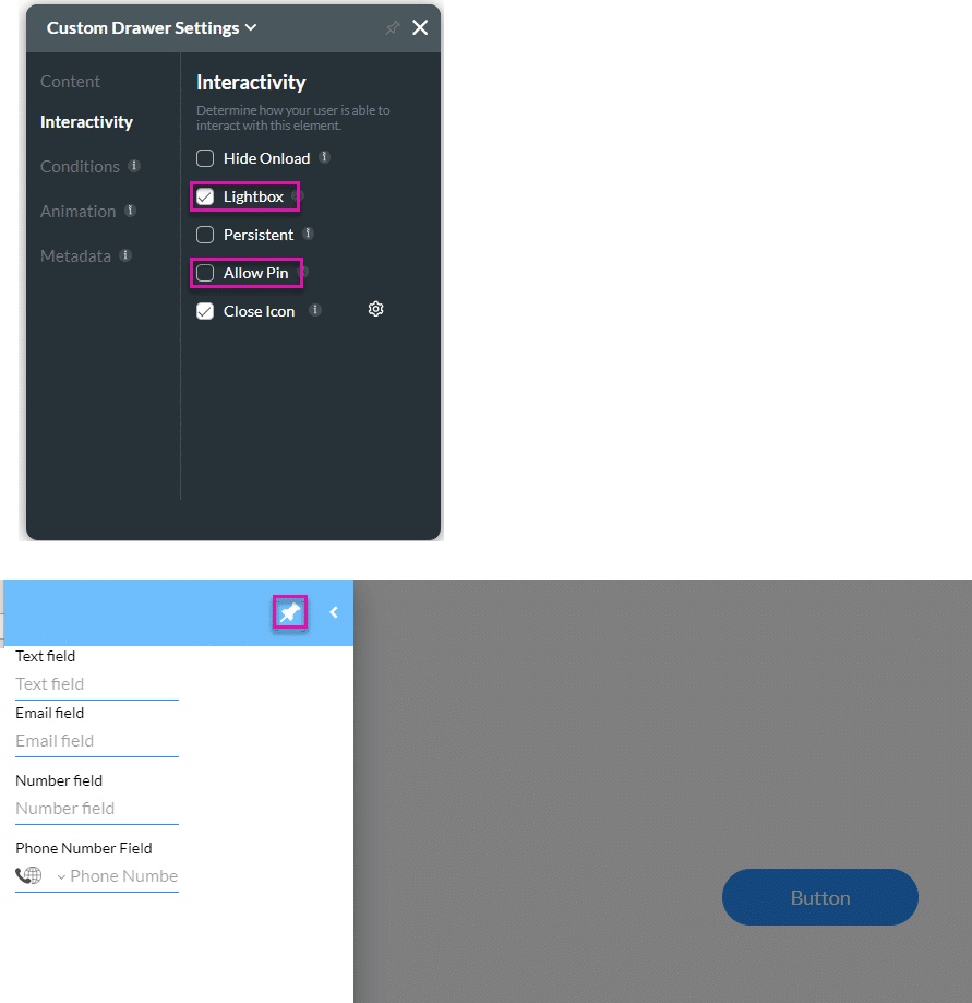
The lightbox functionality refers to a feature that displays images or content in the focused drawer when open, while dimming out the rest of the webpage in the background. It’s often used to showcase content in a more prominent and immersive way without navigating away from the current page. This can enhance user experience by allowing them to view detailed content without interruptions from the surrounding elements on the webpage.
If this option is disabled, the drawer must be closed with the Close icon. If enabled, it can be closed by clicking anywhere on the page.
How to Guide
- Click the + icon to open the list of elements.
- Select the Containers option from the list.
- Click-and-drag the Drawer element to the canvas.
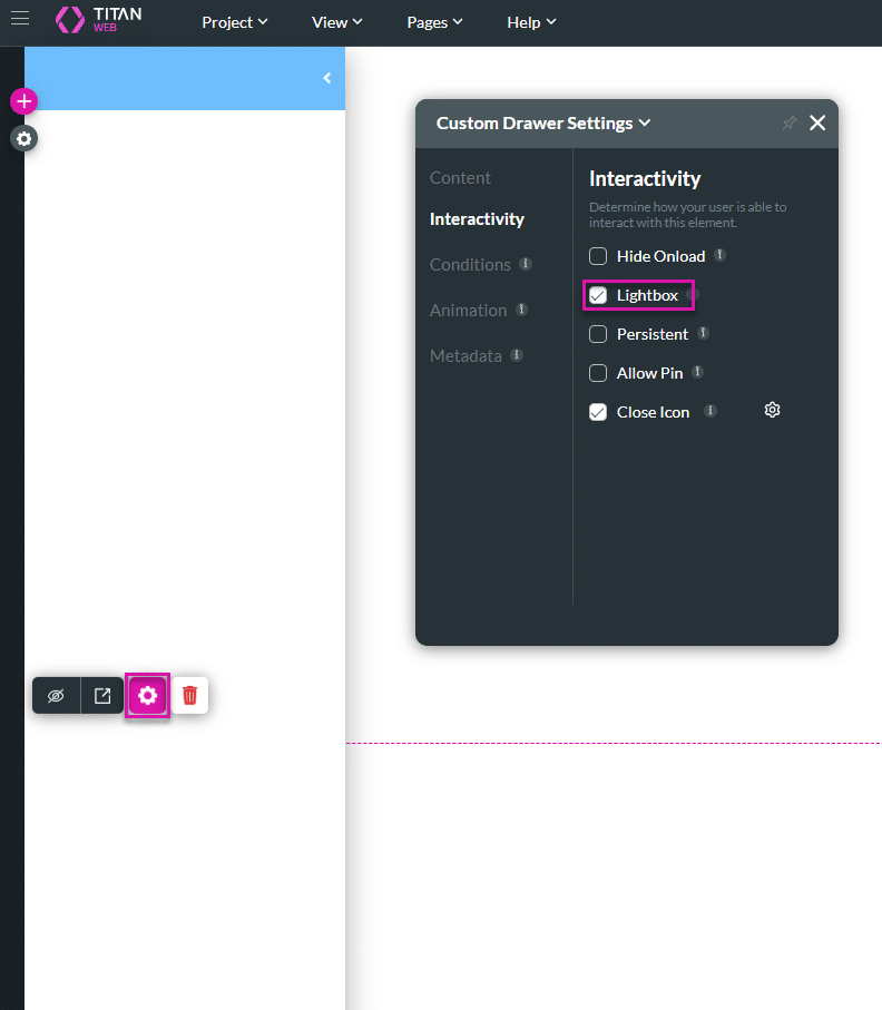
- Click the Drawer element settings Gear icon. The Custom Drawer Settings screen opens.
- Select the Interactivity option. The Lightbox option is checked by default.
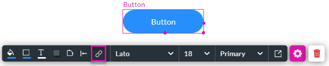
- Drag a button element to the canvas.
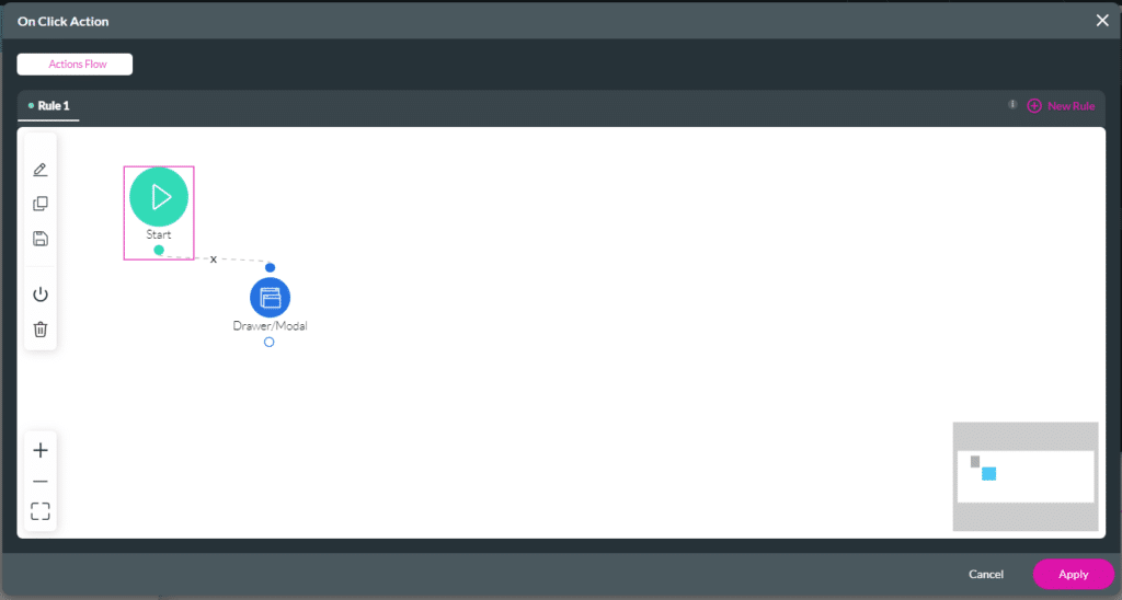
- Click the On Click Action icon.
- Click the + icon next to the Start node.
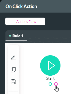
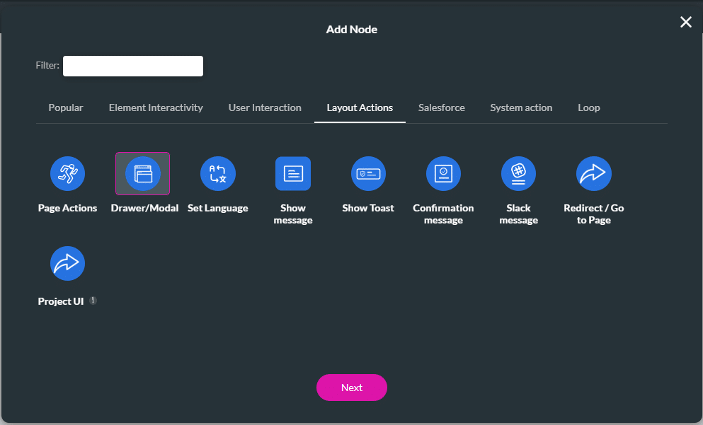
- Under Layout Actions, select the Drawer/Modal option and click the Next button.
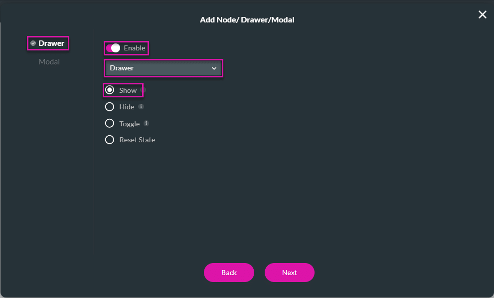
- For the Drawer, use the toggle switch to enable it.
- Use the drop-down list to select the drawer.
- Click the Show radio button and click the Next button.
- Add a tag if necessary and click the Insert button. The Drawer/Modal node is added.
- Click the Apply button.
- Save and Preview the project.
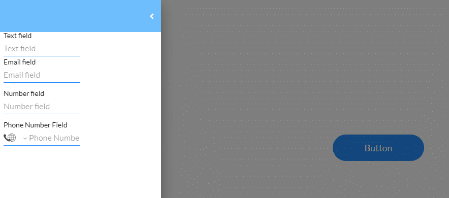
- Click the button to open the drawer.
When the Lightbox option is checked (enabled), the contents are displayed while the rest of the page is greyed out. The user can click anywhere on the webpage to close the drawer.
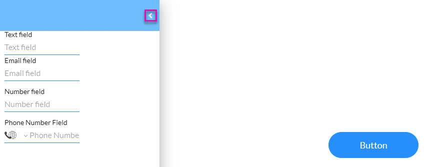
When this option is not checked (disabled), the user must close the drawer using the < icon at the top right of the drawer. When the drawer is open, the rest of the web screen doesn’t become greyed out.
Make sure that the drawer is not pinned (Allow Pin is disabled). When pinned, the drawer will only close when the < icon is clicked, even if the Lightbox option is enabled.