
Element Access and Validation for Affected Elements
Description
Dynamically adjust the characteristics of elements based on user actions or information from Salesforce.
- Read-only elements: Users can view but not directly edit or change read-only fields. These fields typically display static information such as text, numbers, or dates that are not meant to be altered by the user. They are often used to show system-generated, calculated, or historical data. Users can copy information from these fields but cannot modify it directly.
- Editable elements: These fields allow users to input, modify, or update information directly on the web page. They are interactive and enable users to enter text, select options from drop-down menus, pick dates from calendars, or upload files, depending on the type of input required.
- Disabled elements: These input fields appear grayed out and do not accept user interaction. Users cannot click, type, or modify the content of disabled fields. They are typically used when an input is temporarily unavailable, dependent on other inputs, or restricted due to user permissions. Disabled fields do not get submitted with a form.
- Enabled elements: These are active and interactive input fields that allow users to enter or modify information. Enabled fields accept input, can be clicked, and will be included when a form is submitted. They are essential for collecting user data and facilitating user interactions on a web page.
- Mandatory elements: Users must fill out these input fields before submitting a form. They are often marked with an asterisk (*) or accompanied by validation messages indicating the required information. If a mandatory field is left empty, the form typically displays an error message and prevents submission until the required information is provided. Examples include fields like name, email address, and password in a registration form.
- Not Mandatory elements: These fields are optional, meaning users can choose to fill them out or leave them blank without affecting form submission. They provide additional but non-essential information that may enhance user experience or provide more details to the system.
How to Guide
Prerequisite:
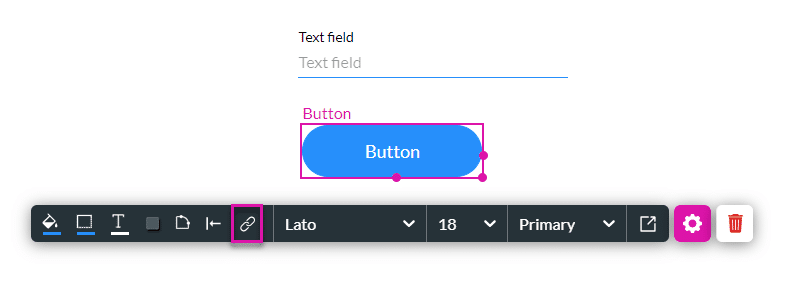
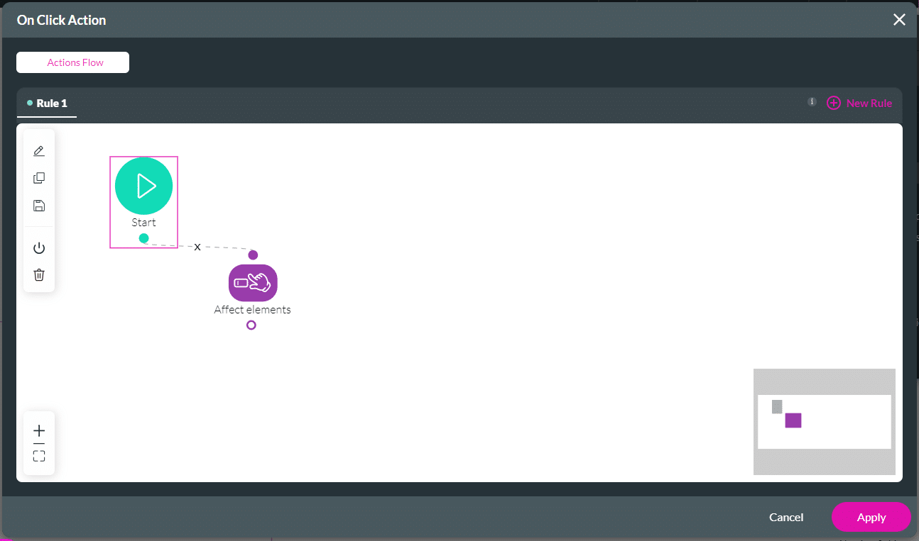
1. Add an Affected Element node to an element such as a button.
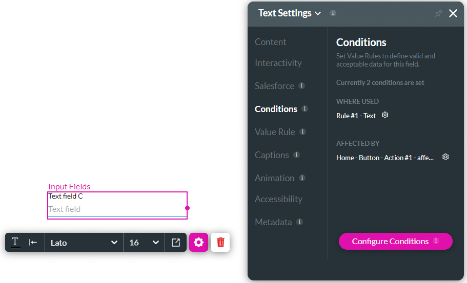
2. Alternatively, configure a condition.
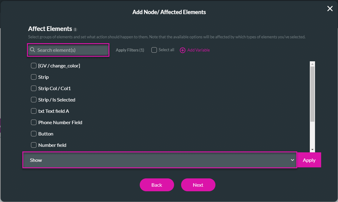
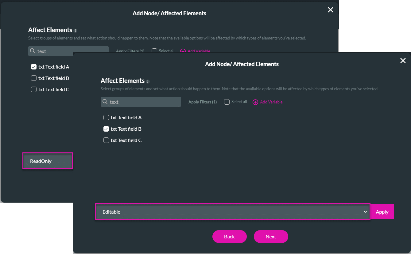
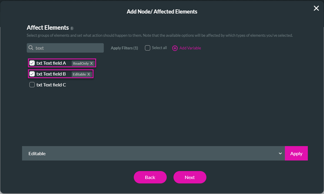
- Select the element/s that you want to affect by clicking the relevant checkbox/es.
- These are all the elements in your project.
- If necessary, use the Search element/s field.
- Use the drop-down list to select an option:
Read-only and Editable
A read-only field cannot be edited.
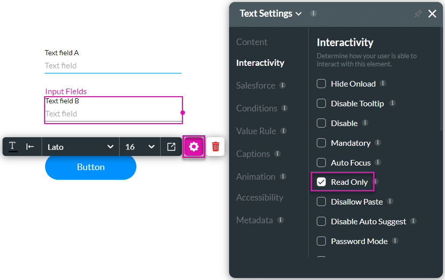
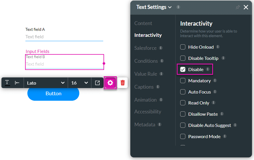
For this example, the Text field B is set to “Read Only” using the Text Settings screen.
- Use the drop-down list to select the Read-only option. In this example, Text field A was chosen.
- Use the drop-down list to select the Editable option. In this example, Text field B was chosen.
- Click the Apply button. The tag “ReadOnly” or “Editable” is added to the selected element/s.
- Click the Next button.
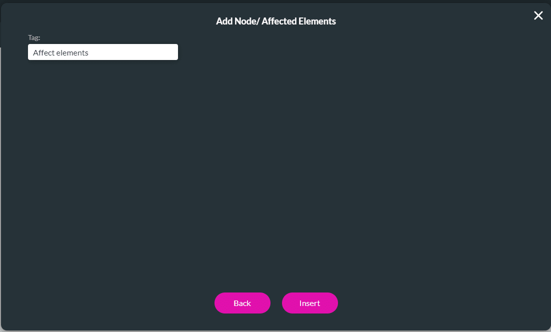
- If required, change the tag and click the Insert button. The node is added to the screen.
- Click the Apply button.
- Save and Preview the project.
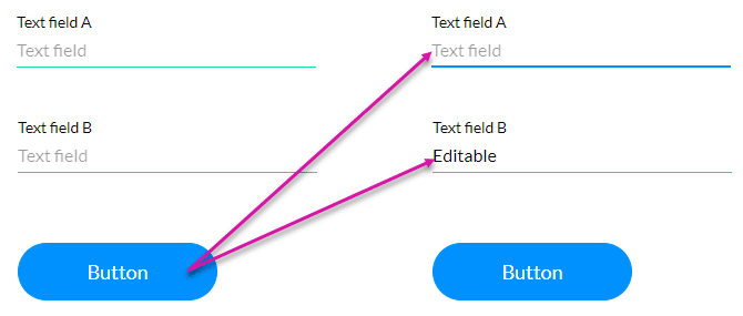
Text field B was set to read-only. When the user clicks the button, text field A is now read-only and text field B can be edited.
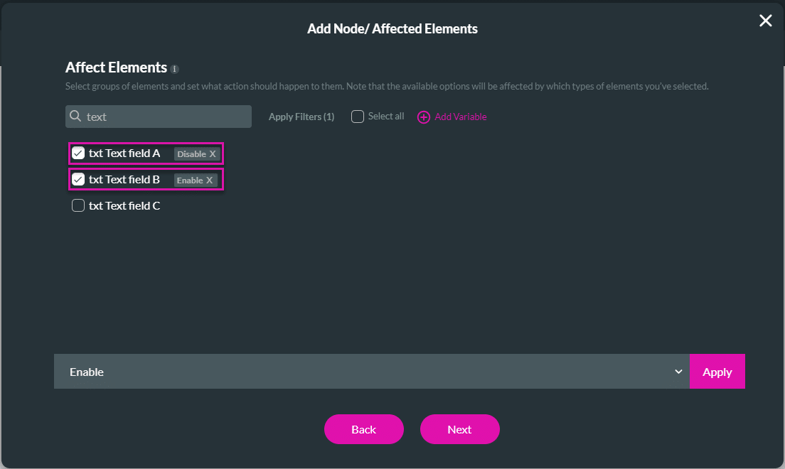
Disabled and Enabled
The disabled field will be greyed out, and a user cannot interact with it.
For this example, the text field B is set to “Disable” using the Text Settings screen.
- Use the drop-down list to select the Disable option. In this example, Text field A was chosen.
- Use the drop-down list to select the Enable option. In this example, Text field B was chosen.
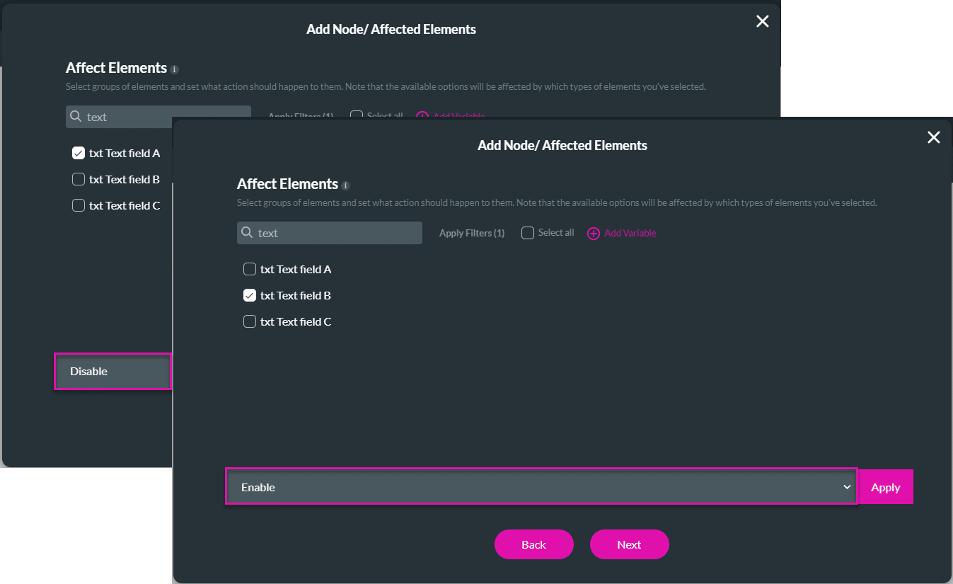
- Click the Apply button. The tag “Disable” or “Enable” is added to the selected element/s.
- Click the Next button.
- If required, change the tag and click the Insert button. The node is added to the screen.
- Click the Apply button.
- Save and Preview the project.
Text field B was set to disable. When the user clicks the button, text field A is now disabled and text field B is enabled.
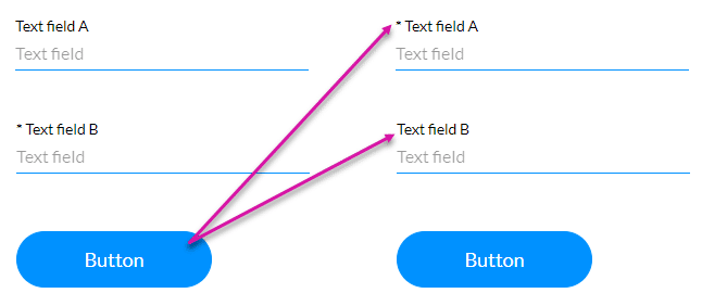
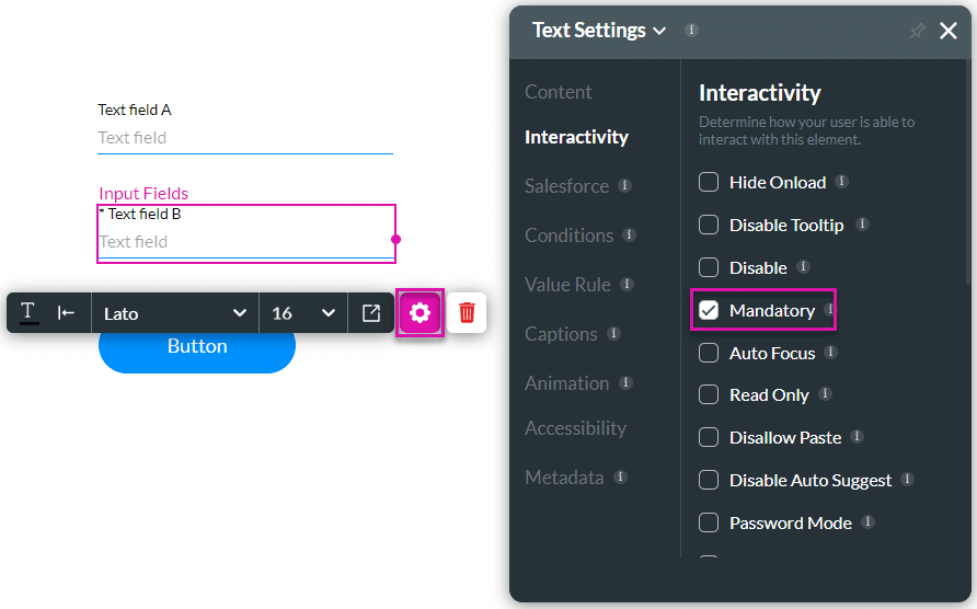
Mandatory and Not Mandatory
Mandatory fields have to be completed.
For this example, the text field B is marked Mandatory. An asterisk is added to the element to indicate that it is mandatory.
- Use the drop-down list to select the Mandatory option. In this example, Text field A was chosen.
- Use the drop-down list to select the Not mandatory option. In this example, Text field B was chosen.
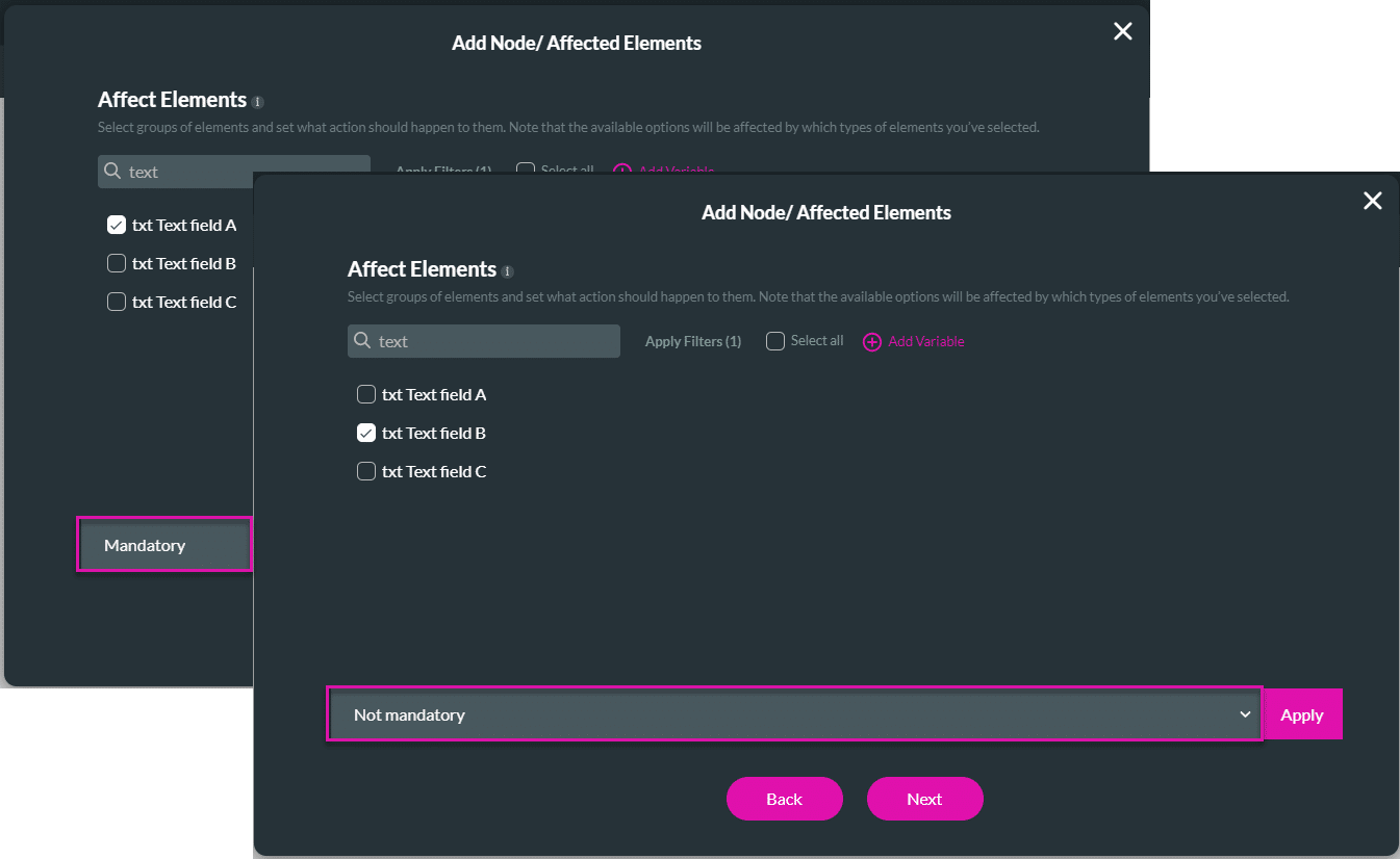
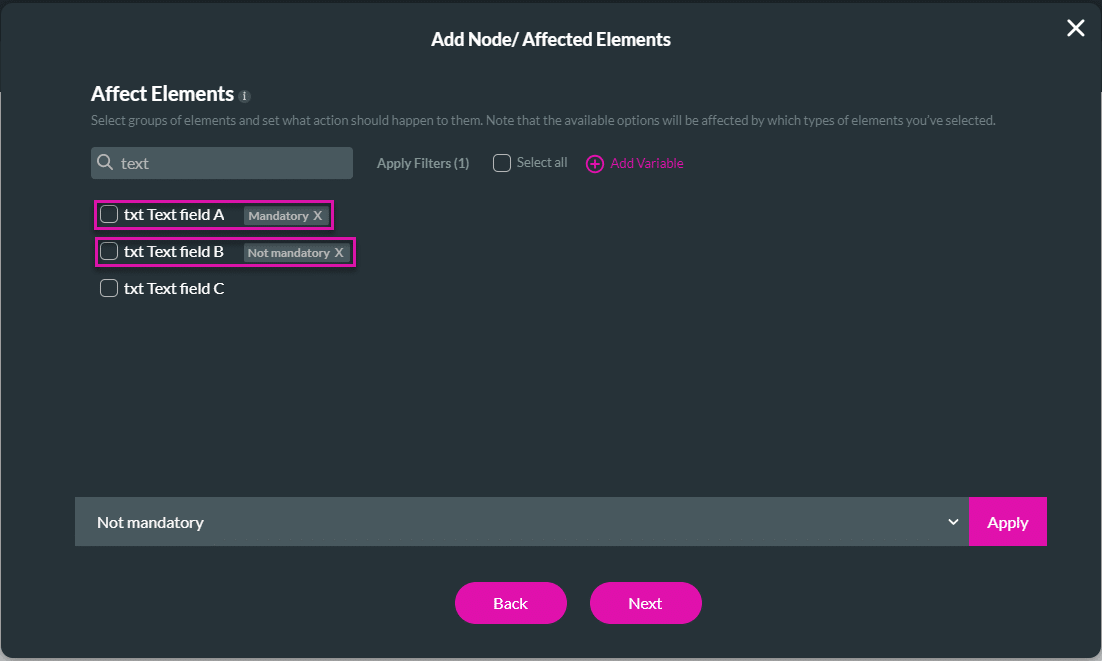
- Click the Apply button. The tag “Mandatory” or “Not mandatory” is added to the selected element/s.
- Click the Next button.
- If required, change the tag and click the Insert button. The node is added to the screen.
- Click the Apply button.
- Save and Preview the project.
Text field B was set to mandatory. When the user clicks the button, text field A is now mandatory and text field B is not.